Viewpagerindicator
🔥 Worked with ViewPager and ViewPager2,support multiple slider styles and multiple slide mode.This repo was split from BannerViewPager-
Install / Use
/learn @zhpanvip/ViewpagerindicatorREADME
ViewPagerIndicator


English | 中文
Use case of ViewPagerIndicator
Preview
Click here or scan the QR code to download demo apk

Various Indicator Styles and various Indicator Slide mode was supported now.It's also support drawable indicator and custom indicator.
IndicatorView
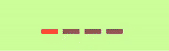
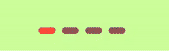
| Attrs | CIRCLE | DASH | ROUND_RECT |
|--|--|--|--|
| NORMAL|  |
|  |
|  |
| SMOOTH|
|
| SMOOTH|  |
|  |
|  |
| WORM|
|
| WORM|  |
|  |
|  |
| COLOR|
|
| COLOR|  |
|  |
|  |
| SCALE|
|
| SCALE|  |
|  |
|  |
|
API
| Method | Description | Default | |--|--|--| | setOrientation(int) | set indicator orientation,enum(INDICATOR_HORIZONTAL/INDICATOR_VERTICAL/INDICATOR_RTL) | Default value is INDICATOR_HORIZONTAL | | setIndicatorStyle(Int) | set indicator style | enum(CIRCLE;DASH;ROUND_RECT) default CIRCLE | | setSliderColor(normalColor: Int,selectedColor: Int)| set indicator slider color |normalColor:color of indicator dot not selected, default value "#8C6C6D72", checkedColor:color of indicator selected default value is "#8C18171C" | | setSlideMode(slideMode: Int) | set indicator slide mode | enum(NORMAL;SMOOTH;WORM;COLOR;SCALE),default value NORMAL | | setSliderWidth(indicatorWidth:Int) | set indicator slider width,if it's Circle indicator the parameter is diameter of circle | default value is 8dp| | setSliderWidth(normalWidth Int , checkWidth Int) | set indicator slider width,if is circle style,the width is diameter of circle | default is 8dp | | setIndicatorHeight(indicatorHeight Int) | set indicator hight,it's only used when the indicator style is DASH or ROUND_RECT | default value is normalIndicatorWidth/2 | | setSliderGap(indicatorMargin Int ) | set the gap of indicator slider| default value is indicator slider width(or the diameter of circle)| | setupWithViewPager(ViewPager) | To link IndicatorView with ViewPager together. | | | setupWithViewPager(ViewPager2) | To link IndicatorView with ViewPager2 together. | |
XML Attrs
| Attributes | format | description | |--|--|--| | vpi_slider_checked_color | color | set slider checked color,default value is "#6C6D72" | | vpi_slider_normal_color | color | set slider normal color,default value is "#8C18171C" | | vpi_slider_radius | dimension | set slider radius or width. if it's circle style the value is radius of circle,if the indicator style is DASH or ROUND_RECT the value is width/2 | | vpi_orientation | enum | set orientation(horizontal/vertical/rtl) | | vpi_slide_mode | enum | set indicator slide mode(normal/smooth/worm/scale/color) | | vpi_style | enum | set indicator slider style (circle/dash/round_rect) |
Usage
Gradle dependency
Please add it in your root build.gradle at the end of repositories:
allprojects {
		repositories {
			...
			maven { url 'https://jitpack.io' }
		}
	}
Then add the dependency in your app build.gradle
implementation 'com.github.zhpanvip:viewpagerindicator:latestVersion'
latestVersion:
1.IndicatorView
Three indicator styles and five slide mode supported with IndicatorView as so far.
(1).Add IndicatorView in layout.xml
    <RelativeLayout
            android:layout_width="match_parent"
            android:layout_height="@dimen/dp_200"
            tools:context=".MainActivity">

            <androidx.viewpager.widget.ViewPager
                android:id="@+id/banner_view"
                android:layout_width="match_parent"
                android:layout_height="match_parent" />

            <com.zhpan.indicator.IndicatorView
                android:id="@+id/indicator_view"
                android:layout_width="wrap_content"
                android:layout_height="wrap_content"
                android:layout_alignParentBottom="true"
                android:layout_centerHorizontal="true"
                android:layout_margin="@dimen/dp_10" />

    </RelativeLayout>
(2).Use IndicatorView with ViewPager/ViewPager2:
         indicatorView.apply {
                             setSliderColor(normalColor, checkedColor)
                             setSliderWidth(resources.getDimension(R.dimen.dp_10))
                             setSliderHeight(resources.getDimension(R.dimen.dp_5))
                             setSlideMode(IndicatorSlideMode.WORM)
                             setIndicatorStyle(IndicatorStyle.CIRCLE)
                             setPageSize(view_pager2!!.adapter!!.itemCount)
                             notifyDataChanged()
                         }
         view_pager2.registerOnPageChangeCallback(object : ViewPager2.OnPageChangeCallback() {
             override fun onPageScrolled(position: Int, positionOffset: Float, positionOffsetPixels: Int) {
                 super.onPageScrolled(position, positionOffset, positionOffsetPixels)
                 indicatorView.onPageScrolled(position, positionOffset, positionOffsetPixels)
             }

             override fun onPageSelected(position: Int) {
                 super.onPageSelected(position)
                 indicatorView.onPageSelected(position)
             }
         })
Or you can do like the following code:
        val indicatorView = findViewById<IndicatorView>(R.id.indicator_view2)
        indicatorView.apply {
                    setSliderColor(normalColor, checkedColor)
                    setSliderWidth(resources.getDimension(R.dimen.dp_10))
                    setSliderHeight(resources.getDimension(R.dimen.dp_5))
                    setSlideMode(IndicatorSlideMode.WORM)
                    setIndicatorStyle(IndicatorStyle.CIRCLE)
                    setupWithViewPager(view_pager2)
                }
2.Custom IndicatorView
DrawableIndicator
| Bitmap Drawable| Vector Drawable|
|--|--|
|  |
|  |
|
You can set bitmap drawable indicator and vector drawable indicator by DrawableIndicator,also you can resize the drawable easily.
Add IndicatorView in layout.xml
    <RelativeLayout
            android:layout_width="match_parent"
            android:layout_height="@dimen/dp_200"
            tools:context=".MainActivity">

            <androidx.viewpager.widget.ViewPager
                android:id="@+id/banner_view"
                android:layout_width="match_parent"
                android:layout_height="match_parent" />

            <com.zhpan.viewpagerindicator.DrawableIndicator
                android:id="@+id/indicator_view"
                android:layout_width="wrap_content"
                android:layout_height="wrap_content"
                android:layout_alignParentBottom="true"
                android:layout_centerHorizontal="true"
                android:layout_margin="@dimen/dp_10" />

    </RelativeLayout>
Use DrawableIndicator with ViewPager/ViewPager2:
        val drawableIndicator = findViewById<DrawableIndicator>(R.id.indicator_view)
        val dp20 = resources.getDimensionPixelOffset(R.dimen.dp_20)
        drawableIndicator.apply {
                            setIndicatorGap(resources.getDimensionPixelOffset(R.dimen.dp_2_5))
                            setIndicatorDrawable(R.drawable.heart_empty, R.drawable.heart_red)
                            setIndicatorSize(dp20, dp20, dp20, dp20)
                            setupWithViewPager(view_pager2)
                        }
FigureIndicatorView
The example wil
Related Skills
openhue
342.5kControl Philips Hue lights and scenes via the OpenHue CLI.
sag
342.5kElevenLabs text-to-speech with mac-style say UX.
weather
342.5kGet current weather and forecasts via wttr.in or Open-Meteo
tweakcc
1.5kCustomize Claude Code's system prompts, create custom toolsets, input pattern highlighters, themes/thinking verbs/spinners, customize input box & user message styling, support AGENTS.md, unlock private/unreleased features, and much more. Supports both native/npm installs on all platforms.
