TidyTuesdayWithPython
My weekly (or monthly) data visualisation practicing using data from TidyTuesday, using Python instead of R!
Install / Use
/learn @xh313/TidyTuesdayWithPythonREADME
Tidy Tuesday with Python
My weekly (or monthly) data visualisation practicing using data from TidyTuesday, using Matplotlib and Python instead of R!
Projects
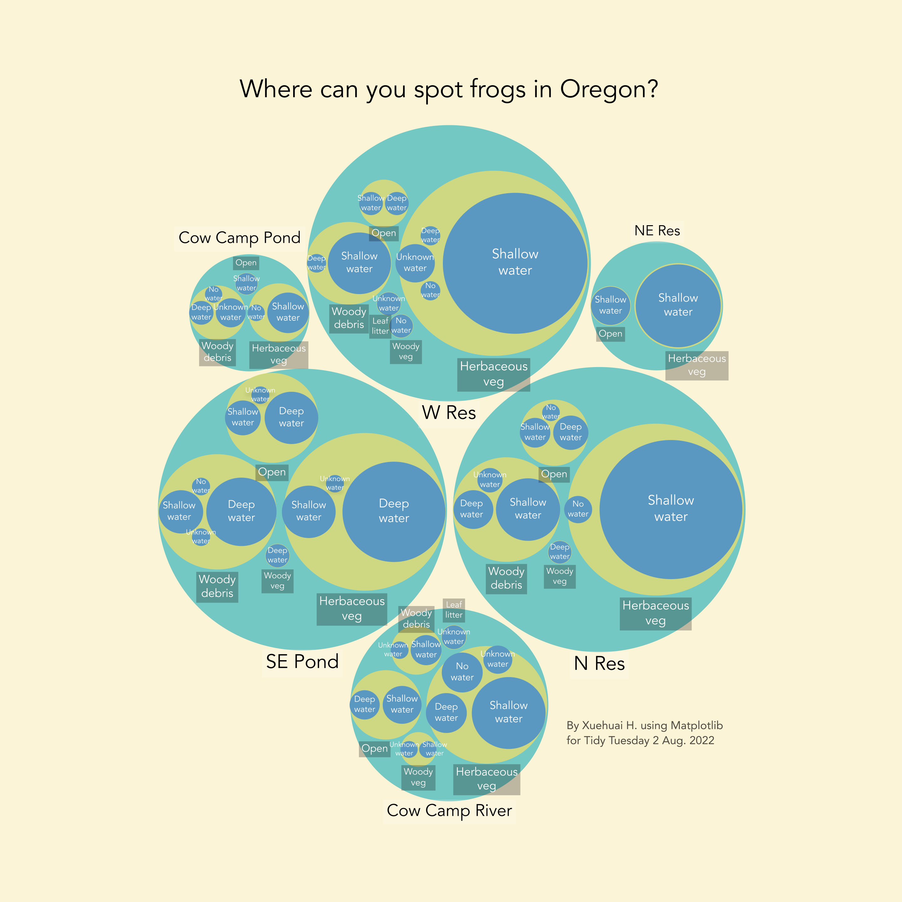
2 Aug 2022
Frogs spotted in Oregon. I experimented with circle packing but it's so much pain that I would probably never do it again. Anyway here's the code and the pic.
Code: Here
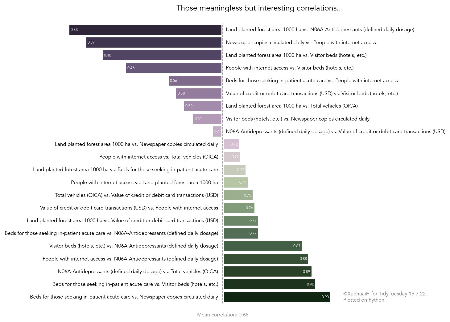
19 Jul 2022
This data set is so interesting that I got so obsessed with wrangling it and forgot about visualisation...
Here is a meaningless graph just for fun XD
Code: Here
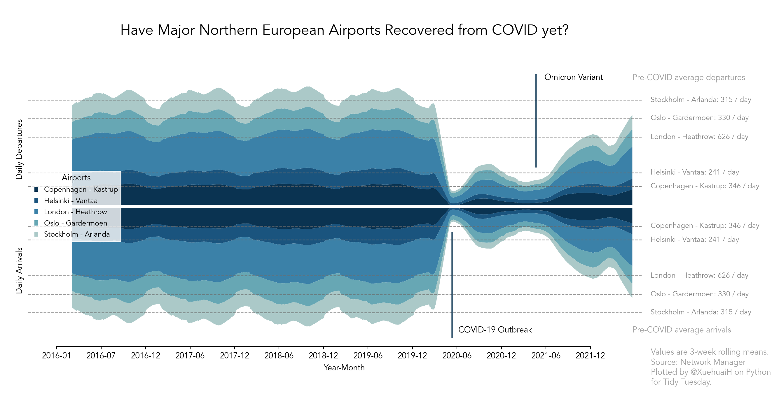
12 Jul 2022
European flights. I don't know what I'm doing. Ideally this highlights the hit of COVID on air traffic.
Code: Here
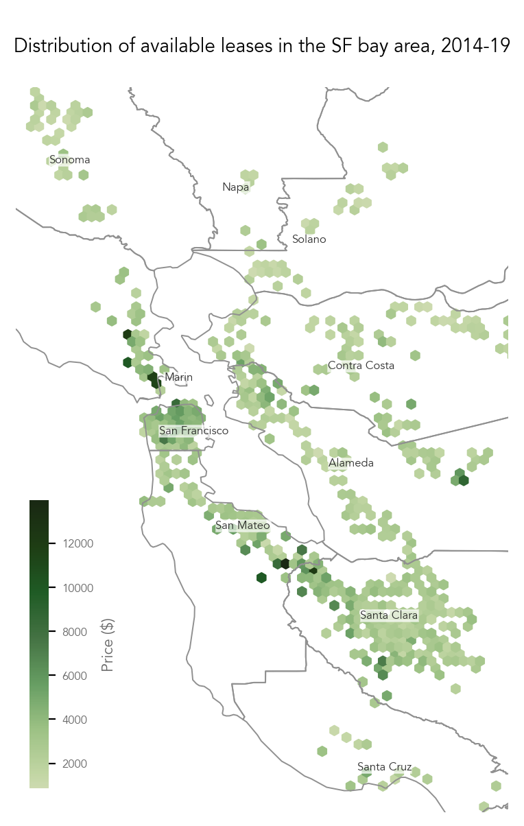
5 Jul 2022
SF rent and lease distribution. I tried to do an animation and failed miserably. I still have to get up to work on Wednesday so I'd try again next week lol.
Code: Here
28 June 2022
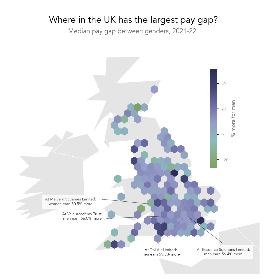
UK pay gap.
Code: Here
21 June 2022
In honour of Juneteenth :) did a lot of text processing stuff to brush up my regex.
Code: Here
14 June 2022
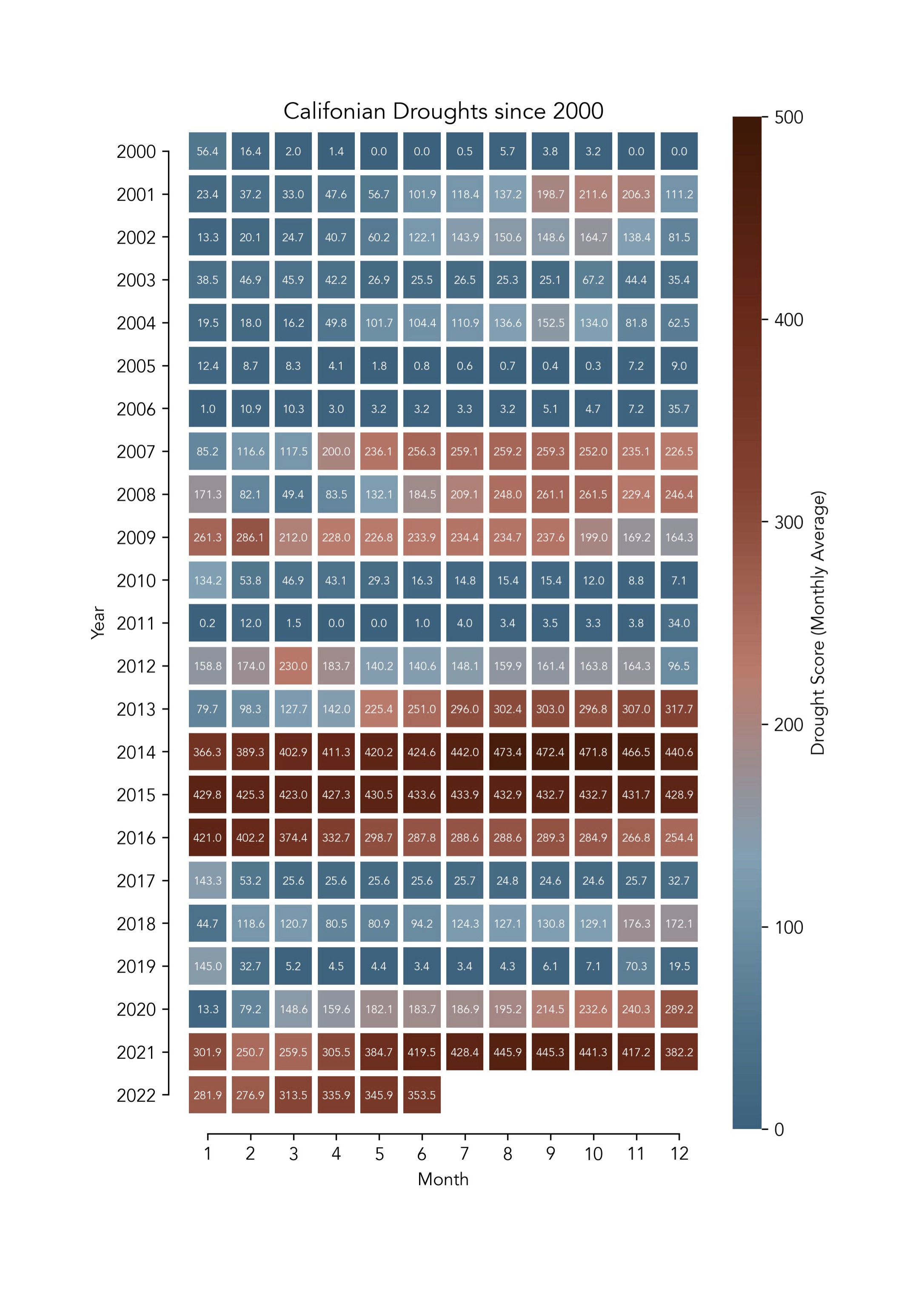
The data set is on droughts in the US but I focused on California in this part. It isn't going well...
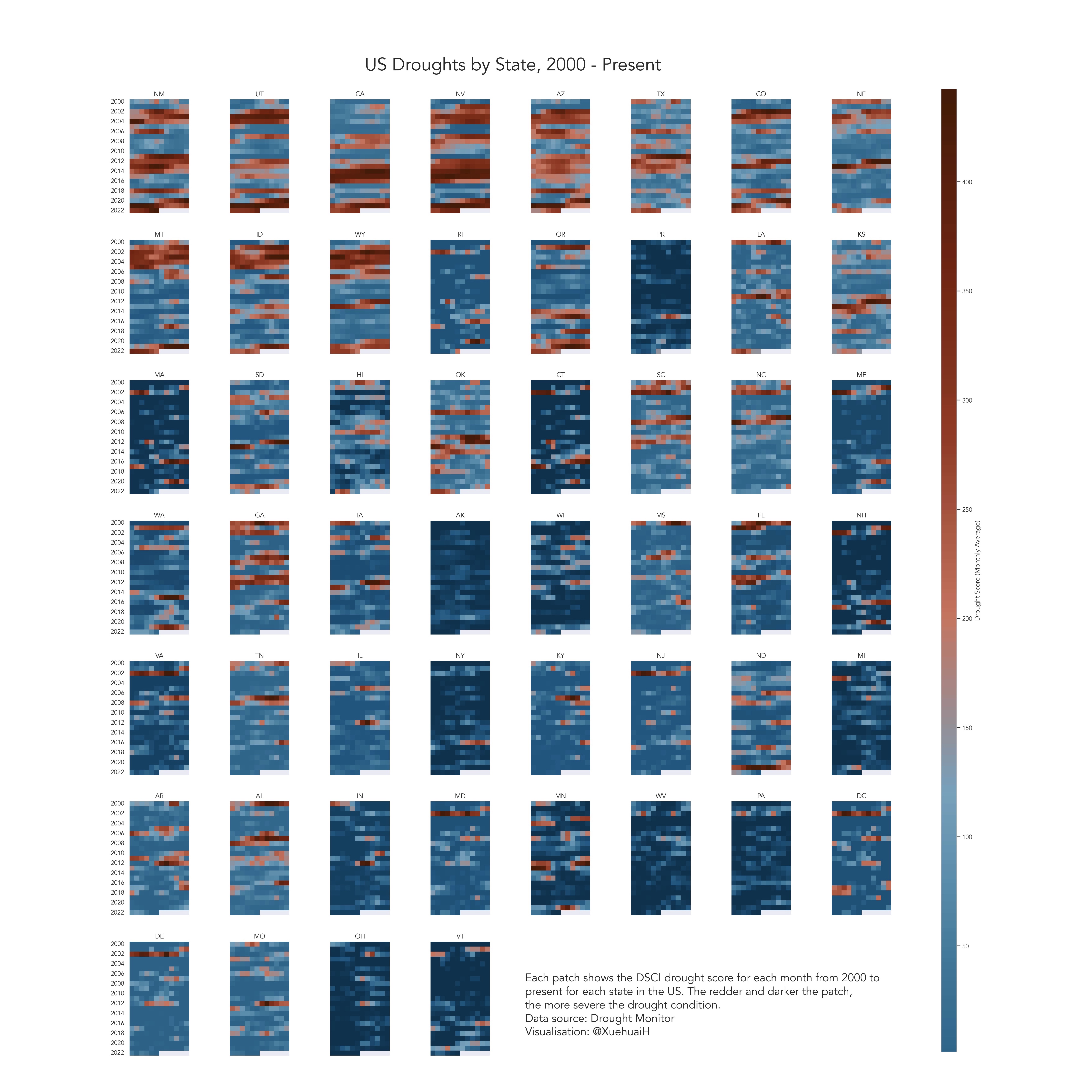
Then I also looked into the general trend for every state in the US but this is kind of unclear at first glance...
Code: Here
7 June 2022
Holding companies donating to anti-LGBTQ politicians accountable.
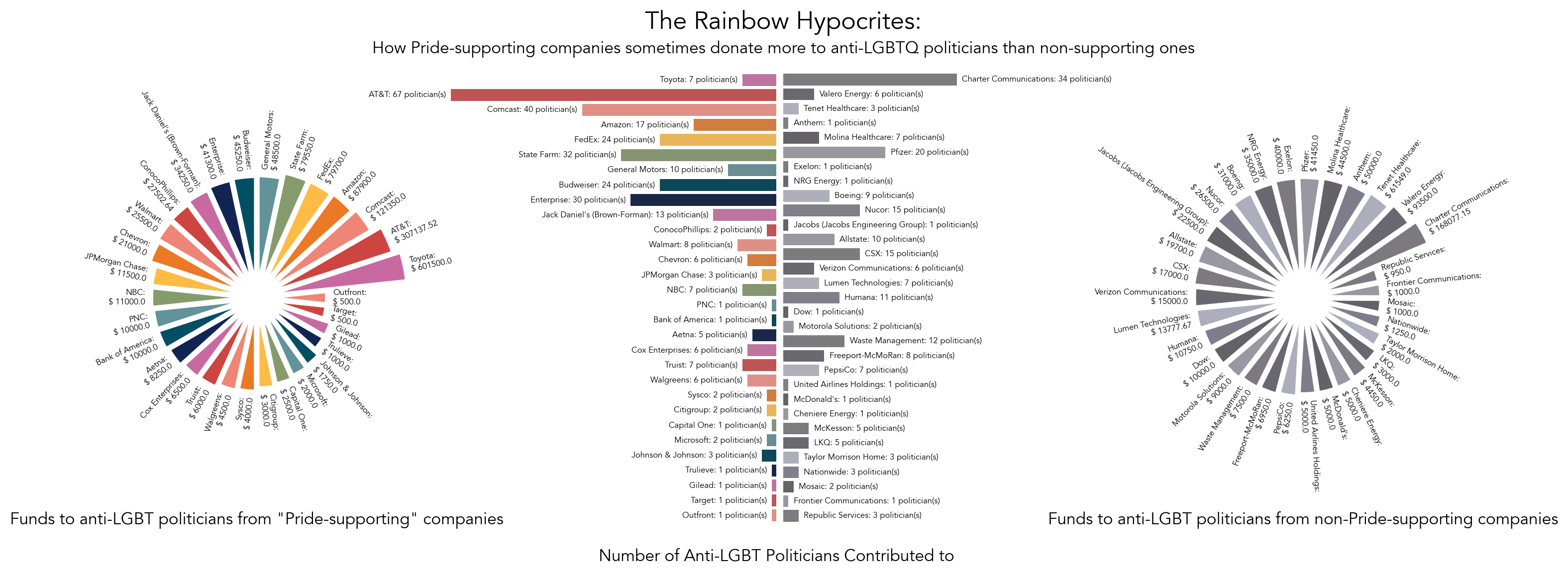 Condensed:
Code: Here
24 May 2022
Women's rugby.
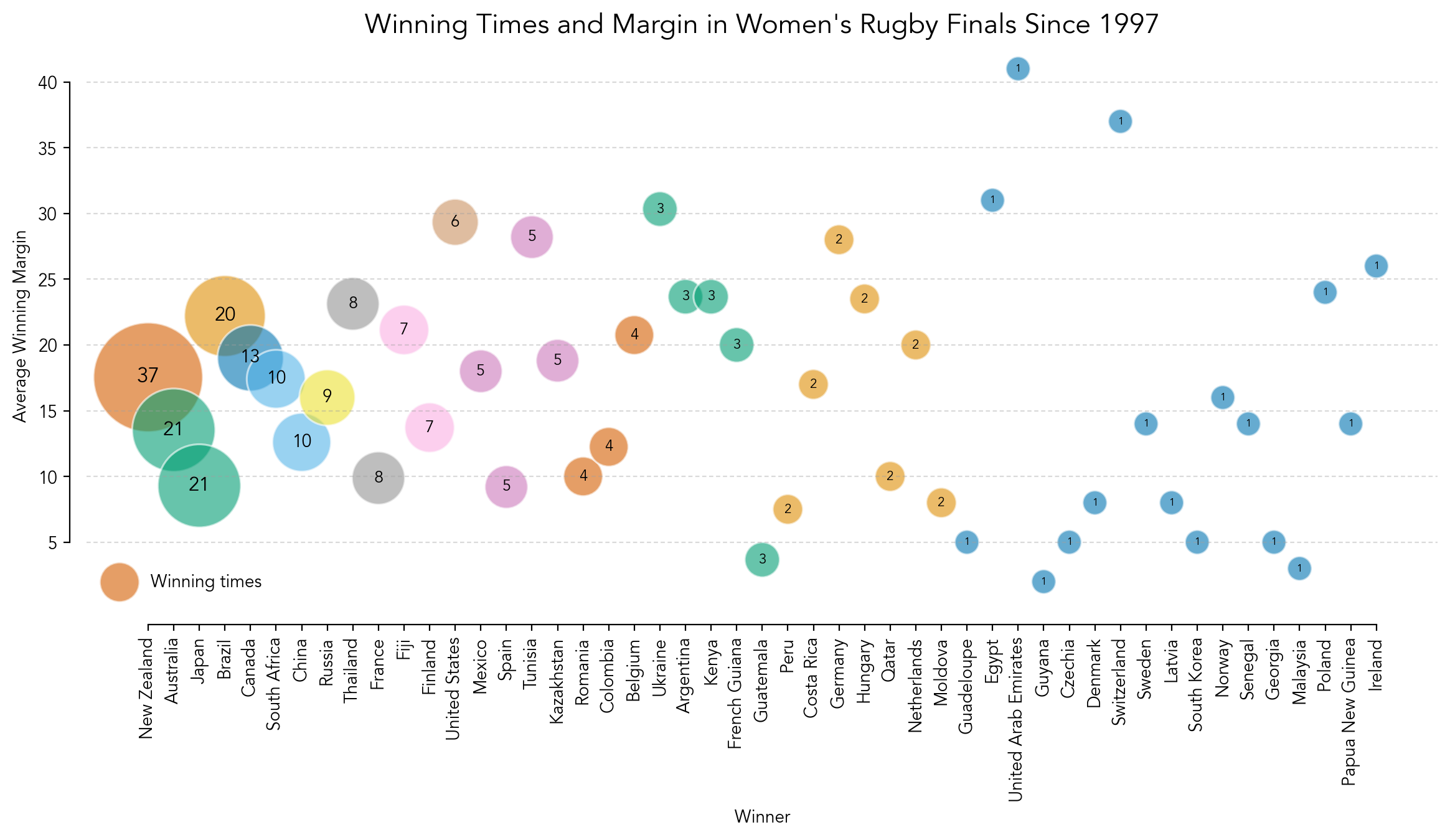
Code: Here
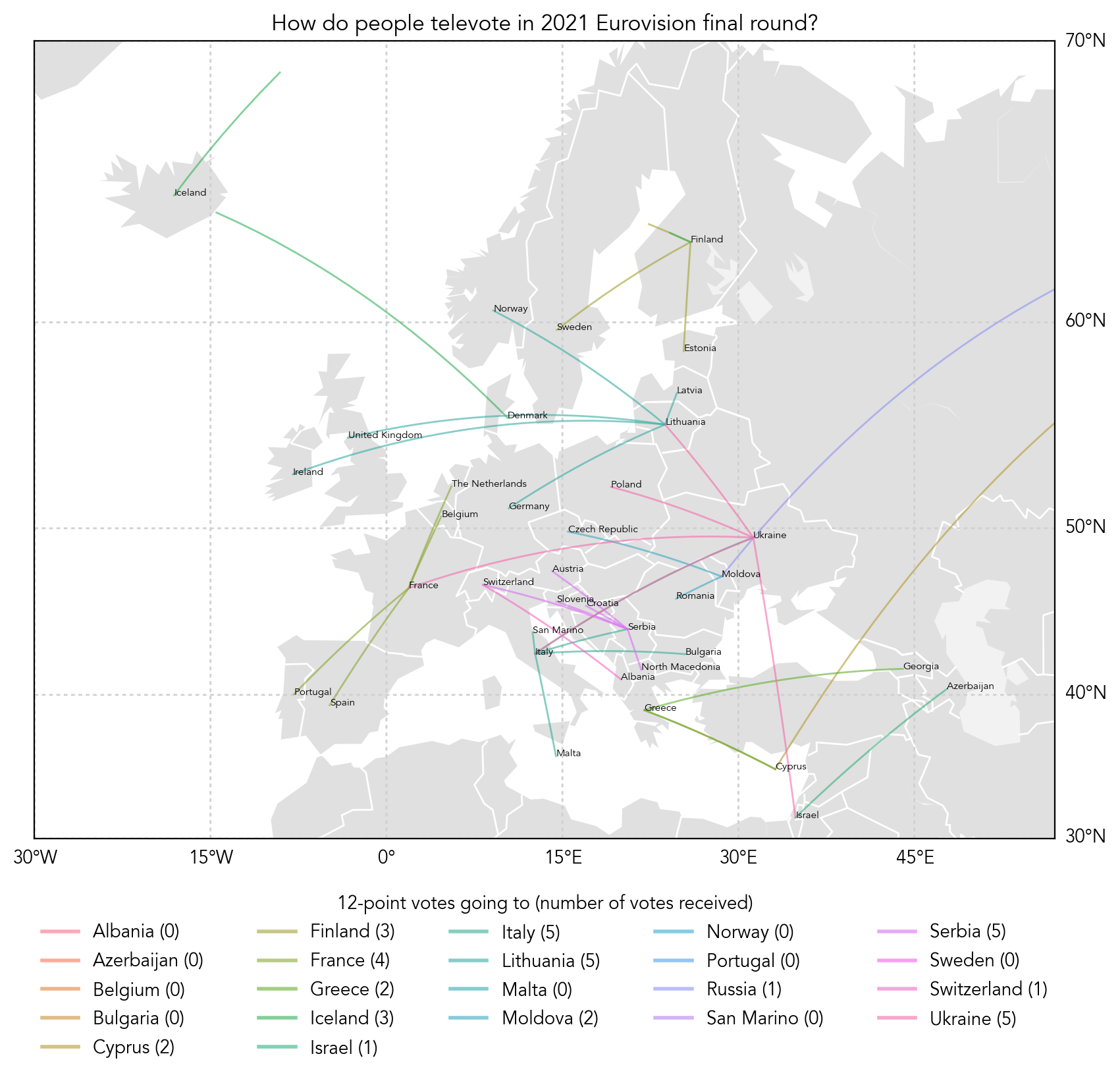
17 May 2022
Eurovision! And the drastic contrast between 2022 and 2021.
2021:
Whereas 2022:
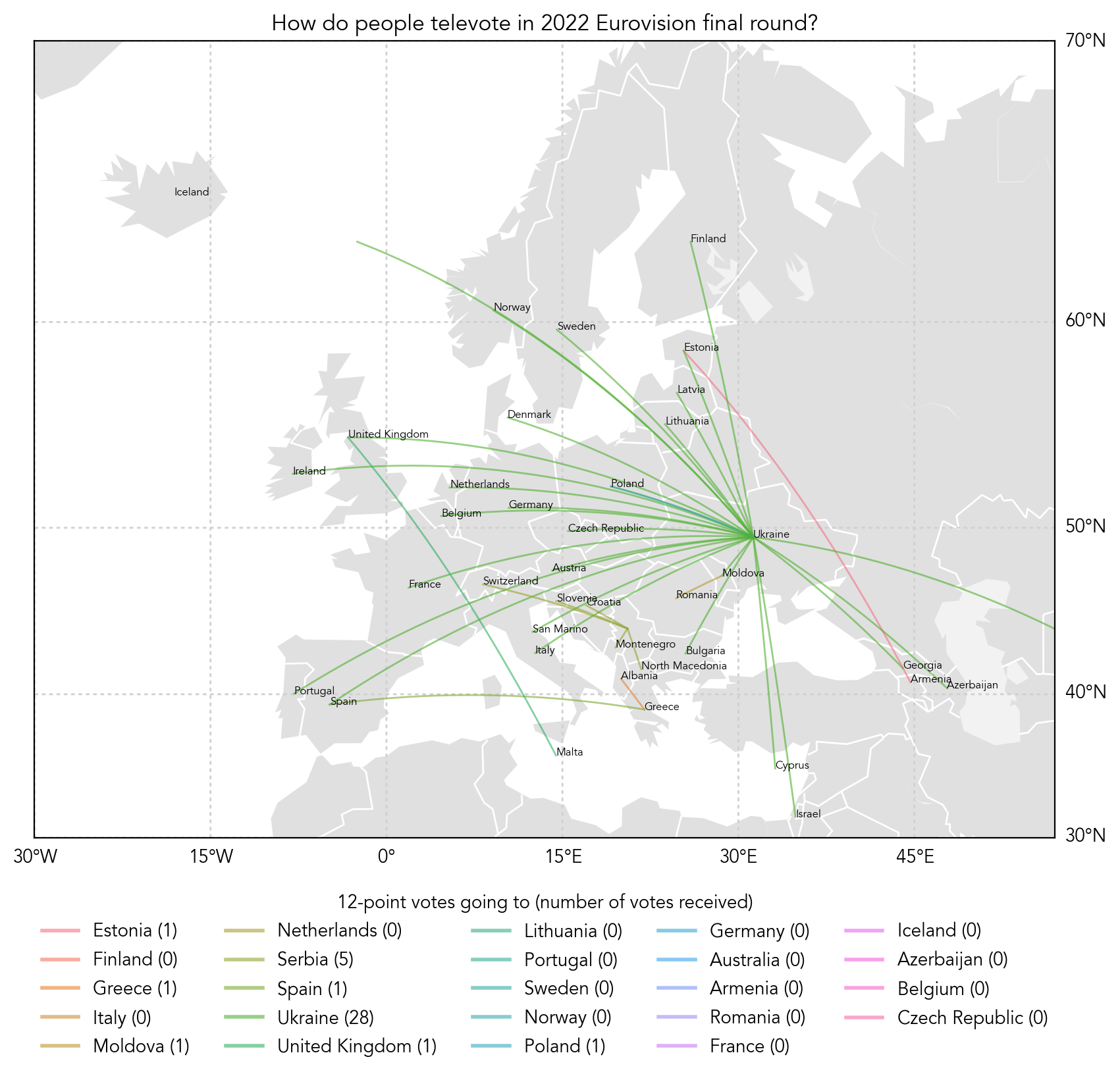
All of our best wishes go to Ukraine <3
Plotted on Python using Basemap in Matplotlib and Geopy.
Code: Click here
3 May 2022
After a month of random COVID disruptions and UCLA DataFest I am finally back to TidyTuesday!
Today's raw data: https://github.com/rfordatascience/tidytuesday/tree/master/data/2022/2022-05-03
Graphic:
29 Mar 2022
Plotly is so cool!
22 Mar 2022
Cheesiest plot I've made so far...
- Raw data: [https://raw.githubusercontent.com/rfordatascience/tidytuesday/master/data/2022/2022-03-22/babynames.csv]
Graphic:
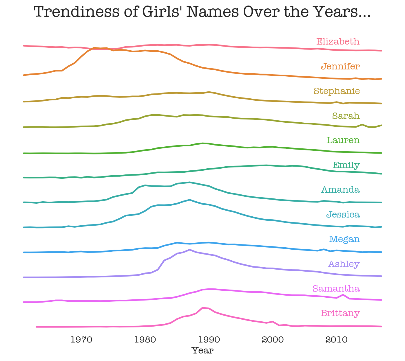
XH 22 Mar 2022
08 Mar 2022
PENDING
01 Mar 2022
Tried Geopandas and Geoplots the first time! I'd say I would probably rather use seaborn the next time though...
Data processing logic:
- Raw data: [https://raw.githubusercontent.com/rfordatascience/tidytuesday/master/data/2022/2022-03-01/stations.csv]
- Map the points on the country map using the LONGITUDE and LATITUDE columns.
- Colour code the points using the column FUEL_TYPE_CODE distinguishing the fuel types.
Visual features:
- Designs:
- Map of the US (excluding Alaska and islands) as background with faint county borders
- Translucent data points showing the density of the distribution clearly
- Legend showing fuel types
- Avenir typesetting! Avenir is the best
- Also added Alt text
Issues:
- Projection: whenever I employ projection methods the session crashes, so now the map looks kind of squished
- The spots on the legend are so faint that it's hard to tell apart the difference in colours
- The legend handles are currently acronym and might work better if I type in the full name
Plans:
- Maybe fix the projection issue
- Differentiate the colours more
Graphic:
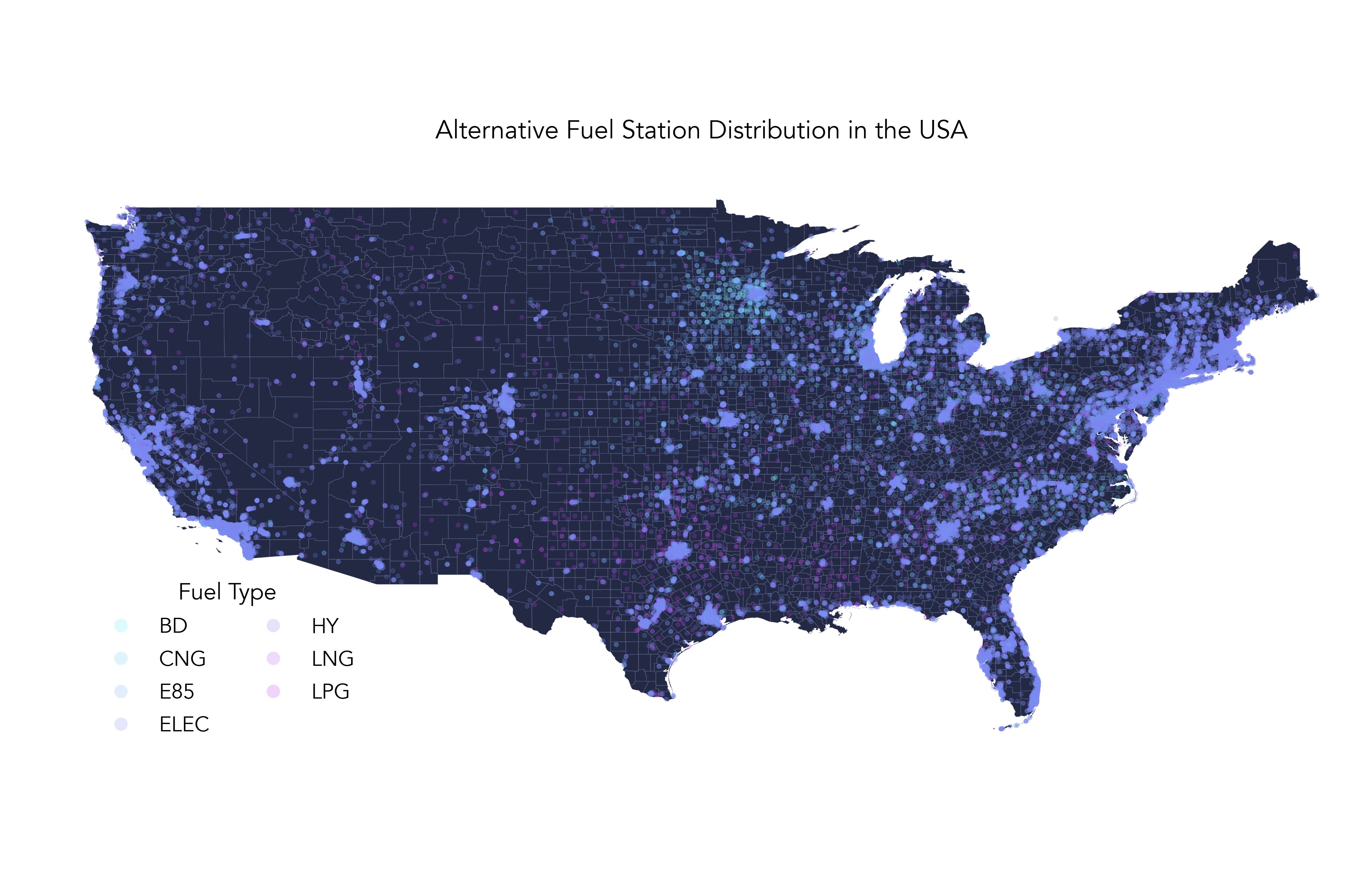
XH 01 Mar 2022
22 Feb 2022
Happy 22022022 palindrome day!
Content note: The raw data given by TidyTuesday this week involves comparison between countries, which might involve some political disputes and/or underlying assumptions. The raw data does not come from me and does not represent my political opinions. Please assess the credibility of the original data under your own judgements.
Data processing logic:
- Raw data: [https://github.com/rfordatascience/tidytuesday/blob/master/data/2022/2022-02-22/freedom.csv]
- Selecting the column of 'Status' (Free, partially free and not free)
- Extract the status of each country for every year (1995-2020), count the data and funnel into 3 dictionaries.
- Show the trend of the number of countries that are in each status over the 26 years
Visual features:
- Designs:
- Used mock-ggplot style with some modifications (facecolor etc.)
- Translucent on-graph legend with sharp corners
- All-filling solid colours with different shades
- Avenir typesetting! Avenir is the best
Issues:
- Sort of boring (I didn't have much time to make it fancier :(
- Would probably work better if the graph is more horizontal (aka the height could be decreased)
- The grids in the background are useless since the area fills don't have an alpha (quick fix)
Plans:
- Add alphas to the filled area under curves
- Change graph dimensions
- Improving the documentation and styling
- Alt text
Graphic:
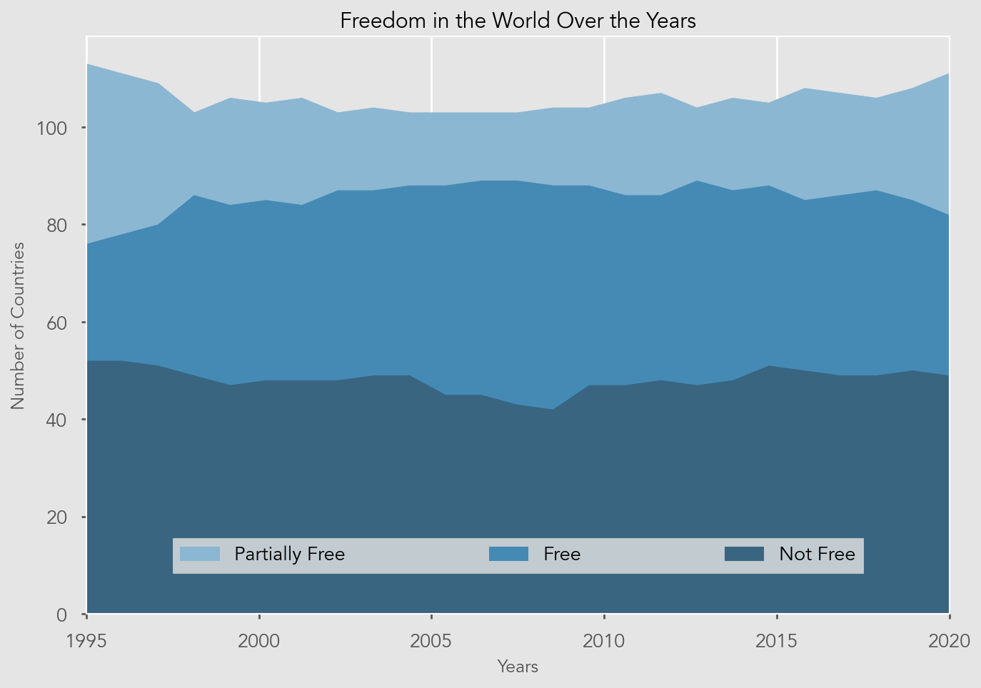
XH 22 Feb 2022
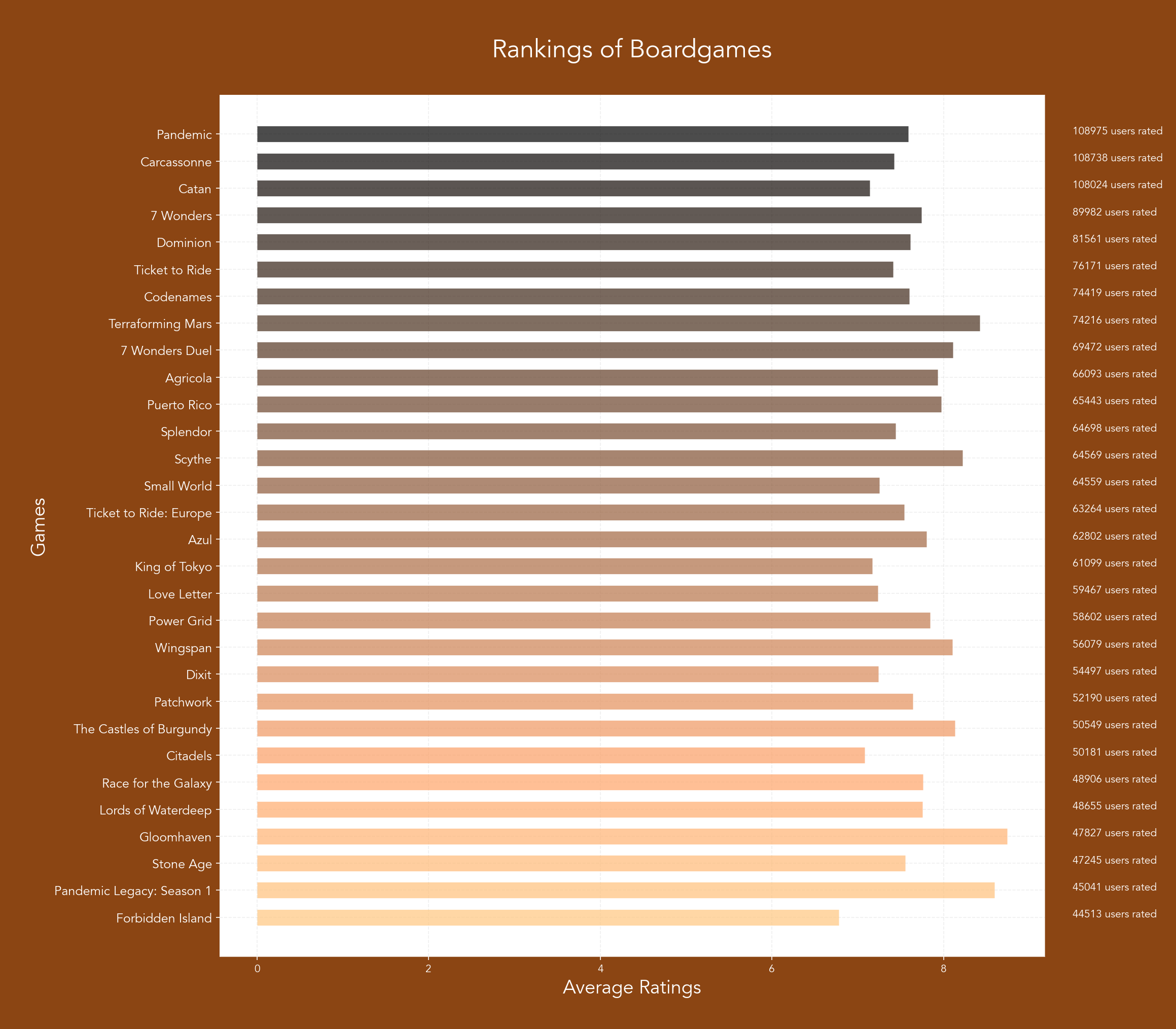
8 Feb 2022 (actually using the data set from 25 Jan 2022)
I am not interested in random american airforce people so I pulled out an old boardgame data set instead!
** LOGGING IN PROCESS NOT FINISHED **
Data processing logic:
- Data on dog breeds and their different traits
- Quantifying all qualitative descriptions into scores using text processing
- Weighting and categorising each trait into two new parameters 'friendliness' and 'fluffiness'
- Plot scatter plot with each point corresponding to a breed on the quadrant of fluffiness-friendliness
Visual features:
- Detecting overlapping points or close-by points automatically and wrap/dodge off the labelling (still bugged :( )
- Generating a new colour for each data point on the tab 20b palette (or any other palettes, might change it if in the mood)
- Avenir typesetting! Avenir is the best
- Annotation of the breed name beside each data point
- Legend indexing all 190+ breed names
Issues:
- The overlap detector does not work for certain few points for some reason
- Graph too huge with too many data points -- hard to read! Don't know if there's a better way to present the data!
- Might need to adjust some weighings a bit (as I don't own a dog myself, I am biased!)
Plans:
- Indexing the position on the diagram for each breed and incorporating into the legend
- Improving the documentation and styling (it is currently unfortunately a mess!)
Graphic:
XH 8 Feb 2022
1 Feb 2022
Data processing logic:
- Data on dog breeds and their different traits
- Quantifying all qualitative descriptions into scores using text processing
- Weighting and categorising each trait into two new parameters 'friendliness' and 'fluffiness'
- Plot scatter plot with each point corresponding to a breed on the quadrant of fluffiness-friendliness
Visual features:
- Detecting overlapping points or close-by points automatically and wrap/dodge off the labell
