MaterialDateTimePicker
Pick a date or time on Android in style
Install / Use
/learn @wdullaer/MaterialDateTimePickerREADME
Material DateTime Picker - Select a time/date in style


Material DateTime Picker tries to offer you the date and time pickers as shown in the Material Design spec, with an easy themable API. The library uses the code from the Android frameworks as a base and tweaked it to be as close as possible to Material Design example.
Support for Android 4.1 and up. (Android 4.0 was supported until 3.6.4)
Feel free to fork or issue pull requests on github. Issues can be reported on the github issue tracker.
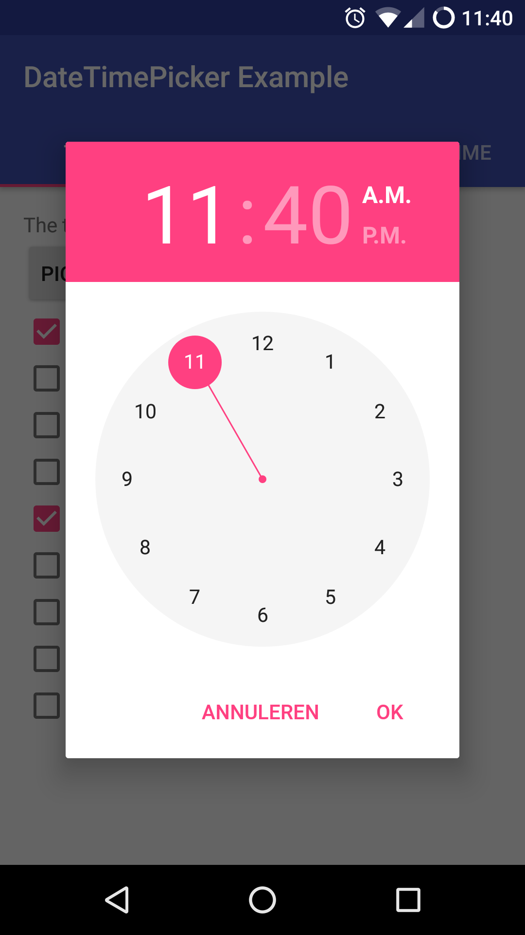
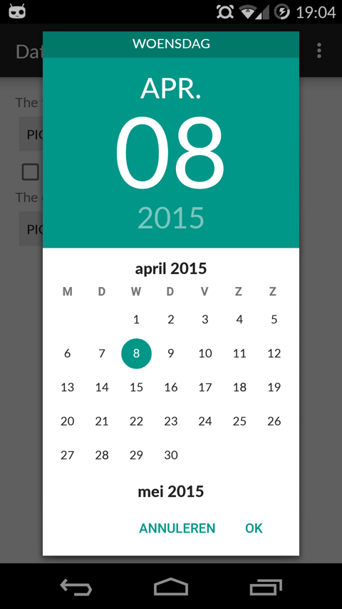
Version 2 Layout
Date Picker | Time Picker
--- | ---
 |
| 
Version 1 Layout
Date Picker | Time Picker
---- | ----
 |
| 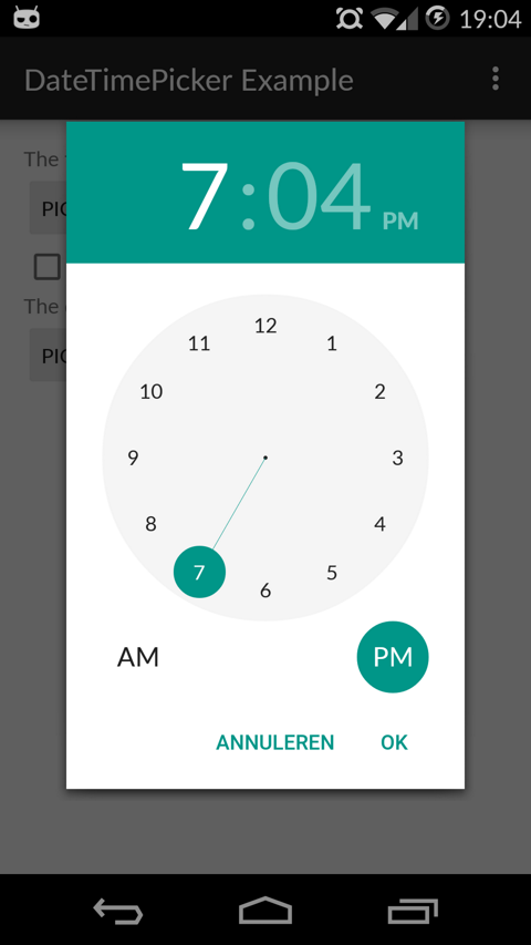
Table of Contents
- Setup
- Using Material Date/Time Pickers
- Implement Listeners
- Create Pickers
- Theme the Pickers
- Additional Options
- FAQ
- Potential Improvements
- License
Setup
The easiest way to add the Material DateTime Picker library to your project is by adding it as a dependency to your build.gradle
dependencies {
    implementation 'com.wdullaer:materialdatetimepicker:4.2.3'
}
You may also add the library as an Android Library to your project. All the library files live in library.
The library also uses some Java 8 features, which Android Studio will need to transpile. This requires the following stanza in your app's build.gradle.
See https://developer.android.com/studio/write/java8-support.html for more information on Java 8 support in Android.
android {
  ...
  // Configure only for each module that uses Java 8
  // language features (either in its source code or
  // through dependencies).
  compileOptions {
    sourceCompatibility JavaVersion.VERSION_1_8
    targetCompatibility JavaVersion.VERSION_1_8
  }
}
Using Material Date/Time Pickers
The library follows the same API as other pickers in the Android framework. For a basic implementation, you'll need to
- Implement an
OnTimeSetListener/OnDateSetListener - Create a
TimePickerDialog/DatePickerDialogusing the supplied factory - Theme the pickers
Implement an OnTimeSetListener/OnDateSetListener
In order to receive the date or time set in the picker, you will need to implement the OnTimeSetListener or
OnDateSetListener interfaces. Typically this will be the Activity or Fragment that creates the Pickers. The callbacks use the same API as the standard Android pickers.
@Override
public void onTimeSet(RadialPickerLayout view, int hourOfDay, int minute, int second) {
  String time = "You picked the following time: "+hourOfDay+"h"+minute+"m"+second;
  timeTextView.setText(time);
}

@Override
public void onDateSet(DatePickerDialog view, int year, int monthOfYear, int dayOfMonth) {
  String date = "You picked the following date: "+dayOfMonth+"/"+(monthOfYear+1)+"/"+year;
  dateTextView.setText(date);
}
Create a TimePickerDialog/DatePickerDialog using the supplied factory
You will need to create a new instance of TimePickerDialog or DatePickerDialog using the static newInstance() method, supplying proper default values and a callback. Once the dialogs are configured, you can call show().
Calendar now = Calendar.getInstance();
DatePickerDialog dpd = DatePickerDialog.newInstance(
  MainActivity.this,
  now.get(Calendar.YEAR), // Initial year selection
  now.get(Calendar.MONTH), // Initial month selection
  now.get(Calendar.DAY_OF_MONTH) // Inital day selection
);
// If you're calling this from a support Fragment
dpd.show(getFragmentManager(), "Datepickerdialog");
// If you're calling this from an AppCompatActivity
// dpd.show(getSupportFragmentManager(), "Datepickerdialog");
Theme the pickers
The library contains 2 layout versions for each picker.
- Version 1: this is the original layout. It is based on the layout google used in the kitkat and early material design era
- Version 2: this layout is based on the guidelines google posted when launching android marshmallow. This is the default and still the most current design.
You can set the layout version using the factory
dpd.setVersion(DatePickerDialog.Version.VERSION_2);
The pickers will be themed automatically based on the current theme where they are created, based on the current colorAccent. You can also theme the dialogs via the setAccentColor(int color) method. Alternatively, you can theme the pickers by overwriting the color resources mdtp_accent_color and mdtp_accent_color_dark in your project.
<color name="mdtp_accent_color">#009688</color>
<color name="mdtp_accent_color_dark">#00796b</color>
The exact order in which colors are selected is as follows:
setAccentColor(int color)in java codeandroid.R.attr.colorAccent(if android 5.0+)R.attr.colorAccent(eg. when using AppCompat)R.color.mdtp_accent_colorandR.color.mdtp_accent_color_darkif none of the others are set in your project
The pickers also have a dark theme. This can be specified globablly using the mdtp_theme_dark attribute in your theme or the setThemeDark(boolean themeDark) functions. The function calls overwrite the XML setting.
<item name="mdtp_theme_dark">true</item>
Additional Options
[All] setThemeDark(boolean themeDark)
The dialogs have a dark theme that can be set by calling
dialog.setThemeDark(true);
[All] setAccentColor(String color) and setAccentColor(int color)
Set the accentColor to be used by the Dialog. The String version parses the color out using Color.parseColor(). The int version requires a ColorInt bytestring. It will explicitly set the color to fully opaque.
[All] setOkColor() and setCancelColor()
Set the text color for the OK or Cancel button. Behaves similar to setAccentColor()
[TimePickerDialog] setTitle(String title)
Shows a title at the top of the TimePickerDialog
[DatePickerDialog] setTitle(String title)
Shows a title at the top of the DatePickerDialog instead of the day of the week
[All] setOkText() and setCancelText()
Set a custom text for the dialog Ok and Cancel labels. Can take a resourceId of a String. Works in both the DatePickerDialog and TimePickerDialog
[DatePickerDialog] setMinDate(Calendar day)
Set the minimum valid date to be selected. Date values before this date will be deactivated
[DatePickerDialog] setMaxDate(Calendar day)
Set the maximum valid date to be selected. Date values after this date will be deactivated
[TimePickerDialog] setMinTime(Timepoint time)
Set the minimum valid time to be selected. Time values earlier in the day will be deactivated
[TimePickerDialog] setMaxTime(Timepoint time)
Set the maximum valid time to be selected. Time values later in the day will be deactivated
[TimePickerDialog] setSelectableTimes(Timepoint[] times)
You can pass in an array of Timepoints. These values are the only valid selections in the picker. setMinTime(Timepoint time), setMaxTime(Timepoint time) and setDisabledTimes(Timepoint[] times) will further trim this list down. Try to specify Timepoints only up to the resolution of your picker (i.e. do not add seconds if the resolution of the picker is minutes).
[TimePickerDialog] setDisabledTimes(Timepoint[] times)
You can pass in an array of Timepoints. These values will not be available for selection. These take precedence over setSelectableTimes and setTimeInterval. Be careful when using this without selectableTimes: rounding to a valid Timepoint is a very expensive operation if a lot of consecutive Timepoints are disabled. Try to specify Timepoints only up to the resolution of your picker (i.e. do not add seconds if the resolution of the picker is minutes).
[TimePickerDialog] setTimeInterval(int hourInterval, int minuteInterval, int secondInterval)
Set the interval for selectable times in the TimePickerDialog. This is a convenience wrapper around setSelectableTimes. The interval for all three time components can be set independently. If you are not using the seconds / minutes picker, set the respective item to 60 for better performance.
[TimePickerDialog] setTimepointLimiter(TimepointLimiter limiter)
Pass in a custom implementation of TimeLimiter
Disables setSelectableTimes, setDisabledTimes, setTimeInterval, setMinTime and setMaxTime
[DatePickerDialog] setSelectableDays(Calendar[] days)
You can pass a Calendar[] to the DatePickerDialog. The values in this list are the only acceptable dates for the picker. It takes precedence over setMinDate(Calendar day) and setMaxDate(Calendar day)
[DatePickerDialog] setDisabledDays(Calendar[] days)
The values in this Calendar[] are explicitly disabled (not selectable
Related Skills
diffs
338.0kUse the diffs tool to produce real, shareable diffs (viewer URL, file artifact, or both) instead of manual edit summaries.
clearshot
Structured screenshot analysis for UI implementation and critique. Analyzes every UI screenshot with a 5×5 spatial grid, full element inventory, and design system extraction — facts and taste together, every time. Escalates to full implementation blueprint when building. Trigger on any digital interface image file (png, jpg, gif, webp — websites, apps, dashboards, mockups, wireframes) or commands like 'analyse this screenshot,' 'rebuild this,' 'match this design,' 'clone this.' Skip for non-UI images (photos, memes, charts) unless the user explicitly wants to build a UI from them. Does NOT trigger on HTML source code, CSS, SVGs, or any code pasted as text.
openpencil
1.8kThe world's first open-source AI-native vector design tool and the first to feature concurrent Agent Teams. Design-as-Code. Turn prompts into UI directly on the live canvas. A modern alternative to Pencil.
ui-ux-designer
Use this agent when you need to design, implement, or improve user interface components and user experience flows. Examples include: creating new pages or components, improving existing UI layouts, implementing responsive designs, optimizing user interactions, building forms or dashboards, analyzing existing UI through browser snapshots, or when you need to ensure UI components follow design system standards and shadcn/ui best practices.\n\n<example>\nContext: User needs to create a new dashboard page for team management.\nuser: "I need to create a team management dashboard where users can view team members, invite new members, and manage roles"\nassistant: "I'll use the ui-ux-designer agent to design and implement this dashboard with proper UX considerations, using shadcn/ui components and our design system tokens."\n</example>\n\n<example>\nContext: User wants to improve the user experience of an existing form.\nuser: "The signup form feels clunky and users are dropping off. Can you improve it?"\nassistant: "Let me use the ui-ux-designer agent to analyze the current form UX and implement improvements using our design system and shadcn/ui components."\n</example>\n\n<example>\nContext: User wants to evaluate and improve existing UI.\nuser: "Can you take a look at our pricing page and see how we can make it more appealing and user-friendly?"\nassistant: "I'll use the ui-ux-designer agent to take a snapshot of the current pricing page, analyze the UX against Notion-inspired design principles, and implement improvements using our design tokens."\n</example>
