
framesmith
Open-source MCP server that gives AI assistants a visual design canvas, rendering HTML/CSS scene graphs to PNG via headless Chromium.
Install / Use
claude mcp add vicmaster -- npx -y github:vicmaster/framesmithIf the server publishes to npm under a different name, use that package instead — check the repo README.
MCP Server
Model Context Protocol server
Quality Score
Category
DesignSupported Platforms
Skill content
View source on GitHubframesmith



An open-source MCP server that turns your AI coding agent into a capable UI designer. It gives the agent a visual canvas, a library of vetted design patterns, and a quality bar it must clear before showing you anything — so you review a real, non-slop design in the browser and agree on it before any framework code is written.
Contents: What it does · Capabilities · Viewer · Installation · Tools · Usage Example · Workflow · Development
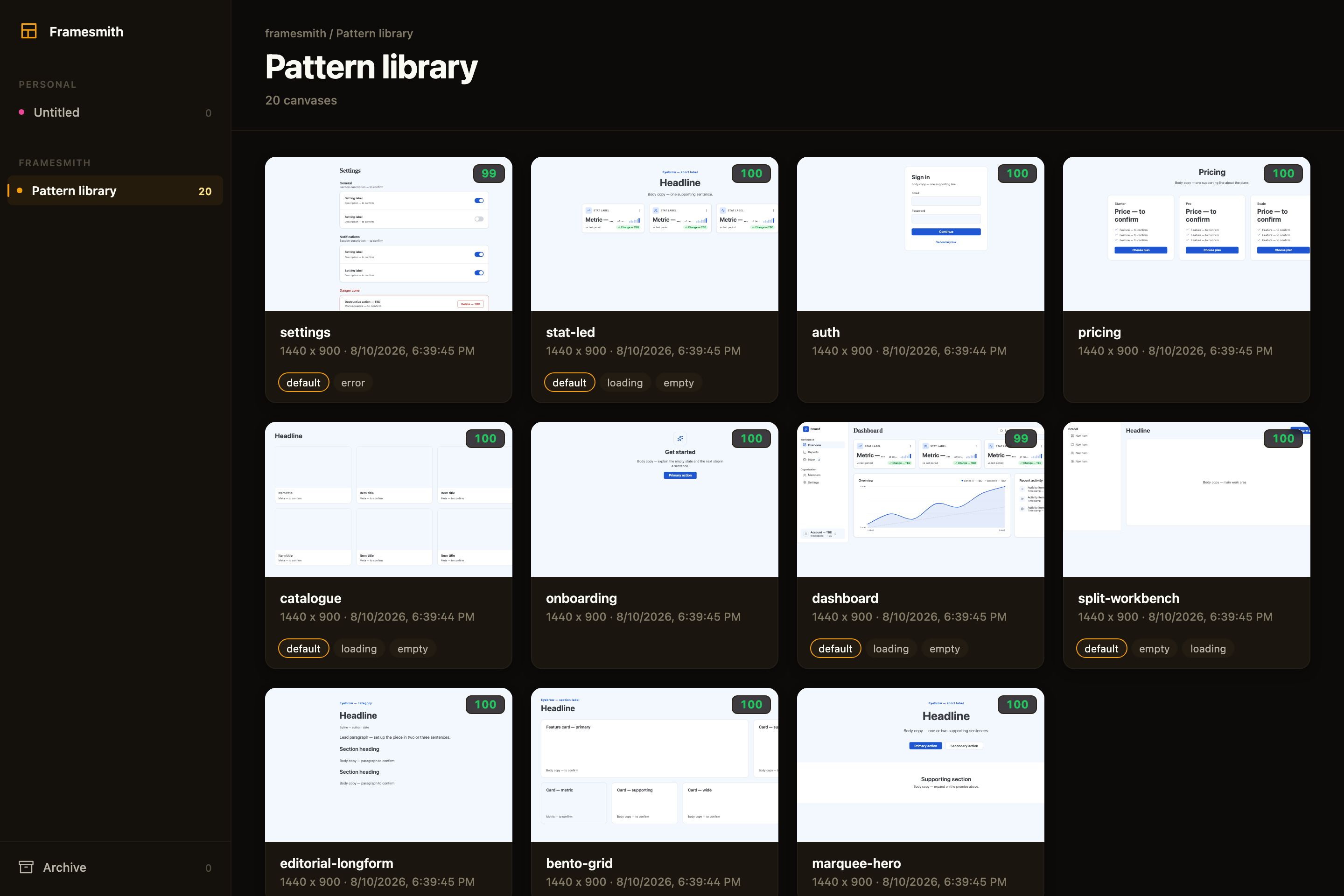
Above: the framesmith viewer, showing the built-in pattern library — 11 vetted page archetypes an agent starts from, each carrying its live quality score and its designed state variants. Workspaces and projects sit in the sidebar; you browse canvases like design files.
What an agent actually ships
Both screens below were built end-to-end by an agent with framesmith's own vocabulary — one generate_design_system call each (a seed color + a personality), stamped patterns, data-bound charts, and every quality gate cleared (score ≥ 95, states designed, stress-tested, both themes):
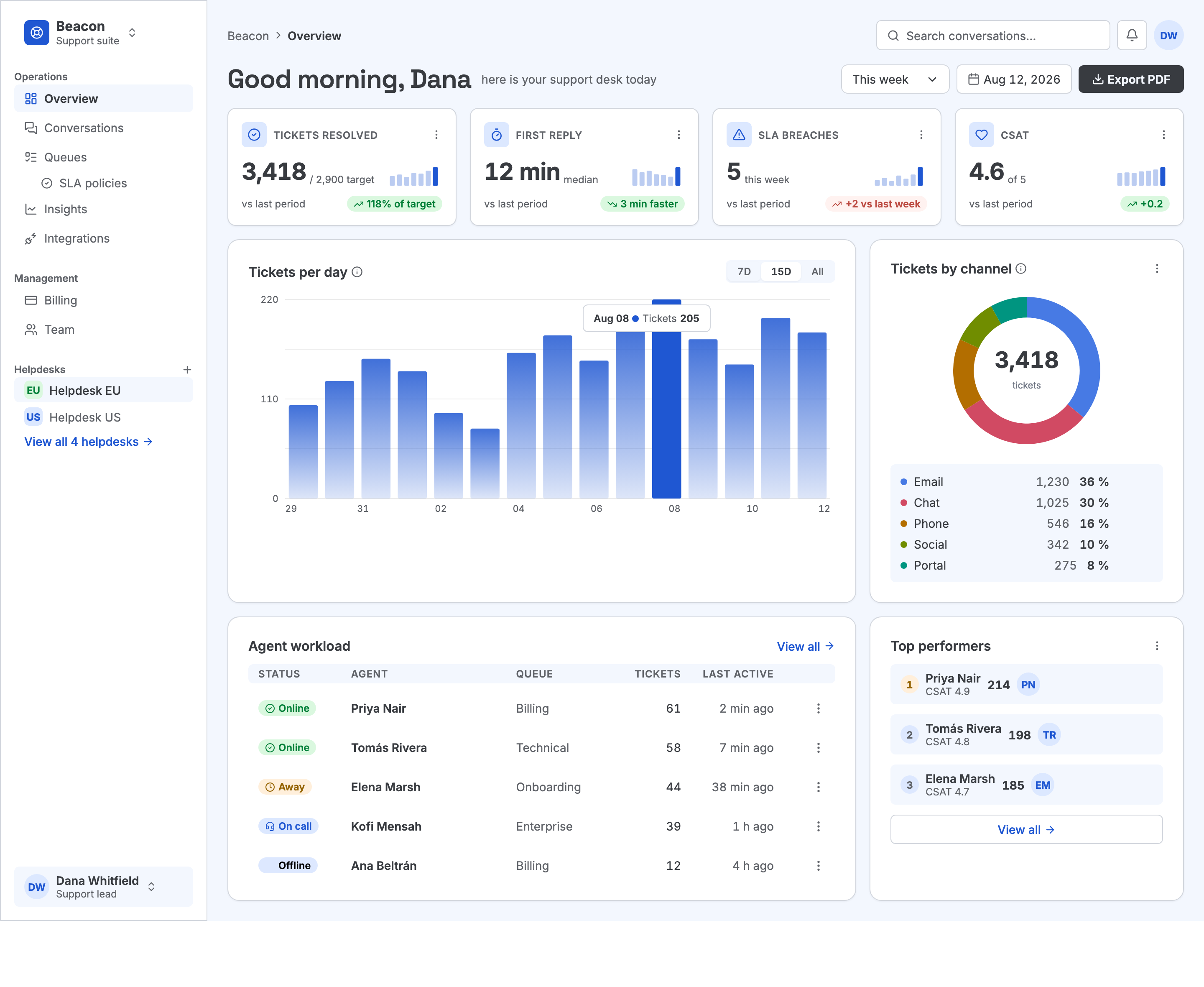
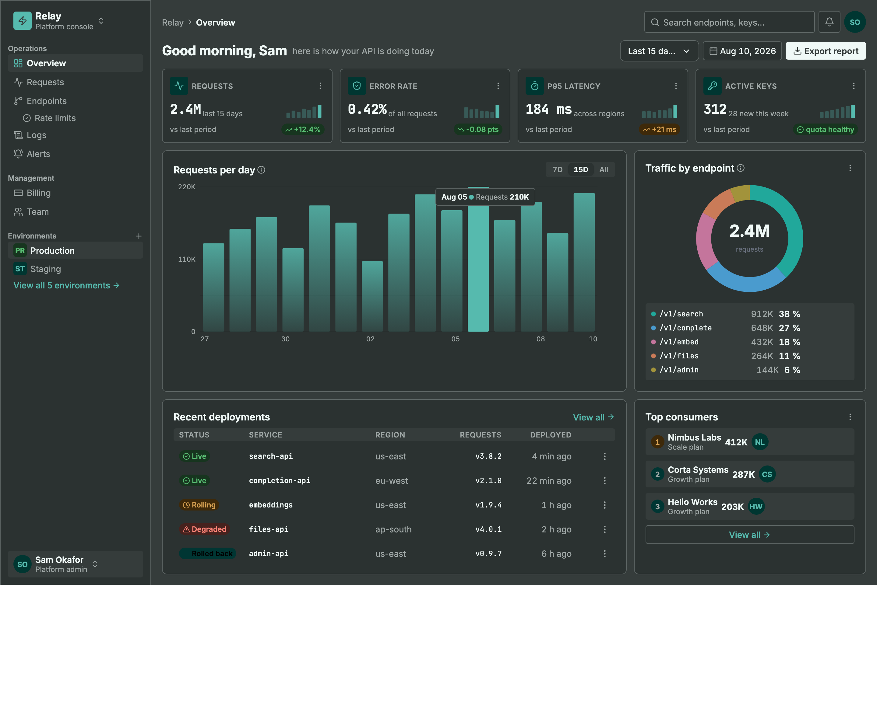
Same machinery, different seed + personality: a light ops dashboard and a dark API console. Every color pair is AA by construction, every chart is data-bound (edit a value, not an SVG path), and the dark theme is generated — not inverted.
MCP Client → stdio → framesmith server
                        ↓
              Scene Graph (in-memory JSON tree)
                        ↓
              HTML/CSS Renderer (inline styles)
                        ↓
              Puppeteer (headless Chromium → PNG)
What framesmith does
Left to itself, an AI agent tends to produce UI that looks AI-generated — generic spacing, no icons, a purple gradient by default, placeholder text that reads like placeholder text. framesmith closes that gap by moving design before code and holding it to a bar:
- Start from taste, not a blank canvas. The agent stamps one of 11 vetted page patterns (dashboard, auth, pricing, settings, onboarding, and more) — each regression-tested to score > 95 with zero cliché tells across every theme, and every structure (page and component alike) built entirely from type-role tokens so it re-voices under a generated design system instead of injecting stray pixel sizes, and hardened to survive hostile-length content (
canvas_stressCLEAN) — then adapts it. A blank canvas is where slop comes from; a pattern is a non-slop starting point. (list_structures/apply_structure) - Use the whole toolkit — like a real UI does. Real icons (Lucide + Material Symbols), fonts resolved by name, real input controls (
toggle/checkbox/radio/select), data-driven charts (line/bar/donut/sparkline, multi-series, bar emphasis), reusable components, and layered design tokens — never faked with Unicode glyphs, stray ellipses, or hand-drawn SVG paths standing in for a chart. - Evaluate, then self-correct.
canvas_evaluatescores the design across five craft categories plus a cliché-tell detector, a state-coverage check (a data screen without designed empty/loading states isn't done), and a usability layer (hit-target floor, label association, honest action copy), and returns aREADY/NOT READYdirective. The agent resolves every warning and tell and only presents once it'sREADY— polishing to the bar is the agent's job, not yours. - Review in the browser, own the output. You browse canvases like design files, with a live quality inspector and design-system panel. Designs persist as open JSON checked into your repo — no proprietary format, no lock-in — and can be re-imported from shipped HTML to keep the design honest.
Capabilities at a glance
| Area | What you get |
|------|--------------|
| Rendering | Scene graph → HTML/CSS → Puppeteer PNG · responsive breakpoints · real CSS grid (layout: "grid" + spans) for bento/editorial compositions · gradients, shadows, blur, glassmorphism · SVG paths · animations · data-driven charts (line/bar/donut/sparkline, multi-series, bar emphasis + in-SVG gradients) |
| Pattern library | 11 vetted page archetypes + 5 component scaffolds, all scoring > 95 with zero cliché tells, typography built from type-role tokens (not literal pixel sizes), and stress-hardened to survive hostile-length content; taxonomy axes + a diversification signal so successive screens vary |
| Quality & taste | canvas_evaluate (8 categories incl. cliché tells, state coverage + usability floors) with a READY/NOT READY directive · canvas_autofix (mechanical fixes) · optional vision-model rubric critique + canvas_revise · canvas_add_variant clones a screen into a linked empty/loading/error state · canvas_stress content-perturbation testing (long text, i18n, big numbers, empty/many rows) · project_evaluate rolls up a project's screens for cross-screen consistency (radius/accent drift, token adoption, hand-copied chrome, state coverage) plus an optional multi-screen flow critique — advisory, never a gate |
| Design systems | generate_design_system: one seed + one personality (technical / editorial / soft / data-dense) → the complete design language — colors, curated font pairing, typography roles, radius/density stances, $elevation depth tokens (dark-aware), $motion defaults · layered $tokens (workspace ▸ project ▸ canvas) · style presets · DESIGN.md import · generate_scale derives a modular type + spacing scale from a named ratio (optional fluid clamp() sizes) · generate_color_system turns one seed color into OKLCH ramps + AA-checked semantic tokens, a categorical chart palette, and a tint layer for chips/tiles/badges, dark theme included · dual-theme rendering + evaluation (theme: "dark" on screenshot/export, both-theme contrast in canvas_evaluate with APCA advisory) · token-detachment lint re-attaches literals that drift from a token |
| Primitives | Lucide + Material Symbols icons · Google Fonts by name · real form controls · components with instance overrides — create_component promotes existing work, copy_nodes carries subtrees (and their component defs) across canvases |
| Import from code | canvas_import_html / canvas_import_url — token-mapped, structure-reconstructed · canvas_sync_from_url pixel drift · canvas_check_drift structural drift · framesmith verify / check-drift CLI for CI/pre-commit gates, no MCP client needed |
| Viewer | Browser gallery + detail view · quality inspector (score, issues, click-to-highlight) · design-system token panel · point-and-tell feedback (Comment mode + Feedback tab) |
| Open by design | MIT · plain HTML/CSS · open JSON you own in your repo · content-hash versioning (canvas_version) so approvals reference an exact design, not just a name · works with any MCP-compatible client |
Viewer
Run npx -p framesmith framesmith-viewer to start the standalone browser viewer (default port 3001). Open any canvas to review it at multiple breakpoints, compare them side-by-side, inspect the underlying JSON, or archive / delete.
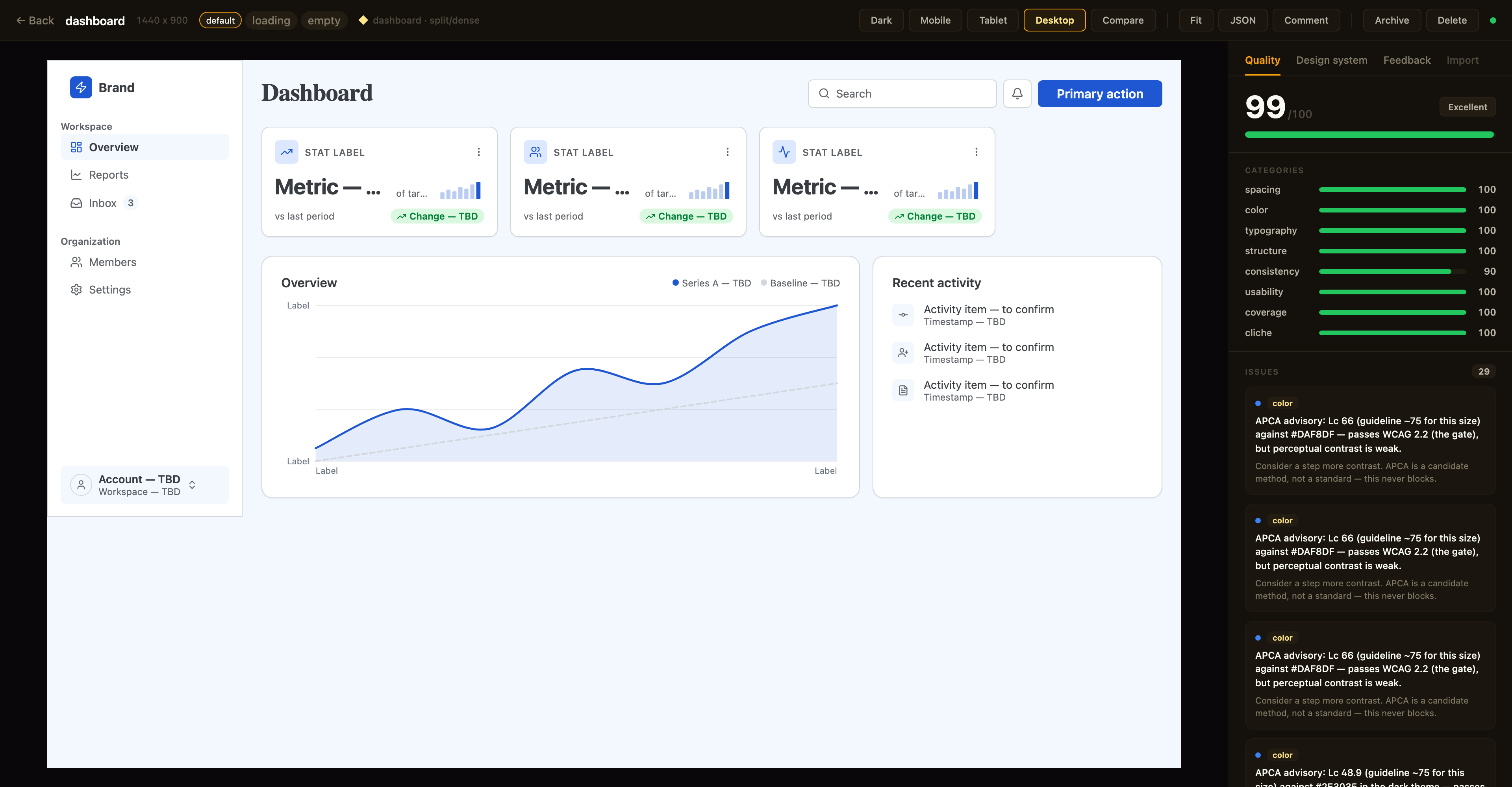
Above: a canvas in the detail view with the Quality inspector on the right — the same
canvas_evaluatescore the agent sees, with per-category bars and the issue list; the tabs along the top switch to the Design-system and Feedback panels. The toolbar exposes breakpoint previews, Compare, Fit, JSON, a Comment toggle for point-and-tell feedback, and lifecycle actions.
Quality panel. The canvas detail view shows a read-only quality inspector on the right: the heuristic canvas_evaluate score (0–100), per-category bars, and the issue list — each cliché tell with its category · tell badge, severity, and suggestion. Issues that canvas_autofix can resolve carry an auto-fixable tag, and clicking any issue highlights its node in the live preview. Every gallery card also shows a color-coded score badge so weak canvases stand out at a glance. The score matches what your agent sees over MCP (same fast-mode evaluation, genre-relaxed by the canvas's preset) — it's computed for display only and never written back.
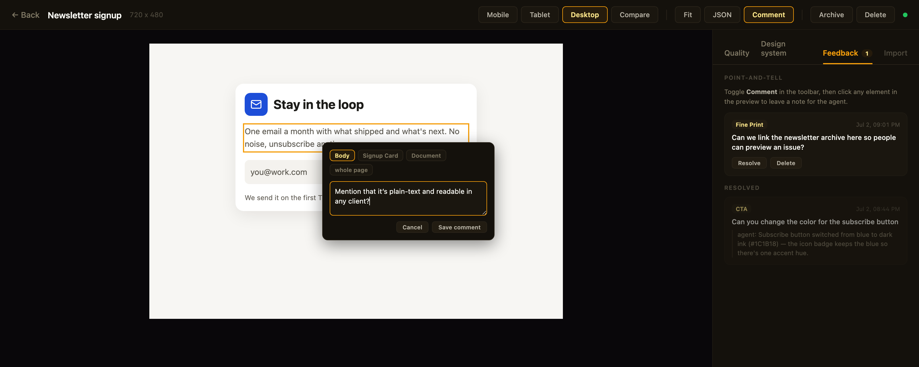
Above: point-and-tell in action — Comment mode is on, the clicked element is outlined, the popover's breadcrumb re-scopes the anchor, and the Feedback tab tracks open comments plus the agent's replies to resolved ones.
Feedback panel. Point-and-tell: toggle Comment in the toolbar and click any element in the preview to leave a note for the agent — a breadcrumb in the popover re-scopes the anchor from the exact element up to its card, section, or the whole page. The Feedback tab lists open comment
Truncated for display — read the full file on GitHub.
Related Skills
momen-cursurrules-prompt-file
40.6kCursor rules for building custom frontends with Momen.app as headless BaaS with GraphQL API, actionflows, AI agents, and Stripe integration.
semiotic-react-dataviz-cursorrules-prompt-file
40.6kCursor rules for Semiotic data visualization library with 30+ chart types, MCP server, and AI-assisted chart generation.
Agent-Reach
74.3kGive your AI agent eyes to see the entire internet. Read & search Twitter, Reddit, YouTube, GitHub, Bilibili, XiaoHongShu — one CLI, zero API fees.
ruflo
68.9k🌊 The original agent meta-harness. Deploy intelligent multi-player swarms, coordinate autonomous workflows, and build conversational AI systems. Features adaptive memory, self-learning intelligence, RAG integration, and native Claude Code / Codex / Hermes and many more Integrated
