CalendarPicker
CalendarPicker Component for React Native
Install / Use
/learn @stephy/CalendarPickerREADME
react-native-calendar-picker


This is a Calendar Picker Component for React Native
Breaking changes in 8.x - replaced moment with date-fns
We've migrated away from moment.js, in favor of date-fns, a modular and lightweight alternative. Users wanting to continue to use Moment should stick with 7.x
Prerequisites
CalendarPicker requires date-fns >=3.0. Date props may be anything parseable by the Javascript Date object, such as a Javascript Date, or ISO8601 datetime string.
npm install --save date-fns
Scrollable CalendarPicker — New in 7.x
The scrollable prop was introduced in 7.0.0 and features a bi-directional infinite scroller. It recycles months using RecyclerListView, shifting them as the ends are reached. If the Chrome debugger is used during development, month shifting may be erratic due to a RN setTimeout bug. To prevent month shifts at the ends of the scroller, set restrictMonthNavigation, minDate, and maxDate range to 5 years or less.
To use the calendar you just need to:
npm install --save react-native-calendar-picker
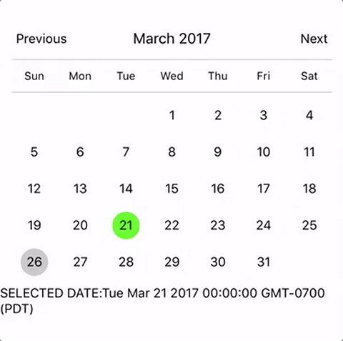
Example
import React, { Component } from "react";
import { StyleSheet, Text, View } from "react-native";
import CalendarPicker from "react-native-calendar-picker";

export default class App extends Component {
  constructor(props) {
    super(props);
    this.state = {
      selectedStartDate: null,
    };
    this.onDateChange = this.onDateChange.bind(this);
  }

  onDateChange(date) {
    this.setState({
      selectedStartDate: date,
    });
  }
  render() {
    const { selectedStartDate } = this.state;
    const startDate = selectedStartDate ? selectedStartDate.toString() : "";
    return (
      <View style={styles.container}>
        <CalendarPicker onDateChange={this.onDateChange} />

        <View>
          <Text>SELECTED DATE:{startDate}</Text>
        </View>
      </View>
    );
  }
}

const styles = StyleSheet.create({
  container: {
    flex: 1,
    backgroundColor: "#FFFFFF",
    marginTop: 100,
  },
});
CalendarPicker Props
| Prop | Type | Description |
| :----------------------------------- | :--------------------------- | :------------------------------------------------------------------------------------------------------------------------------------------------------------------------------------------------------------------------------------------------------------------------------------------------------------------------------------------------------- |
| weekdays | Array | Optional. List of week days. Eg. ['Mon', 'Tue', ...] Must be 7 days |
| months | Array | Optional. List of months names. Eg. ['Jan', 'Feb', ...] Must be 12 months |
| firstDay | Number | Optional. Default first day of week will be Sunday. You can set start of week with number from 0 to 6. Default is 0 or Sunday |
| startFromMonday | Boolean | Optional. Default first day of week will be Sunday. You can set start of week from Monday by setting this to true. Default is false |
| showDayStragglers | Boolean | Optional. Populate previous & next month days in empty slots. Default is false |
| allowRangeSelection | Boolean | Optional. Allow to select date ranges. Default is false |
| allowBackwardRangeSelect | Boolean | Optional. Allow selecting range in reverse. Default is false |
| previousTitle | String | Optional. Title of button for previous month. Default is Previous |
| nextTitle | String | Optional. Title of button for next month. Default is Next |
| previousTitleStyle | TextStyle | Optional. Text styling for Previous text. |
| nextTitleStyle | TextStyle | Optional. Text styling for Next text. |
| previousComponent | Object | Optional. Component to use in Previous button. Overrides previousTitle & previousTitleStyle. |
| nextComponent | Object | Optional. Component to use in Next button. Overrides nextTitle & nextTitleStyle. |
| selectedDayColor | String | Optional. Color for selected day |
| selectedDayStyle | ViewStyle | Optional. Style for selected day. May override selectedDayColor. |
| selectedDayTextColor | String | Optional. Text color for selected day
Related Skills
node-connect
347.0kDiagnose OpenClaw node connection and pairing failures for Android, iOS, and macOS companion apps
frontend-design
107.8kCreate distinctive, production-grade frontend interfaces with high design quality. Use this skill when the user asks to build web components, pages, or applications. Generates creative, polished code that avoids generic AI aesthetics.
openai-whisper-api
347.0kTranscribe audio via OpenAI Audio Transcriptions API (Whisper).
qqbot-media
347.0kQQBot 富媒体收发能力。使用 <qqmedia> 标签,系统根据文件扩展名自动识别类型(图片/语音/视频/文件)。
