Pickr
🎨 Pickr - A simple, multi-themed, responsive and hackable Color-Picker library. No dependencies, no jQuery. Compatible with all CSS Frameworks e.g. Bootstrap, Materialize. Supports alpha channel, rgba, hsla, hsva and more!
Install / Use
/learn @simonwep/PickrREADME
Features
- 🎨 Themes
- 🔄 Simple usage
- 🚫 Zero dependencies
- 🌈 Multiple color representations
- 🔍 Color comparison
- 🎚️ Opacity control
- 🖱️ Detail adjustments via mouse-wheel
- 📱 Responsive and auto-positioning
- 👆 Supports touch devices
- 🎨 Swatches for quick-selection
- ♿ Fully accessible and i18n
- 🌑 Shadow-dom support
Status of this project
[!IMPORTANT] This project might continue to get important security- and bug-related updates but its feature set is frozen, and it's highly unlikely that it'll get new features or enhancements.
The reason behind this decision is the way this tool has been build (monolithic, the core is one single file, everything is in plain JS etc.) which makes it incredible hard to maintain, tests become impossible at this stage without a complete rewrite, and the fun is gone at such a level of cramped complexity.
Personally I recommend building these UI-Related "widgets" directly into the app with the framework you're using which takes more time but in return gives you full power of how it should work and look like. Frameworks such as (p)react, vue and svelte will make it a breeze to develop such things within a day.
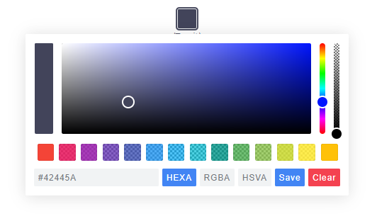
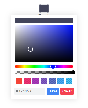
Themes
|Classic|Monolith|Nano|
|-------|--------|----|
| |
| |
| |
|
Nano uses css-grid thus it won't work in older browsers.
Getting Started
Node
Note: The readme is always up-to-date with the latest commit. See Releases for installation instructions regarding to the latest version.
Install via npm:
$ npm install @simonwep/pickr
Install via yarn:
$ yarn add @simonwep/pickr
Include code and style:
// One of the following themes
import '@simonwep/pickr/dist/themes/classic.min.css';   // 'classic' theme
import '@simonwep/pickr/dist/themes/monolith.min.css';  // 'monolith' theme
import '@simonwep/pickr/dist/themes/nano.min.css';      // 'nano' theme

// Modern or es5 bundle (pay attention to the note below!)
import Pickr from '@simonwep/pickr';
import Pickr from '@simonwep/pickr/dist/pickr.es5.min';
Attention: The es5-bundle (e.g. legacy version) is quite big (around a triple of the modern bundle). Please take into consideration to use the modern version and add polyfills later to your final bundle! (Or better: give a hint to users that they should use the latest browsers). Browsers such as IE are not supported (at least not officially).
Browser
jsdelivr:
<!-- One of the following themes -->
<link rel="stylesheet" href="https://cdn.jsdelivr.net/npm/@simonwep/pickr/dist/themes/classic.min.css"/> <!-- 'classic' theme -->
<link rel="stylesheet" href="https://cdn.jsdelivr.net/npm/@simonwep/pickr/dist/themes/monolith.min.css"/> <!-- 'monolith' theme -->
<link rel="stylesheet" href="https://cdn.jsdelivr.net/npm/@simonwep/pickr/dist/themes/nano.min.css"/> <!-- 'nano' theme -->

<!-- Modern or es5 bundle -->
<script src="https://cdn.jsdelivr.net/npm/@simonwep/pickr/dist/pickr.min.js"></script>
<script src="https://cdn.jsdelivr.net/npm/@simonwep/pickr/dist/pickr.es5.min.js"></script>
Be sure to load the pickr.min.js (or the es5 version) after pickr.min.css. Moreover the script tag doesn't work with the defer attribute.
Usage
// Simple example, see optional options for more configuration.
const pickr = Pickr.create({
    el: '.color-picker',
    theme: 'classic', // or 'monolith', or 'nano'

    swatches: [
        'rgba(244, 67, 54, 1)',
        'rgba(233, 30, 99, 0.95)',
        'rgba(156, 39, 176, 0.9)',
        'rgba(103, 58, 183, 0.85)',
        'rgba(63, 81, 181, 0.8)',
        'rgba(33, 150, 243, 0.75)',
        'rgba(3, 169, 244, 0.7)',
        'rgba(0, 188, 212, 0.7)',
        'rgba(0, 150, 136, 0.75)',
        'rgba(76, 175, 80, 0.8)',
        'rgba(139, 195, 74, 0.85)',
        'rgba(205, 220, 57, 0.9)',
        'rgba(255, 235, 59, 0.95)',
        'rgba(255, 193, 7, 1)'
    ],

    components: {

        // Main components
        preview: true,
        opacity: true,
        hue: true,

        // Input / output Options
        interaction: {
            hex: true,
            rgba: true,
            hsla: true,
            hsva: true,
            cmyk: true,
            input: true,
            clear: true,
            save: true
        }
    }
});
You can find more examples here.
Events
Since version 0.4.x Pickr is event-driven. Use the on(event, cb) and off(event, cb) functions to bind / unbind eventlistener.
| Event | Description | Arguments |
| -------------- | ----------- | --------- |
| init | Initialization done - pickr can be used | PickrInstance |
| hide | Pickr got closed | PickrInstance |
| show | Pickr got opened | HSVaColorObject, PickrInstance |
| save | User clicked the save / clear button. Also fired on clear with null as color. | HSVaColorObject or null, PickrInstance |
| clear | User cleared the color. | PickrInstance |
| change | Color has changed (but not saved). Also fired on swatchselect | HSVaColorObject, eventSource, PickrInstance |
| changestop | User stopped to change the color | eventSource, PickrInstance |
| cancel | User clicked the cancel button (return to previous color). | PickrInstance |
| swatchselect | User clicked one of the swatches | HSVaColorObject, PickrInstance |
Example:
pickr.on('init', instance => {
    console.log('Event: "init"', instance);
}).on('hide', instance => {
    console.log('Event: "hide"', instance);
}).on('show', (color, instance) => {
    console.log('Event: "show"', color, instance);
}).on('save', (color, instance) => {
    console.log('Event: "save"', color, instance);
}).on('clear', instance => {
    console.log('Event: "clear"', instance);
}).on('change', (color, source, instance) => {
    console.log('Event: "change"', color, source, instance);
}).on('changestop', (source, instance) => {
    console.log('Event: "changestop"', source, instance);
}).on('cancel', instance => {
    console.log('Event: "cancel"', instance);
}).on('swatchselect', (color, instance) => {
    console.log('Event: "swatchselect"', color, instance);
});
Where source can be
slider- Any slider in the UI.input- The user input field.swatch- One of the swatches.
Options
const pickr = new Pickr({

    // Selector or element which will be replaced with the actual color-picker.
    // Can be a HTMLElement.
    el: '.color-picker',

    // Where the pickr-app should be added as child.
    container: 'body',

    // Which theme you want to use. Can be 'classic', 'monolith' or 'nano'
    theme: 'classic',

    // Nested scrolling is currently not supported and as this would be really sophisticated to add this
    // it's easier to set this to true which will hide pickr if the user scrolls the area behind it.
    closeOnScroll: false,

    // Custom class which gets added to the pcr-app. Can be used to apply custom styles.
    appClass: 'custom-class',

    // Don't replace 'el' Element with the pickr-button, instead use 'el' as a button.
    // If true, appendToBody will also be automatically true.
    useAsButton: false,

    // Size of gap between pickr (widget) and the corresponding reference (button) in px
    padding: 8,

    // If true pickr won't be floating, and instead will append after the in el resolved element.
    // It's possible to hide it via .hide() anyway.
    inline: false,

    // If true, pickr will be repositioned automatically on page scroll or window resize.
    // Can be set to false to make custom positi
Related Skills
openhue
332.0kControl Philips Hue lights and scenes via the OpenHue CLI.
sag
332.0kElevenLabs text-to-speech with mac-style say UX.
weather
332.0kGet current weather and forecasts via wttr.in or Open-Meteo
tweakcc
1.4kCustomize Claude Code's system prompts, create custom toolsets, input pattern highlighters, themes/thinking verbs/spinners, customize input box & user message styling, support AGENTS.md, unlock private/unreleased features, and much more. Supports both native/npm installs on all platforms.
