Puyopuyo
A reactive and declarative layout library for UIKit written in swift.
Install / Use
/learn @scubers/PuyopuyoREADME
Puyopuyo


Introduce:
Youtube: https://youtu.be/3MOBCtIfRFA
Bilibili: https://www.bilibili.com/video/BV1Kh411J7vJ
Communicate:
Telegram: https://t.me/swift_puyopuyo
QQ: 830599565
Description
A declaretive layout library for UIKit base on data driven written in swift.
Requirements
swift 5.1
Installation
pod 'Puyopuyo'
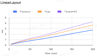
Layout cost
LinearLayout | - |5|10|30|50|80|100|120|150|180|200 |--|--|--|--|--|--|--|--|--|--|--| Puyopuyo|0.133|0.2081|0.5259|0.7739|1.141|1.3921|1.6517|2.0799|2.4759|2.7499 Yoga|0.1549|0.272|0.678|1.0211|1.4729|1.8479|2.202|2.7499|3.2939|3.664 TangramKit|0.1859|0.3151|0.7939|1.1901|1.7089|2.1331|2.5599|3.201|3.8499|4.2488 UIStackView|0.5679|0.699|1.7571|2.7871|5.0063|6.901|9.392|13.741|19.3428|23.3399
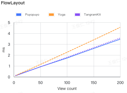
FlowLayout |-|3|5|10|50|80|100|120|150|180|200 |--|--|--|--|--|--|--|--|--|--|--| Puyopuyo|0.1299|0.1292|0.2298|0.9217|1.398|1.7228|2.0749|2.5968|3.1189|3.4549 Yoga|0.1039|0.1449|0.262|1.132|1.8072|2.2501|2.7101|3.39|4.0788|4.549 TangramKit|0.1339|0.123|0.209|0.9109|1.4457|1.7881|2.1469|2.675|3.2138|3.5629
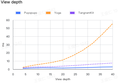
View depth | - |4|8|12|16|20|24|28|32|36|40 |--|--|--|--|--|--|--|--|--|--|--| Puyopuyo|1.0719|1.5108|1.7547|1.6169|1.4448|1.739|2.0349|2.2962|2.671|2.8882 Yoga|2.3851|4.7698|6.6361|8.4819|11.2879|16.4551|23.0069|31.568|42.9677|55.4869 TangramKit|1.7189|2.711|2.932|3.117|3.7751|4.508|5.2759|6.1821|6.8421|7.6298
Usage
A simple cell can be implemented like below. The subviews will be layout by specific rules. The buildin box follow the FlexBox rules.
/**
 VBox            HBox
 |-----------|   |-------------------|
 |Title      |   |Title   Description|
 |           |   |-------------------|
 |Description|
 |-----------|
 */

VBox().attach {
    UILabel().attach($0)
        .text("Title")
        .fontSize(20, weight: .bold)

    UILabel().attach($0)
        .text("Description")
}
.space(20)

// or
/**
VFlow       HFlow
|-------|   |-------|
|0  1  2|   |0  3  6|
|3  4  5|   |1  4  7|
|6  7   |   |2  5   |
|-------|   |-------|
 */
VFlow(count: 3).attach {
    for i in 0..<8 {
        UILabel().attach($0)
            .text(i.description)
    }
}
.space(20)
Library provide three buildin layout
LinearBox, FlowBox, ZBox
BoxView
    |-- ZBox
    |-- LinearBox
        |-- HBox
        |-- VBox
    |-- FlowBox
        |-- HFlow
        |-- VFlow
The core of the layout is the description of View nodes. Measure Regulator
Measure properties
|Property|Description|Value|
|--|--|--|
|margin|Current view's margin| UIEdgeInset, default: .zero|
|alignment|The alignment in superview|.none, .left, .top, .bottom, .vertCenter, .horzCenter, default: .none|
|size|Size description| SizeDescription<br/> .fixed: fixed size<br/> .wrap: wrap contents<br/> .ratio fill up the residual space ratio, .aspectRatio: width / height<br/> default: .wrap, Demo:Size Properties|
|flowEnding|Only works in FlowBox, and the arranceCount = 0, it means that current view is the last view in the row| Bool, default: false |
|activated|If will be calculate by parent box| Bool, default: true|
Regulator & ZBox properties
ZBox extends Regulator
|Property|Description|Value|
|--|--|--|
|justifyContent|Control all subview's alignment, if subview has set an alignment value, will be override by alignment| .left, .top, .bottom, .vertCenter, .horzCenter, default: .none |
|padding|Current box's padding| UIEdgeInset, default: .zero|
LinearRegulator properties
LinearRegulator extends Regulator
|Property|Description|Value|
|--|--|--|
|space|Control the space between subviews | CGFloat, default: 0|
|format|Control the main axis alignment of subviews| .leading, .center, .between, .round, .trailing, default: .leading|
|reverse|If reverse the order from adding| Bool default: false|
FlowRegulator properties
FlowRegulator extends LinearRegulator
|Property|Description|Value|
|--|--|--|
|arrange|Control the arrange count in each row, when arrange = 0, will be separate by contents| Int, default: 0|
|itemSpace|The space between items| CGFloat, default: 0|
|runSpace|The space between rows| CGFloat, default: 0|
|format|The format of the each row| .leading, .center, .between, .round, .trailing, default: .leading|
|runFormat|The format of rows| .leading, .center, .between, .round, .trailing, default: .leading|
|runRowSize|The row size in run direction| (Int) -> SizeDescription, default: .wrap(shrink: 1)|
DataDriven
Library provide a data driven api, to keep your UI always representing the right data. And relayout when something changes.
let text = State("")

VBox().attach {
    UILabel().attach($0)
        .text("Title")

    UILabel().attach($0)
        .text(text)
}

// do when some data come back
text.value = "My Description"

// if you are using RxSwift that would be another good choise
// make `Observable` implements Outputing protocol
extension Observable: Outputing {
    public typealias OutputType = Element
    /// .... some code
}

func getDescription() -> Observable<String> {
    // get some description by network or other async works
}

// use in view declare
UILabel().attach($0)
    .text(getDescription())
PS: The dataDriven api is follow the RxSwift's logic, Be aware of the memory leaks
Animations
UIView has an extension property, is an instance of protocol Animator {}
After BoxView layout, each subview's center, bounds will be assigned, The box will create animation for each view if needed.
PS: If subview has no animation, will use the nearest superview's animation, the superview must be instance of BoxView
public struct ExpandAnimator: Animator {
    public init(duration: TimeInterval = 0.3) {
        self.duration = duration
    }

    public var duration: TimeInterval
    public func animate(_ view: UIView, size: CGSize, center: CGPoint, animations: @escaping () -> Void) {
        let realSize = view.bounds.size
        let realCenter = view.center
        if realSize != size || realCenter != center {
            if realSize == .zero, realCenter == .zero {
                runAsNoneAnimation {
                    view.center = center
                    let scale: CGFloat = 0.5
                    view.bounds.size = CGSize(width: size.width * scale, height: size.height * scale)
                    view.layer.transform = CATransform3DMakeRotation(.pi / 8 + .pi, 0, 0, 1)
                }
            }

            UIView.animate(withDuration: duration, delay: 0, usingSpringWithDamping: 2, initialSpringVelocity: 5, options: [.curveEaseOut, .overrideInheritedOptions, .overrideInheritedDuration], animations: {
                animations()
                if realSize == .zero, realCenter == .zero {
                    view.layer.transform = CATransform3DIdentity
                }
            }, completion: nil)
        } else {
            animations()
        }
    }
}
Demo: Animation
Custom View
Because of the BoxView also a view, feel free to subclassing a Box, to reduce the view's hierarchy
class MyView: VBox {
    override func buildBody() {
        // do your view declare here
    }
}
State and Event
A complex view also need to be provide a data, and create some events, like click. In UIKit, also call DataSource and Delegate
Library provide a code pattern to defind a data and emit events.
class MyView: VBox, Stateful, Eventable {
    // declare your dataSource you need
    struct ViewState {
        var name: String?
        var title: String?
    }
    // declare event that will occured
    enum Event {
        case onConfirmed
    }
    /// declare in Stateful implement by this class
    let state = State(ViewState())
    /// declare in Eventable implement by this class
    let emitter = SimpleIO<Event>()

    override func buildBody() {
        attach {
            UILabel().attach($0)
                .text(state.map(\.name)) // use map to transform value

            UILabel().attach($0)
                .text(binder.title) // use binder dynamic member lookup to find value

            UIButton().attach($0)
                .text("Confirm")
                .bind(event: .touchUpInside, input: emitter.asInput { _ in .onConfirmed })
        }
    }
}

// Use view

let state = State(MyView.ViewState())

MyView().attach($0)
    .state(state) // bind your data source
    .onEvent(Inputs { event in
        // do your logic when event occured
    })
Styles
Demo: Style
// declare style
let styles: [Style] = [
    (\UIView.backgroundColor).getStyle(with: .white),
    TapRippleStyle(),
    (\UILabel.text).getStyle(with: "Click"),
    (\UIView.isUserInteractionEnabled).getStyle(with: true)
]
// Use style
UILabel().attach()
    .styles(styles)
Extension
See Puyo+xxx.swift
You can extension more depende on your needs, expect your contribution
Author
Jrwong, jr-wong@qq.com
License
Puyopuyo is available under the MIT license. See the LICENSE file for more info.
