Carbon
🚴 A declarative library for building component-based user interfaces in UITableView and UICollectionView.
Install / Use
/learn @ra1028/CarbonREADME
|Declarative|Component-Based|Non-Destructive| |:----------|:--------------|:--------------| |Provides a declarative design with power of diffing algorithm for building list UIs.|Declare component once, it can be reused regardless kind of the list element.|Solves the various problems by architecture and algorithm without destructing UIKit.|
<br> <p align="center"> <a href="https://github.com/ra1028/Carbon/releases/latest"><img alt="Release" src="https://img.shields.io/github/release/ra1028/Carbon.svg"/></a> <a href="https://cocoapods.org/pods/Carbon"><img alt="CocoaPods" src="https://img.shields.io/cocoapods/v/Carbon.svg"/></a> <a href="https://github.com/Carthage/Carthage"><img alt="Carthage" src="https://img.shields.io/badge/carthage-compatible-yellow.svg"/></a> </br> <a href="https://github.com/ra1028/Carbon/actions"><img alt="CI Status" src="https://github.com/ra1028/Carbon/workflows/GitHub%20Actions/badge.svg"/></a> <a href="https://developer.apple.com/swift"><img alt="Swift 5.1" src="https://img.shields.io/badge/language-Swift 5.1-orange.svg"/></a> <a href="https://developer.apple.com/"><img alt="Platform" src="https://img.shields.io/badge/platform-iOS-green.svg"/></a> <a href="https://github.com/ra1028/Carbon/blob/master/LICENSE"><img alt="Lincense" src="https://img.shields.io/badge/License-Apache%202.0-black.svg"/></a> </p>Introduction
Carbon is a library for building component-based user interfaces in UITableView and UICollectionView inspired by SwiftUI and React.
This make it painless to build and maintain the complex UIs.
Since components made with Carbon can be works directly on SwiftUI, the cost of future migration can be greatly reduced.
Uses DifferenceKit which is highly optimized based on Paul Heckel's paper for diffing.
Declarative design and diffing algorithm make your code more predictable, debugging easier and providing beautiful animations to users.
Our goal is similar to Instagram/IGListKit and airbnb/Epoxy, we respect those library as pioneers.
Examples
| |
| |
| |
| |
| |
|:----------------------------:|:------------------------:|:------------------------:|:----------------------:|:----------------------:|
|
|:----------------------------:|:------------------------:|:------------------------:|:----------------------:|:----------------------:|
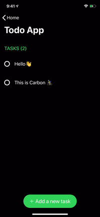
<img src="https://raw.githubusercontent.com/ra1028/Carbon/master/assets/hello.png" height=240 align=right>
renderer.render {
    Header("GREET")
        .identified(by: \.title)

    HelloMessage("Vincent")
    HelloMessage("Jules")
    HelloMessage("Mia")

    Footer("👋 Greeting from Carbon")
        .identified(by: \.text)
}
SwiftUI Compatibility
struct ContentView: View {
    var body: some View {
        ScrollView {
            VStack {
                Text("GREET")
                    .font(.title)
                    .padding(.horizontal, 16)

                HelloMessage("World")
                    .frame(height: 60)
                    .background(Color.red)
            }
        }
    }
}
Getting Started
Build for Development
$ git clone https://github.com/ra1028/Carbon.git
$ cd Carbon/
$ make setup
$ open Carbon.xcworkspace
Basic Usage
Described here are the fundamentals for building list UIs with Carbon.
The API document will help you understand the details of each type.
For more advanced usage, see the Advanced Guide.
And the more practical examples are here.
Component
Component is the base unit of the UI in Carbon.
All elements are made up of components, and it can be animated by diffing update.
UIView, UIViewController and its subclasses are available as content of component by default.
You can declare fixed size component by implementing referenceSize(in bounds: CGRect) -> CGSize?. The default is to return nil and falls back to a value such as UITableView.rowHeight or UICollectionViewFlowLayout.itemSize.
See here for more depth of component.
Definition below is the simplest implementation.
struct HelloMessage: Component {
    var name: String

    func renderContent() -> UILabel {
        UILabel()
    }

    func render(in content: UILabel) {
        content.text = "Hello \(name)"
    }
}
Component used as a cell requires to specify an arbitrary id.
Give an id by Component.identified(by:) or declare it by using IdentifiableComponent protocol.
Renderer
The components are displayed on the list UI by Renderer.render.
Boilerplates such as registering element types to a table view are no longer needed in Carbon.
The adapter acts as delegate and dataSource, the updater handles updates.
You can also change the behaviors by inheriting and customizing it.
There are also UITableViewReloadDataUpdater and UICollectionViewReloadDataUpdater which update by reloadData without diffing updates.
When render called again, the updater calculates the diff from the currently rendered components and updates them with the system animation.
Renderer for UITableView:
@IBOutlet var tableView: UITableView!

let renderer = Renderer(
    adapter: UITableViewAdapter(),
    updater: UITableViewUpdater()
)

override func viewDidLoad() {
    super.viewDidLoad()

    renderer.target = tableView
}
Renderer for UICollectionView:
@IBOutlet var collectionView: UICollectionView!

let renderer = Renderer(
    adapter: UICollectionViewFlowLayoutAdapter(),
    updater: UICollectionViewUpdater()
)

override func viewDidLoad() {
    super.viewDidLoad()

    renderer.target = collectionView
}
Render Components:
renderer.render {
    Header("GREET")
        .identified(by: \.title)

    HelloMessage("Butch")
    HelloMessage("Fabianne")
}
Section
A section can include header, footer and cells.
This also needs to specify id for identify from among multiple sections.
The cells can be declared using a function builder as below:
let appearsBottomSection: Bool = ...
let appearsFourthMan: Bool = ...

renderer.render {
    Section(
        id: "Bottom",
        header: Header("GREET"),
        footer: Footer("👋 Greeting from Carbon"),
        cells: {
            HelloMessage("Marsellus")
            HelloMessage("The Wolf")
        }
    )

    if appearsBottomSection {
        Section(id: "Top") {
            HelloMessage("Brett")
            HelloMessage("Roger")

            if appearsFourthMan {
                HelloMessage("Fourth Man")
            }
        }
    }
}
Group
The number of limit to declare cells or section with function builder syntax is until 10. You can avoid that limitation by grouping with Group.
It can also be used to create a cell or section from an array with N elements.
Group of Components:
renderer.render {
    Group {
        Header("GREET")
            .identified(by: \.title)

        HelloMessage("Vincent")
        HelloMessage("Jules")
    }

    Group(of: ["Pumpkin", "Honey Bunny"]) { name in
        HelloMessage(name)
    }
}
Group of Sections:
renderer.render {
    Group {
        Section(id: 0) {
            HelloMessage("Jimmie")
        }

        Section(id: 1) {
            HelloMessage("Bonnie")
        }
    }

    Group(of: ["Lance", "Jody"]) { name in
        Section(id: name) {
            HelloMessage(name)
        }
    }
}
Advanced Guide
Custom Content
Of course, the content of component can use custom class. You can also instantiate it from Xib.
It can be inherited whichever class, but the common means is inherit UIView or UIViewController.
class HelloMessageContent: UIView {
    @IBOutlet var label: UILabel!
}
struct HelloMessage: Component {
    var name: String

    func renderContent() -> HelloMessageContent {
        HelloMessageContent.loadFromNib()  // Extension for instantiate from Xib. Not in Carbon.
    }

    func render(in content: HelloMessageContent) {
        content.label.text = "Hello \(name)"
    }
}
IdentifiableComponent
IdentifiableComponent is a component that simply can predefine an identifier.
It can be omitted the definition of id if the component conforms to Hashable.
struct HelloMessage: IdentifiableComponent {
    var name: String

    var id: String {
        name
    }
Related Skills
bluebubbles
343.1kUse when you need to send or manage iMessages via BlueBubbles (recommended iMessage integration). Calls go through the generic message tool with channel="bluebubbles".
node-connect
343.1kDiagnose OpenClaw node connection and pairing failures for Android, iOS, and macOS companion apps
slack
343.1kUse when you need to control Slack from OpenClaw via the slack tool, including reacting to messages or pinning/unpinning items in Slack channels or DMs.
frontend-design
90.0kCreate distinctive, production-grade frontend interfaces with high design quality. Use this skill when the user asks to build web components, pages, or applications. Generates creative, polished code that avoids generic AI aesthetics.
