
Financial Asset Comparison Tool
R Shiny app to compare the relative performance of cryptos and equities.
Install / Use
npx skills add pmaji/financial-asset-comparison-toolInstalls into whichever agent you are using.
README
Introduction
Welcome! The Financial Asset Comparison Tool is an R Shiny App that facilitates the comparison of a myriad of assets--both traditional and crypto--across time. The idea for this tool came to me when I was trading crypto-currencies actively, and spending a decent amount of time in investor telegram chats and forums. A common argument I would see was over what asset one should have invested in a short while ago, but it was clear that most such discussions were fueled by emotion--primarily "FOMO"--as opposed to testable metrics. This isn't just a popular type of discussion in the crypto investing space; in fact, it may be even more common in traditional finance. I wanted to create a tool that would be able to settle all such asset performance comparison questions, regardless of whether the question was about traditional assets such as equities, crypto-assets like Bitcoin and Ethereum, or some combination of both. The tools made available via this app allow for analysis of varying degrees of complexity, as can be seen in the visualization below.
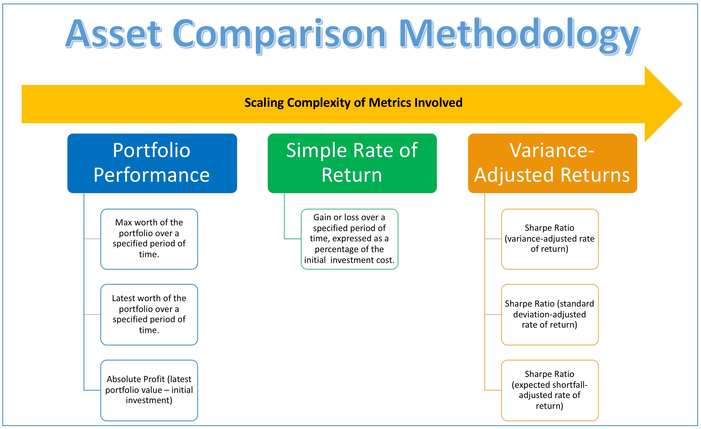
This scaling of metric complexity is also intuitively integrated into the UI design of the app itself, as illustrated by the screenshot below.
<img src="https://raw.githubusercontent.com/pmaji/crypto-asset-comparison-tool/master/screenshots/ui_scaling_complexity.JPG" width="900" height="500">The ultimate purpose of this tool is thus to settle every question of the form: "If I had M amount of money to invest over time period T, what would have been the better investment as judged by various metrics: Asset A or Asset B?"
To determine what metrics might be of greatest importance to your particular question, consider the following:
- What if I care about the absolute profit that I make?
- If so, then consider the simple portfolio performance metrics.
- What if I care about relative gains and losses?
- If so, then consider the rate of return metrics.
- What if I care about the trade-off that exists between asset performance and the risk / volatility associated with holding that asset?
- If so, then consider the variance-adjusted rate of return metrics.
This tool is modular in nature, such that there are some parameters that affect the entire app, and others that only affect certain outputs. This allows the user, at a high level, to select assets of interest, a date-range of relevance, and an initial investment amount, and thereafter compare the chosen assets using a variety of metrics. The app facilitates this procedural evaluation by nature of its layout, such that there are sections that focus on portfolio value, simple returns, and risk-adjusted returns.
Over the course of the rest of this document, we will walk through all of the features of the app one-by-one, explaining their purpose and functionality, along with any pertinent technical details. There is plenty of explanatory material contained within the web app UI itself, primarily via small comments explaining inputs, and embedded hyperlinks that provide more information about particular metrics or definitions. In cases where I provide such links and explanation wthin the app UI, I will not repeat the explanation here. In all screenshots of the app below, I will be using Bitcoin (btc) and Ethereum (eth) as the two assets to be compared. Read all the way through the final section to learn how you can support this project and how to access the app. I hope this tool helps you make more informed financial decisions moving forward, and better evaluate those you have made previously!
UI Overview: Sidebar UI Elements
Starting with the top-leftmost elements of the UI (screenshot below), you can see that directly to the right of the title, there is an icon composed of three horizonal lines. Clicking this icon will expand or collapse the entire sidebar. Below the title you will find 3 hyperlinked buttons that will direct the user to this markdown document, this GitHub's issue page, and the code hosted on GitHub, in turn.
<img src="https://raw.githubusercontent.com/pmaji/crypto-asset-comparison-tool/master/screenshots/title_links_bar.JPG" width="300" height="150">The next segment of the sidebar (screenshot below) allows the user to choose which assets to compare. As is stated in the label, the lowercase assets are crypto-assets, and the uppercase assets are equities. This is done for two main reasons: visual identification, and avoidance of conflict. Visually it makes it easier at a glance to tell when you are comparing different types of assets, and, while it is rare, there are cases when there are crypto-assets and equities with the same ticker (i.e. one can still compare "ETH" (Ethan Allen) the equity with "eth" (Ethereum) the cryptocurrency). I include all equities listed on Yahoo finance as of March 2018 (excluding REITs and ETFs), along with every crypto-asset included on CoinMetrics.
<img src="https://raw.githubusercontent.com/pmaji/crypto-asset-comparison-tool/master/screenshots/asset_input_bar.JPG" width="300" height="200">The final segment of the sidebar (screenshot below) allows the user to pick what date range to consider for the comparison of their chosen assets. The default is to show the most recent six months (i.e., had you invested the specified amount of money 6 months ago, this is how the assets would have performed to date). The one noteworthy caveat (which is evident from the code and can be changed locally) is that the most recent date is always lagged by 3 days (i.e. if you are using the app on April 7th, the default will be to show 6 months of data from April 3rd and then backwards in time 6 months). I do this because the various APIs that I use sometimes have a lag, and also there are instances where the stock market is closed for Friday or Monday; hence, this lag is the minimum lag necessary to assure there are never cases of empty data caused by API lag and/or bank holidays.
<img src="https://raw.githubusercontent.com/pmaji/crypto-asset-comparison-tool/master/screenshots/date_range_bar.JPG" width="300" height="150">UI Overview: Portfolio Performance Section
The main time series chart shown (screenshot below) is rather intuitive: it simply shows the worth of two single-asset portfolios over time. In layman's terms, had you invested the same amount in both assets over the time series specified, this chart shows you the value of that investment over time. The default smoothing parameters were chosen arbitrarily to balance the tradeoff of resiliency vis-a-vis outliers and maintenance of fit, but can be changed as the user desires.
<img src="https://raw.githubusercontent.com/pmaji/crypto-asset-comparison-tool/master/screenshots/portfolio_box_ui.JPG" width="900" height="400">The portfolio summary table (screenshot below) presents multiple aggregate metrics on which the two chosen assets can be judged. Each metric is its own column. For each column, the value in green is the value deemed optimal in terms of that particular metric. For example, the first column is "Asset Portfolio Max Worth"; hence, whichever asset resulted in the highest portfolio max worth over the range specified will have its value displayed in green, while the other will be displayed in red. The background within each cell is also a reactive bar chart, so the magnitude of each cell can be judged at a glance relative to the magnitude of the other cell in that column. Continuing the previous example of the "Asset Portfolio Max Worth" column, if the two assets being compared have max worths of $1000 and $2000 respectively, the bar charts in each cell will be of length 50% of cell width and 100% of cell width, respectively.
<img src="https://raw.githubusercontent.com/pmaji/crypto-asset-comparison-tool/master/screenshots/summary_box_ui.JPG" width="900" height="200">UI Overview: Rate of Return Section
The rate of return section (screenshot below) is entirely intuitive: it is simply a time series chart of the returns for the chosen asset over the period specified.
<img src="https://raw.githubusercontent.com/pmaji/crypto-asset-comparison-tool/master/screenshots/returns_box_ui.JPG" width="900" height="400">UI Overview: Variance-Adjusted Returns Section
The variance-adjusted return section (screenshot below) is a slightly more complicated additional set of metrics meant to supplement the base rate of return section. The parameter that allows the user to select the period over which to calculate rate of return (from the section above) also affects the variance-adjusted returns section, as the three varieties of Sharpe Ratio are calculated over that same time period. One must be careful when choosing the Risk Free Rate, because that rate should be chosen relative to the time period selected (i.e. if you choose to visualize "weekly" returns, your chosen risk-free rate should reflect a weekly risk free rate). Generally speaking, risk-free rates are chosen relative to some US treasury rate, but it is parameterized over a relatively wide range such that the user can choose whatever rate they see fit, within reason.
The three varieties of Sharpe Ratio shown are pretty standard, the only difference being the denominators, which are variance (VaR), standard deviation (StdDev), and expected shortfall (ES), in turn.
<img src="https://raw.githubusercontent.com/pmaji/crypto-asset-comparison-tool/master/screenshots/sharpe_box_ui.JPG" width="900" height="400">Analytic Conclusions
The app is laid out in such a way that as you descend vertically, you follow a logical series of questions about value:
Related Skills
node-connect
385.5kDiagnose OpenClaw Android, iOS, or macOS node pairing, QR/setup code, route, auth, and connection failures.
blender-python-addon
40.5kBlender Python add-on rules for operators, panels, properties, registration, testing, and API-safe scripting
flutter-development-guidelines-cursorrules-prompt-file
40.5kCursor rules for Flutter development with MVVM architecture, Riverpod state management, Material widgets, and Dart style guidelines.
commit-push-pr
140.6kCommit, push, and open a PR
