Mplfinance
Financial Markets Data Visualization using Matplotlib
Install / Use
/learn @matplotlib/MplfinanceREADME
![]()
mplfinance
matplotlib utilities for the visualization, and visual analysis, of financial data
Installation
pip install --upgrade mplfinance
- mplfinance requires matplotlib and pandas
<a name="announcements"></a>⇾ Latest Release Information ⇽
<a name="announcements"></a> ⇾ Older Release Information
<a name="tutorials"></a>Contents and Tutorials
- The New API
- Tutorials
- Basic Usage
- Customizing the Appearance of Plots
- Adding Your Own Technical Studies to Plots
- Subplots: Multiple Plots on a Single Figure
- Fill Between: Filling Plots with Color
- Price-Movement Plots (Renko, P&F, etc)
- Trends, Support, Resistance, and Trading Lines
- Coloring Individual Candlesticks (New: December 2021)
- Saving the Plot to a File
- Animation/Updating your plots in realtime
- ⇾ Latest Release Info ⇽
- Older Release Info
- Some Background History About This Package
- Old API Availability
<a name="newapi"></a>The New API
This repository, matplotlib/mplfinance, contains a new matplotlib finance API that makes it easier to create financial plots. It interfaces nicely with Pandas DataFrames.
More importantly, the new API automatically does the extra matplotlib work that the user previously had to do "manually" with the old API. (The old API is still available within this package; see below).
The conventional way to import the new API is as follows:
import mplfinance as mpf
The most common usage is then to call
mpf.plot(data)
where data is a Pandas DataFrame object containing Open, High, Low and Close data, with a Pandas DatetimeIndex.
Details on how to call the new API can be found below under Basic Usage, as well as in the jupyter notebooks in the examples folder.
I am very interested to hear from you regarding what you think of the new mplfinance, plus any suggestions you may have for improvement. You can reach me at dgoldfarb.github@gmail.com or, if you prefer, provide feedback or a ask question on our issues page.
<a name="usage"></a>Basic Usage
Start with a Pandas DataFrame containing OHLC data. For example,
import pandas as pd
daily = pd.read_csv('examples/data/SP500_NOV2019_Hist.csv',index_col=0,parse_dates=True)
daily.index.name = 'Date'
daily.shape
daily.head(3)
daily.tail(3)
(20, 5)
...
<table border="1" class="dataframe"> <thead> <tr style="text-align: right;"> <th></th> <th>Open</th> <th>High</th> <th>Low</th> <th>Close</th> <th>Volume</th> </tr> <tr> <th>Date</th> <th></th> <th></th> <th></th> <th></th> <th></th> </tr> </thead> <tbody> <tr> <th>2019-11-26</th> <td>3134.85</td> <td>3142.69</td> <td>3131.00</td> <td>3140.52</td> <td>986041660</td> </tr> <tr> <th>2019-11-27</th> <td>3145.49</td> <td>3154.26</td> <td>3143.41</td> <td>3153.63</td> <td>421853938</td> </tr> <tr> <th>2019-11-29</th> <td>3147.18</td> <td>3150.30</td> <td>3139.34</td> <td>3140.98</td> <td>286602291</td> </tr> </tbody> </table> <br>After importing mplfinance, plotting OHLC data is as simple as calling mpf.plot() on the dataframe
import mplfinance as mpf
mpf.plot(daily)
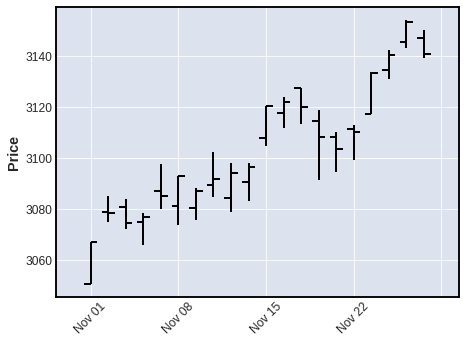
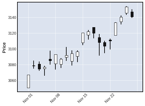
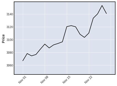
The default plot type, as you can see above, is 'ohlc'. Other plot types can be specified with the keyword argument type, for example, type='candle', type='line', type='renko', or type='pnf'
mpf.plot(daily,type='candle')
mpf.plot(daily,type='line')
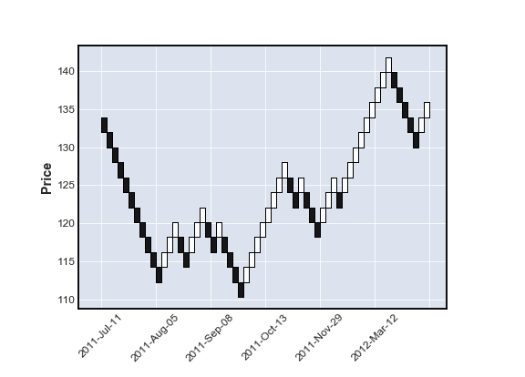
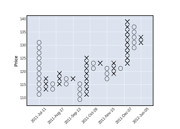
year = pd.read_csv('examples/data/SPY_20110701_20120630_Bollinger.csv',index_col=0,parse_dates=True)
year.index.name = 'Date'
mpf.plot(year,type='renko')
mpf.plot(year,type='pnf')
<br>
We can also plot moving averages with the mav keyword
- use a scalar for a single moving average
- use a tuple or list of integers for multiple moving averages
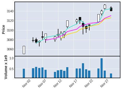
mpf.plot(daily,type='ohlc',mav=4)
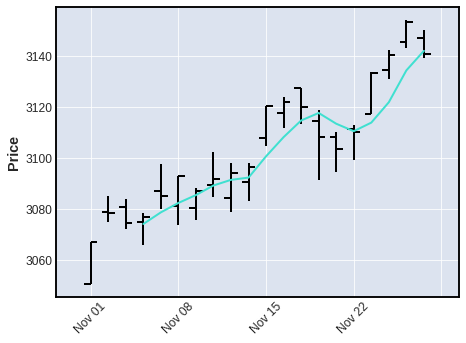
mpf.plot(daily,type='candle',mav=(3,6,9))
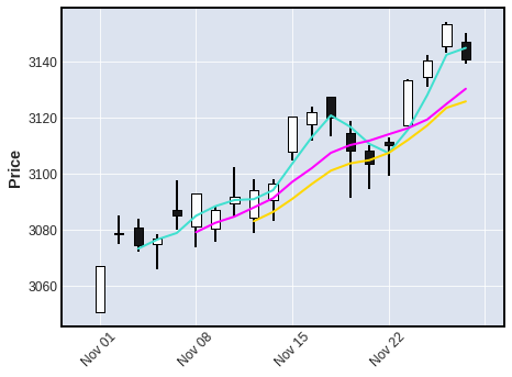
We can also display Volume
mpf.plot(daily,type='candle',mav=(3,6,9),volume=True)
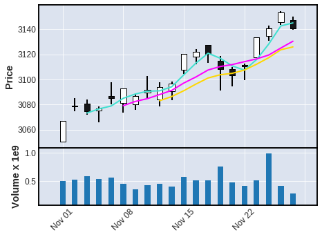
Notice, in the above chart, there are no gaps along the x-coordinate, even though there are days on which there was no trading. Non-trading days are simply not shown (since there are no prices for those days).
-
However, sometimes people like to see these gaps, so that they can tell, with a quick glance, where the weekends and holidays fall.
-
Non-trading days can be displayed with the
show_nontradingkeyword.- Note that for these purposes non-trading intervals are those that are not represented in the data at all. (There are simply no rows for those dates or datetimes). This is because, when data is retrieved from an exchange or other market data source, that data typically will not include rows for non-trading days (weekends and holidays for example). Thus ...
show_nontrading=Truewill display all dates (all time intervals) between the first time stamp and the last time stamp in the data (regardless of whether rows exist for those dates or datetimes).show_nontrading=False(the default value) will show only dates (or datetimes) that have actual rows in the data. (This means that if there are rows in your DataFrame that exist but contain onlyNaNvalues, these rows will still appear on the plot even ifshow_nontrading=False)
-
For example, in the chart below, you can easily see weekends, as well as a gap at Thursday, November 28th for the U.S. Thanksgiving holiday.
mpf.plot(daily,type='candle',mav=(3,6,9),volume=True,show_nontrading=True)
We can also plot intraday data:
intraday = pd.read_csv('examples/data/SP500_NOV2019_IDay.csv',index_col=0,parse_dates=True)
intraday = intraday.drop('Volume',axis=1) # Volume is zero anyway for this intraday data set
intraday.index.name = 'Date'
intraday.shape
intraday.head(3)
intraday.tail(3)
(1563, 4)
Related Skills
beanquery-mcp
41Beancount MCP Server is an experimental implementation that utilizes the Model Context Protocol (MCP) to enable AI assistants to query and analyze Beancount ledger files using Beancount Query Language (BQL) and the beanquery tool.
valuecell
9.8kValueCell is a community-driven, multi-agent platform for financial applications.
ezbookkeeping
Use ezBookkeeping API Tools script to record new transactions, query transactions, retrieve account information, retrieve categories, retrieve tags, and retrieve exchange rate data in the self hosted personal finance application ezBookkeeping.
REFERENCE
An intelligent middleware layer between crypto wallets and traditional payment systems.
