BezelKit
BezelKit is a Swift package designed to simplify the process of accessing device-specific bezel sizes in apps. Knowing the exact bezel size can be crucial for aligning UI elements, creating immersive experiences, or when you need pixel-perfect design layouts.
Install / Use
/learn @markbattistella/BezelKitREADME
BezelKit
<small>Perfecting Corners, One Radius at a Time</small>


Overview
BezelKit is a Swift package designed to simplify the process of accessing device-specific bezel sizes in apps.
Knowing the exact bezel size can be crucial for aligning UI elements, creating immersive experiences, or when you need pixel-perfect design layouts.
By providing an easy-to-use API, BezelKit allows developers to focus more on their app's functionality rather than wrestling with device metrics.
Rationale
Quick summary
- There is no public API from Apple for fetching device bezel sizes
- Using the internal API can jeopardise App Store eligibility
- Static bezel values can cause UI distortions across devices
BezelKitoffers an easy-to-use solution for accurate bezel metrics
Longer explanation
Apple currently does not offer a public API for fetching the bezel radius of its devices.
Although an internal API exists, using it jeopardises the app's eligibility for the App Store — a risk that's not justifiable for a mere UI element.
Another consideration stems from the variability in screen bezel dimensions across different Apple devices. Setting a static bezel value is problematic for several reasons:
-
If the actual bezel radius is smaller or larger than the static value, the UI corners will appear disproportionately thick or thin.
-
On older devices or those with square screens, such as the SE models, the display will inaccurately feature curved corners when it should not.
While Apple has provided the ContainerRelativeShape inset, its functionality is currently limited to Widgets. For all other applications, this API reports a squared rectangle, making it unsuitable for our needs.
A nice looking solution would look like this:
Compatibility
Devices
In terms of the devices supported though, it covers from the initial versions of all devices. See the supported device list.
Installation
Swift Package Manager
The BezelKit package uses Swift Package Manager (SPM) for easy and convenient distribution. Follow these steps to add it to your project:
-
In Xcode, click
File -> Swift Packages -> Add Package Dependency -
In the search bar, type
https://github.com/markbattistella/BezelKitand clickNext. -
Specify the version you want to use, then click
Next. -
Finally, select the target in which you want to use
BezelKitand clickFinish.
Usage
Using BezelKit is simple and can help you avoid complexities related to device metrics.
Quick Start
-
Import the BezelKit module:
import BezelKit -
Access the device bezel size:
let currentBezel: CGFloat = .deviceBezel
For advanced usage, including perfect scaling of UI elements and setting fallback sizes, read the sections below.
Perfect Scaling
The BezelKit package not only provides an easy way to access device-specific bezel sizes but also enables perfect scaling of rounded corners within the UI.
When you have a rounded corner on the outer layer and an inner UI element that also needs a rounded corner, maintaining a perfect aspect ratio becomes essential for a harmonious design. This ensures your UI scales beautifully across different devices.
Here's how you'd manually implement it:
let outerBezel: CGFloat = .deviceBezel
let innerBezel = outerBezel - distance  // Perfect ratio
By following this approach, you can ensure that your UI elements scale perfectly in relation to the device's bezel size.
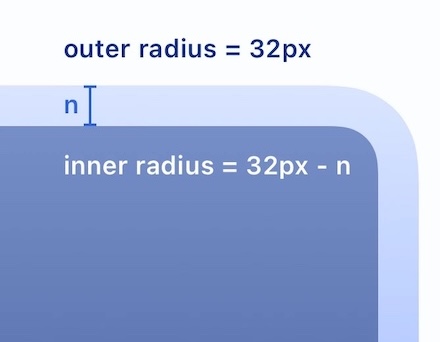
You can use the deviceBezel(with:) function to pass in the margin size, and it will return the device bezel but perfectly scaled with the inner ratio.
Setting a Fallback Bezel Size
The package provides an easy way to specify a fallback bezel size for all Apple device types. By default, the CGFloat.deviceBezel attribute returns 0.0 if it cannot ascertain the device's bezel size (on iOS / iPadOS).
Enable Zero-Check Option
In addition to specifying the fallback value, you have the option to return the fallback value even when the bezel size is determined to be zero.
UIKit: Setting the Fallback in AppDelegate
For UIKit-based applications, you can set the fallback value in the AppDelegate within the application(_:didFinishLaunchingWithOptions:) method. This is the earliest point at which you can set the fallback value for your app.
import UIKit

@UIApplicationMain
class AppDelegate: UIResponder, UIApplicationDelegate {

  func application(_ application: UIApplication, didFinishLaunchingWithOptions launchOptions: [UIApplication.LaunchOptionsKey: Any]?) -> Bool {

    // Sets a fallback value of 10.0 on iOS and enables zero-check
    CGFloat.setFallbackConfig(
      FallbackConfig(
        iOS: (10.0, true)
      )
    )

    return true
  }
}
SwiftUI: Setting the Fallback on Appear
For SwiftUI applications, you can set this value in the init() function for your main content view.
import SwiftUI

@main
struct YourApp: App {
  init() {

    // Sets a fallback value of 10.0 on iOS and enables zero-check
    CGFloat.setFallbackConfig(
      FallbackConfig(
        iOS: (10.0, true)
      )
    )
  }
  var body: some Scene {
    WindowGroup {
      ContentView()
    }
  }
}
[!Important] You only need to call
setFallbackConfig(_:)once, and as early as possible (like in yourAppinit) to ensure it's applied globally.
Effects of Setting a Fallback
If you've set a fallback value, CGFloat.deviceBezel will return this fallback value when it cannot determine the bezel size for the current device, or optionally, when the bezel size is zero.
// With fallback set to 10.0 and zero check enabled
let currentBezel = CGFloat.deviceBezel
print("Current device bezel: \(currentBezel)")

// Output will be 10.0 if the device is not in the JSON data or the bezel is zero
If no fallback is set, CGFloat.BezelKit defaults to 0.0 when the device-specific bezel size is unavailable.
// With no fallback set and zero check disabled
let currentBezel = CGFloat.deviceBezel
print("Current device bezel: \(currentBezel)")

// Output will be 0.0 if the device is not in the JSON data
[!Warning] The previously documented method
setFallbackDeviceBezel(_:ifZero:)has been deprecated and is unavailable. Please usesetFallbackConfig(_:)with aFallbackConfiginstance instead.
Handling Errors with BezelKit
BezelKit offers optional error handling to manage unexpected issues like missing device bezel data or data parsing problems.
By using BezelKit's error callback, developers are alerted of these hiccups, allowing them to handle them as they see fit, whether it's logging for debugging or user notifications.
This ensures a smoother and more resilient app experience.
SwiftUI: Error handling
import SwiftUI
import BezelKit

struct ContentView: View {
  @State private var showErrorAlert: Bool = false
  @State private var errorMessage: String = ""

  var body: some View {
    RoundedRectangle(cornerRadius: .deviceBezel)
      .stroke(Color.green, lineWidth: 20)
      .ignoresSafeArea()
      .alert(isPresented: $showErrorAlert) {
        Alert(title: Text("Error"),
              message: Text(errorMessage),
              dismissButton: .default(Text("Got it!")))
      }
      .onAppear {
          DeviceBezel.errorCallback = { error in
            errorMessage = error.localizedDescription
            showErrorAlert = true
          }
      }
    }
}
UIKit: Error handling
import UIKit
import BezelKit

class ViewController: UIViewController {
  override func viewDidLoad() {
    super.viewDidLoad()

    DeviceBezel.errorCallback = { [weak self] error in
      let alert = UIAlertController(title: "Error",
                                    message: error.localizedDescription,
                                    preferredStyle: .alert)
      alert.addAction(UIAlertAction(title: "OK", style: .default, handler: nil))
      self?.present(alert, animated: true, completion: nil)
    }

    let bezelValue = CGFloat.deviceBezel
    // Use bezelValue for your views
  }
}
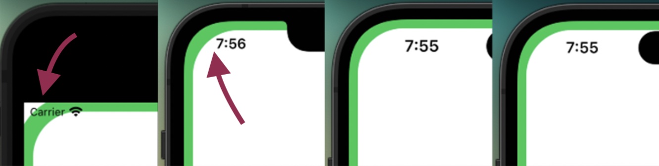
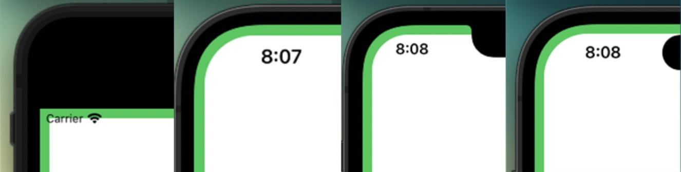
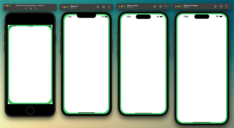
Comparison
This is a comparison between using a static, single value for all devices and how it looks when rendered compared to BezelKit which will adapt to each device.
This was the code when using a static, single value for all devices:
import SwiftUI

struct ContentView: View {
  var body: some View {
    RoundedRectangle(cornerRadius: 60)
      .stroke(.green, lineWidth: 20)
      .ignoresSafeArea()
  }
}
In a fixed value configuration, devices with no curved screen look odd, while this cornerRadius is designed for the iPhone 14 Pro Max, it looks chunky on the
