Themed
Flutter package: Allows you to define colors and text styles as const values which can be changed dynamically. Improves, does not replace, Flutter's theme system.
Install / Use
/learn @marcglasberg/ThemedREADME


Sponsor

themed
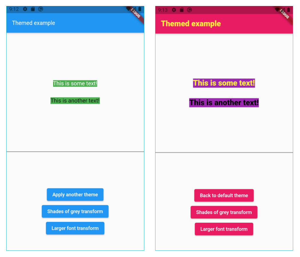
The Themed package:
- Lets you define a theme with const values, but change them dynamically anyway.
ChangeColorswidget to change the brightness, saturation and hue of widgets or images.- Color extension methods like
decolorize,addOpacity,removeOpacity,darker,lighter,averageand more. - Static methods
ColorUtil.rgbaToArgbandColorUtil.abgrToArgb. - TextStyle extension methods:
var myStyle = TextStyle(fontSize: 15) + Colors.blueand more.
Const values that you can change
As we all know, using const variables is the easiest way to create and use themes:
static const myColor = Colors.white;
static const myStyle = TextStyle(fontSize: 16);

Container(
  color: myColor,
  child: const Text('Hi', style: myStyle)))
However, if you do it like that you can't later change the theme dynamically. By using the Themed package you can:
static const myColor = ColorRef(Colors.white);
static const myStyle = TextStyleRef(TextStyle(fontSize: 16));

Container(
   color: myColor,
   child: const Text('Hello', style: myStyle)))

// Later, change the theme dynamically.
Themed.currentTheme = {
   myColor: Colors.blue,
   myStyle: TextStyle(fontSize: 20);
}
There is no need to use Theme.of(context) anymore:
// So old-fashioned.
Container(
   color: Theme.of(context).primary,
   child: Text('Hello', style: TextStyle(color: Theme.of(context).secondary)))
Also, since Theme.of needs the context and is not constant, you can't use it in
constructors. However, the Themed package has no such limitations:
// The const color is the default value of an optional parameter.
MyWidget({
    this.color = myColor,
  });
Setup
Wrap your widget tree with the Themed widget, above the MaterialApp:
@override
Widget build(BuildContext context) {
   return Themed(
      child: MaterialApp(
        ...
Compatibility
The Themed package is a competitor to writing Theme.of(context).xxx in your build
methods, but it’s NOT a competitor to Flutter’s native theme system and the Theme
widget. It’s there to solve a different problem, and it’s usually used together with
the Theme widget. For example, if you want to set a global default color for all
buttons, you’ll use the Theme widget. You may use it together with the Themed
package however, meaning that Themed colors and styles may be used inside
a ThemeData widget:
static const myColor1 = ColorRef(Colors.red);
static const myColor2 = ColorRef(Colors.blue);
...

child: MaterialApp(
   theme: ThemeData(
      primaryColor: MyTheme.color2,
      elevatedButtonTheme:
         ElevatedButtonThemeData(
            style: ElevatedButton.styleFrom(primary: MyTheme.color2),
      ),
   ),
How to define a theme map
Each theme should be a Map<ThemeRef, Object>, where the keys are your ColorRef
and TextStyleRef const values, and the values are the colors and styles you want to
use on that theme. For example:
Map<ThemeRef, Object> theme1 = {
  MyTheme.color1: Colors.yellow,
  MyTheme.color2: Colors.pink,
  MyTheme.color3: Colors.purple,
  MyTheme.mainStyle: const TextStyle(fontSize: 22, fontWeight: FontWeight.w900, color: MyTheme.color1),
};
At any point in your app you can just change the current theme by doing:
// Setting a theme:
Themed.currentTheme = theme1;

// Setting another theme:
Themed.currentTheme = theme2;

// Removing the current theme (and falling back to the default theme):
Themed.clearCurrentTheme();

// This would also remove the current theme:
Themed.currentTheme = null;
Resetting
Calling the static method Themed.reset() will remove the entire widget tree inside
the Themed widget for one frame, and then restore it, rebuilding everything. This can
be helpful when some widgets are not responding to theme changes. Usage of this method
is not usually necessary. A side effect is that the all stateful widgets below Themed
will be recreated, and you'll need to have mechanisms to recover their state, like for
example having the state come from above Themed widget, or using a proper state
management solution.
Organization
You can also organize your theme in a class:
class MyTheme {
   static const myColor = ColorRef(Colors.white);
   static const myStyle = TextStyleRef(TextStyle(fontSize: 16, color: Colors.red));
}

Container(
   color: MyTheme.myColor,
   child: const Text('Hello', style: MyTheme.myStyle)))
Color transform
Instead of changing the current theme you can create a color transformation. For example, this will turn your theme into shades of grey:
static Color shadesOfGreyTransform(Color color) {
  int average = (color.red + color.green + color.blue) ~/ 3;
  return Color.fromARGB(color.alpha, average, average, average);
}
Note you can create your own function to process colors, but shadesOfGreyTransform is
already provided:
// Turn it on:
Themed.transformColor = ColorRef.shadesOfGreyTransform;

// Then, later, turn it off:
Themed.clearTransformColor();
Changing brightness, saturation and hue of widgets or images.
Use the provided ChangeColors widget to change the brightness, saturation and hue of any
widget, including images. Example:
ChangeColors(
   hue: 0.55,
   brightness: 0.2,
   saturation: 0.1,
   child: Image.asset('myImage.png'),
);
To achieve a greyscale effect, you may also use the ChangeColors.greyscale constructor.
Note: This widget is based upon <a href="https://stackoverflow.com/questions/64639589/how-to-adjust-hue-saturation-and-brightness-of-an-image-in-flutter"> this code</a> (from <a href="https://stackoverflow.com/users/937841/banananeil"> BananaNeil's</a>), which is in turn based upon <a href='https://stackoverflow.com/a/7917978/937841'> this code</a> (by <a href="https://stackoverflow.com/users/812976/richard-lalancette"> Richard Lalancette</a>).
Color extension
The lighter method makes the color lighter (more white). Example:
// 20% more white.
Colors.blue.lighter(0.2);
The darker method makes the color darker (more black). Example:
// 20% more black.
Colors.blue.darker(0.2);
The average method makes the current color more similar to the given color. Example:
// 50% blue and 50% red.
Colors.blue.average(Colors.red);

// 20% blue and 80% red.
Colors.blue.average(Colors.red, 0.8);
The decolorize method makes the current color more grey. Example:
// Grey, with luminance similar to the original blue.
Colors.blue.decolorize();

// Blue with 20% less color.
Colors.blue.decolorize(0.2);
The addOpacity method makes the current color more transparent than it already is, by
the given amount. The removeOpacity method makes the current color less transparent than
it already is, by the given amount. This is different from the withOpacity method,
as you can see below.
// 50% transparent blue.
Colors.blue.addOpacity(0.5);

// 80% transparent black.
Colors.transparent.removeOpacity(0.2);

// Also 50% transparent blue.
Colors.withOpacity(0.5);

// 75% transparent blue, because we add 50% and then more 50%.
Colors.blue.addOpacity(0.5).addOpacity(0.5);

// This is 50% transparent blue, because the opacity is replaced, not added.
Colors.withOpacity(0.5).withOpacity(0.5);
There are also two static methods for advanced color representation conversion:
The ColorUtil.rgbaToArgb method converts the RGBA color representation to ARGB.
The ColorUtil.abgrToArgb method converts the ABGR color representation to ARGB.
TextStyle transform
You can also create a style transformation. For example, this will make your fonts larger:
static TextStyle largerText(TextStyle textStyle) =>
      textStyle.copyWith(fontSize: textStyle.fontSize! * 1.5);

// Turn it on:
Themed.transformTextStyle = largerText;

// Then, later, turn it off:
Themed.clearTransformTextStyle();
TextStyle extension
With the provided extension, you can make your code more clean-code by creating new text
styles by adding colors and other values to a TextStyle. For example:
const myStyle = TextStyle(...);

// Using some style:
Text('Hello', style: myStyle);

// Making text black:
Text('Hello', style: myStyle + Colors.black);

// Changing some other stuff:
Text('Hello', style: myStyle + FontWeight.w900 + FontSize(20.0) + TextHeight(1.2));
Beware not to define the same constant
Please remember Da
Related Skills
node-connect
354.0kDiagnose OpenClaw node connection and pairing failures for Android, iOS, and macOS companion apps
frontend-design
112.2kCreate distinctive, production-grade frontend interfaces with high design quality. Use this skill when the user asks to build web components, pages, or applications. Generates creative, polished code that avoids generic AI aesthetics.
openai-whisper-api
354.0kTranscribe audio via OpenAI Audio Transcriptions API (Whisper).
qqbot-media
354.0kQQBot 富媒体收发能力。使用 <qqmedia> 标签,系统根据文件扩展名自动识别类型(图片/语音/视频/文件)。
