Komponent
An opinionated way of organizing front-end code in Ruby on Rails, based on components
Install / Use
/learn @komposable/KomponentREADME
<img alt="Komponent" src="https://raw.github.com/ouvrages/komponent/master/logo.svg?sanitize=true" width="200" height="40" />


Komponent implements an opinionated way of organizing front-end code in Ruby on Rails, based on components.
:wave: HEADS UP! The future of this gem is currently being discussed. Please have your say!
Each component has its own folder, containing a Ruby module, a partial, a stylesheet and a JavaScript file.
Komponent relies heavily on webpacker to manage dependencies and generate the production JS and CSS files.
This README examples are written in Slim, but Komponent is compatible with:
- your preferred templating language (Slim, Haml, erb)
- your stylesheet language of choice (Sass, SCSS, CSS, PostCSS)
This gem has been inspired by our Rails development practices at Ouvrages and Etamin Studio, and the (excellent) Modern Front-end in Rails article from Evil Martians.
<details> <summary>Table of Contents</summary>- Compatibility
- Getting started
- Usage
- Contributing
- Releasing a new version
- License
Compatibility
- Ruby 2.5+
- Rails 5.0+
- Webpacker 3.0.0+
Getting started
# Gemfile

gem 'komponent'
Run the following command to set up your project instantly:
rails generate komponent:install
This command will:
- check that the dependencies (currently, webpacker) are installed
- rename the
app/javascriptfolder tofrontendand modify webpacker config accordingly - create the
frontend/componentsfolder where you will put your component - create the
frontend/components/index.jsfile that will list your components andimportit infrontend/packs/application.js
Usage
Generate a new component with the component generator:
rails generate component button
Then, render it in your views with the component helper (or its alias c).
/ app/views/pages/home.html.slim

= component 'button'
= c 'button'
Or, directly from your controllers:
# app/controllers/pages_controller.rb

def home
  render html: helpers.component('home')
end
Make sure to include javascript pack tag and stylesheet pack tag in your application layout file, for instance:
/ app/views/layouts/application.html.slim

doctype html
html
  head
    = stylesheet_pack_tag 'application'

  body
    = yield
    = javascript_pack_tag 'application'
Check Webpacker documentation for further information.
Passing variables
You can pass locals to the helper. They are accessible within the component partial, as instance variables. Additionally, the entire locals hash is made available through a properties helper method.
/ app/views/pages/home.html.slim

= component 'button', text: 'My button'
/ frontend/components/button/_button.html.slim

.button
  = @text
Passing options
Component caching
Komponent relies on Rails Low-level caching.
You can cache the component by passing the cached: true option. The cache will expire when the locals, options or block change.
If you want better control of the cache expiration, you can provide a custom cache_key. When the cache_key changes, the cache will be cleared.
/ app/views/pages/home.html.slim

/ Cache the component based on its locals
= component "button", { text: 'Click here' }, cached: true

/ or cache the component with a specific key, such as the last update of a model
= component "button", { text: 'Click here' }, cached: true, cache_key: @product.updated_at
Passing a block
The component also accepts a block. To render the block, just use the standard yield.
/ app/views/pages/home.html.slim

= component 'button'
  span= 'My button'
/ frontend/components/button/_button.html.slim

.button
  = yield
You can check if the component has been called with a block using the block_given_to_component? helper from within the component.
Properties
Each component comes with a Ruby module. You can use it to set properties:
# frontend/components/button/button_component.rb

module ButtonComponent
  extend ComponentHelper

  property :href, required: true
  property :text, default: 'My button'
end
/ frontend/components/button/_button.html.slim

a.button(href=@href)
  = @text
Helpers
If your partial becomes too complex and you want to extract logic from it, you may want to define custom helpers in the ButtonComponent module:
# frontend/components/button/button_component.rb

module ButtonComponent
  extend ComponentHelper

  property :href, required: true
  property :text, default: 'My button'

  def external_link?
    @href.starts_with? 'http'
  end
end
/ frontend/components/button/_button.html.slim

a.button(href=@href)
  = @text
  = ' (external link)' if external_link?
/ app/views/pages/home.html.slim

= component "button", text: "My button", href: "http://github.com"
Component partials
You can also choose to split your component into partials. In this case, we can use the default render helper to render a partial, stored inside the component directory.
/ frontend/components/button/_button.html.slim

a.button(href=@href)
  = @text
  - if external_link?
    = render 'suffix', text: 'external link'
/ frontend/components/button/_suffix.html.slim

= " (#{text})"
Namespacing components
To organize different types of components, you can group them in namespaces when you use the generator:
rails generate component admin/header
This will create the component in an admin folder, and name its Ruby module AdminHeaderComponent.
Stimulus integration
Komponent supports Stimulus >= 1.0.
You can pass --stimulus to both generators to use Stimulus in your components.
rails generate komponent:install --stimulus
This will yarn add stimulus and create a stimulus_application.js in the frontend folder.
rails generate component button --stimulus
This will create a component with an additional button_controller.js file, and define a data-controller in the generated view.
Internationalization
In case your component will contain text strings you want to localize, you can pass the --locale option to generate localization files in your component directory.
rails generate component button --locale
This will create a yml file for each locale (using I18n.available_locales). In your component, the t helper will use the same "lazy" lookup as Rails.
/ frontend/components/button/_button.html.slim

= a.button(href=@href)
  = @text
  = render('suffix', text: t(".external_link")) if external_link?
# frontend/components/button/button.en.yml

en:
  button_component:
    external_link: external link
# frontend/components/button/button.fr.yml

fr:
  button_component:
    external_link: lien externe
Available locales configuration
You can whitelist the locales you use by setting this into an initializer, as explained in the "official guide":
I18n.available_locales = [:en, :fr]
If you have the
rails-i18ngem in yourGemfile, you should whitelist locales to prevent creating a lot of locale files when you generate a new component.
Styleguide
Komponent includes a basic styleguide engine that you can use in your project to document your components.
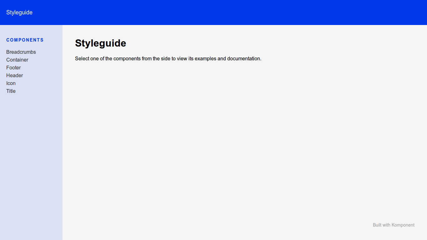
To set it up, you can use the generator:
rails generate komponent:styleguide
This command will:
- copy the styleguide components (
komponent/container,komponent/footer,komponent/headerandkomponent/sidebar) to your components folder, so you can customize them - add a new
komponent.jspack to your packs folder - mount the engine in your routes
Then, for each component, you can describe it and render examples for each state in the _example.html.slim file from the
