MobileTech
A useful tools or tips list for mobile web application developing
Install / Use
/learn @jtyjty99999/MobileTechREADME
mobileTech
A useful tools or tips list for mobile web application developing
这个项目收集移动端开发所需要的一些资源与小技巧
移动端统计 (from BiosSun)
可基于下方所列出的统计数据来决定您要兼容的设备及浏览器。
工具类网站
iphone6的那些事
响应式测试工具
Firefox 浏览器内置了 自定义设计视图 的功能,可以通过 Firefox->Web 开发者->自定义设计视图(或者摁下 Shift + Ctrl + m )。相比网络工具,运行更加流畅,无需联网。
判断 iPad 和 iPhone 的版本和状态的 CSS 媒体查询代码
https://quirktools.com/screenfly/
媒体查询常用样式表:
<link rel="stylesheet" media="all and (orientation:portrait)" href="portrait.css">    // 竖放加载
<link rel="stylesheet" media="all and (orientation:landscape)"href="landscape.css">   // 横放加载

//竖屏时使用的样式
<style media="all and (orientation:portrait)" type="text/css">
	#landscape { display: none; }
</style>

//横屏时使用的样式
<style media="all and (orientation:landscape)" type="text/css">
	#portrait { display: none; }
</style>
Web app 开发的最佳实践与中文总结
It’s not a web app. It’s an app you install from the web.
来自maxzhang的一些移动端经验总结干货
移动Web开发,4行代码检测浏览器是否支持position:fixed
移动Web开发实践——解决position:fixed自适应BUG
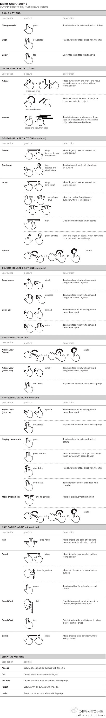
本资料很多引用了指尖上的js系列
指尖下的js ——多触式web前端开发之一:对于Touch的处理
基础知识
meta标签
meta标签大全 http://segmentfault.com/blog/ciaocc/1190000002407912
meta标签,这些meta标签在开发webapp时起到非常重要的作用
<meta content="width=device-width; initial-scale=1.0; maximum-scale=1.0; user-scalable=0" name="viewport" />
<meta content="yes" name="apple-mobile-web-app-capable" />
<meta content="black" name="apple-mobile-web-app-status-bar-style" />
<meta content="telephone=no" name="format-detection" />
第一个meta标签表示:强制让文档的宽度与设备的宽度保持1:1,并且文档最大的宽度比例是1.0,且不允许用户点击屏幕放大浏览; 尤其要注意的是content里多个属性的设置一定要用分号+空格来隔开,如果不规范将不会起作用。
注意根据 public_00 提供的资料补充,content 使用分号作为分隔,在老的浏览器是支持的,但不是规范写法。
规范的写法应该是使用逗号分隔,参考 Safari HTML Reference - Supported Meta Tags 和 Android - Supporting Different Screens in Web Apps
其中:
- width - viewport的宽度
- height - viewport的高度
- initial-scale - 初始的缩放比例
- minimum-scale - 允许用户缩放到的最小比例
- maximum-scale - 允许用户缩放到的最大比例
- user-scalable - 用户是否可以手动缩放
第二个meta标签是iphone设备中的safari私有meta标签,它表示:允许全屏模式浏览; 第三个meta标签也是iphone的私有标签,它指定的iphone中safari顶端的状态条的样式; 第四个meta标签表示:告诉设备忽略将页面中的数字识别为电话号码
在设置了initial-scale=1 之后,我们终于可以以1:1 的比例进行页面设计了。 关于viewport,还有一个很重要的概念是:iphone 的safari 浏览器完全没有滚动条,而且不是简单的“隐藏滚动条”, 是根本没有这个功能。iphone 的safari 浏览器实际上从一开始就完整显示了这个网页,然后用viewport 查看其中的一部分。 当你用手指拖动时,其实拖的不是页面,而是viewport。浏览器行为的改变不止是滚动条,交互事件也跟普通桌面不一样。 (请参考:指尖的下JS 系列文章)
更详细的 viewport 相关的知识也可以参考
适配类文章
移动开发事件
手势事件
- touchstart //当手指接触屏幕时触发
- touchmove //当已经接触屏幕的手指开始移动后触发
- touchend //当手指离开屏幕时触发
- touchcancel
触摸事件
- gesturestart //当两个手指接触屏幕时触发
- gesturechange //当两个手指接触屏幕后开始移动时触发
- gestureend
屏幕旋转事件
- onorientationchange
检测触摸屏幕的手指何时改变方向
- orientationchange
touch事件支持的相关属性
- touches
- targetTouches
- changedTouches
- clientX // X coordinate of touch relative to the viewport (excludes scroll offset)
- clientY // Y coordinate of touch relative to the viewport (excludes scroll offset)
- screenX // Relative to the screen
- screenY // Relative to the screen
- pageX // Relative to the full page (includes scrolling)
- pageY // Relative to the full page (includes scrolling)
- target // Node the touch event originated from
- identifier // An identifying number, unique to each touch event
- 屏幕旋转事件:onorientationchange
判断屏幕是否旋转
function orientationChange() {
	switch(window.orientation) {
	  case 0:
			alert("肖像模式 0,screen-width: " + screen.width + "; screen-height:" + screen.height);
			break;
	  case -90:
			alert("左旋 -90,screen-width: " + screen.width + "; screen-height:" + screen.height);
			break;
	  case 90:
			alert("右旋 90,screen-width: " + screen.width + "; screen-height:" + screen.height);
			break;
	  case 180:
		  alert("风景模式 180,screen-width: " + screen.width + "; screen-height:" + screen.height);
		  break;
	};};
添加事件监听
addEventListener('load', function(){
	orientationChange();
	window.onorientationchange = orientationChange;
});
JS 单击延迟
click 事件因为要等待单击确认,会有 300ms 的延迟,体验并不是很好。
开发者大多数会使用封装的 tap 事件来代替click 事件,所谓的 tap 事件由 touchstart 事件 + touchmove 判断 + touchend 事件封装组成。
Creating Fast Buttons for Mobile Web Applications
Eliminate 300ms delay on click events in mobile Safari
WebKit CSS:
携程 UED 整理的 Webkit CSS 文档 ,全面、方便查询,下面为常用属性。
①“盒模型”的具体描述性质的包围盒块内容,包括边界,填充等等。
-webkit-border-bottom-left-radius: radius;
-webkit-border-top-left-radius: horizontal_radius vertical_radius;
-webkit-border-radius: radius;      //容器圆角
-webkit-box-sizing: sizing_model; 边框常量值:border-box/content-box
-webkit-box-shadow: hoff voff blur color; //容器阴影(参数分别为:水平X 方向偏移量;垂直Y 方向偏移量;高斯模糊半径值;阴影颜色值)
-webkit-margin-bottom-collapse: collapse_behavior; 常量值:collapse/discard/separate
-webkit-margin-start: width;
-webkit-padding-start: width;
-webkit-border-image: url(borderimg.gif) 25 25 25 25 round/stretch round/stretch;
-webkit-appearance: push-button;   //内置的CSS 表现,暂时只支持push-button
②“视觉格式化模型”描述性质,确定了位置和大小的块元素。
direction: rtl
unicode-bidi: bidi-override; 常量:bidi-override/embed/normal
③“视觉效果”描述属性,调整的视觉效果块内容,包括溢出行为,调整行为,能见度,动画,变换,和过渡。
clip: rect(10px, 5px, 10px, 5px)
resize: auto; 常量:auto

Security Score
Audited on Mar 28, 2026