MaterialStyledDialogs
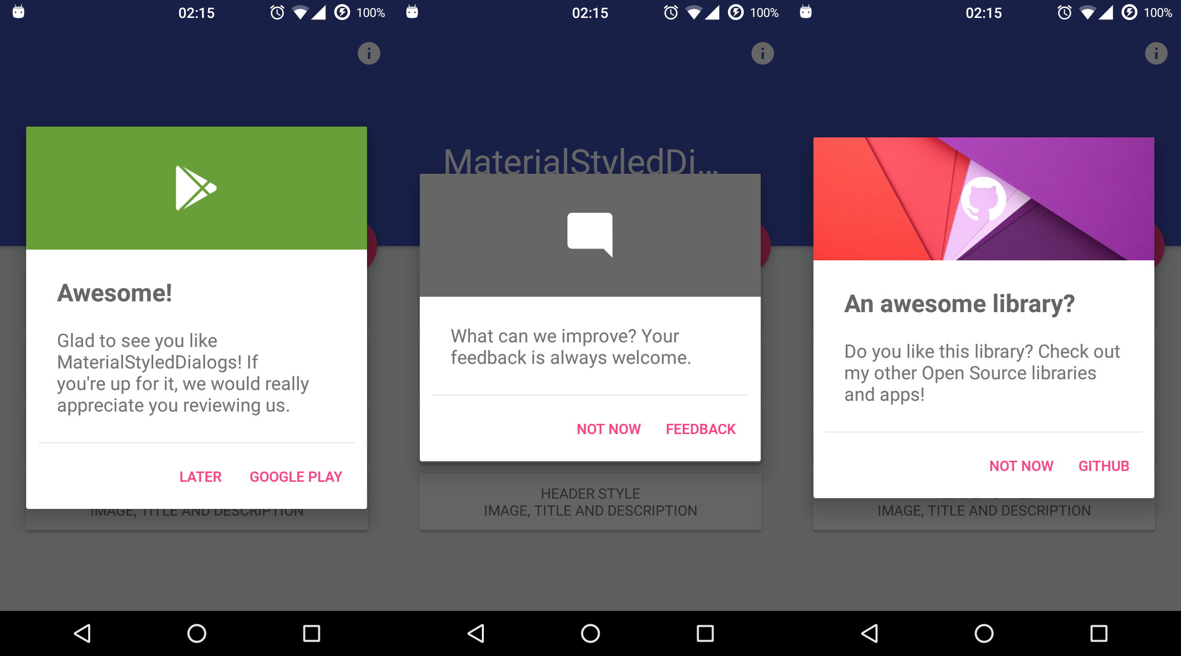
A library that shows a beautiful and customizable Material-based dialog with header. API 14+ required.
Install / Use
/learn @javiersantos/MaterialStyledDialogsREADME
How to include
Add the repository to your project build.gradle:
repositories {
    jcenter()
    maven {
        url "https://jitpack.io"
    }
}
And add the library to your module build.gradle:
AndroidX
dependencies {
    implementation 'com.github.javiersantos:MaterialStyledDialogs:3.0.1'
}
Pre AndroidX (no longer supported)
dependencies {
    implementation 'com.github.javiersantos:MaterialStyledDialogs:2.2'
}
Usage
Basic Dialog
A basic dialog will show the provided title (optional) and description, using your primary color as the header background. You have access to methods such as setTitle(), setContent(), setIcon(), setCancelable(), dismiss(), etc. Customizations are explained below.
MaterialStyledDialog.Builder(this)
	.setTitle("Awesome!")
	.setDescription("What can we improve? Your feedback is always welcome.")
	.show()
new MaterialStyledDialog.Builder(this)
	.setTitle("Awesome!")
	.setDescription("What can we improve? Your feedback is always welcome.")
	.show();
or using the builder...
val dialog = MaterialStyledDialog.Builder(this)
	.setTitle("Awesome!")
	.setDescription("What can we improve? Your feedback is always welcome.")
	.build()
dialog.show()
MaterialStyledDialog dialog = new MaterialStyledDialog.Builder(this)
	.setTitle("Awesome!")
	.setDescription("What can we improve? Your feedback is always welcome.")
	.build();
...
dialog.show();
Customizations (Wiki)
Setting a style
<table align="center"> <tr> <th> <img src="https://raw.githubusercontent.com/javiersantos/MaterialStyledDialogs/master/Screenshots/style-1.png" height="400" /> </td> <th> <img src="https://raw.githubusercontent.com/javiersantos/MaterialStyledDialogs/master/Screenshots/style-2.png" height="400" /> </td> </tr> <tr> <td>Header with Icon (default): .setStyle(Style.HEADER_WITH_ICON)</td> <td>Header with Title: .setStyle(Style.HEADER_WITH_TITLE)</td> </tr> </table>MaterialStyledDialog.Builder(this)
.setTitle("Awesome!")
.setDescription("What can we improve? Your feedback is always welcome.")
.setStyle(Style.HEADER_WITH_ICON)
.show()
new MaterialStyledDialog.Builder(this)
	.setTitle("Awesome!")
	.setDescription("What can we improve? Your feedback is always welcome.")
	.setStyle(Style.HEADER_WITH_ICON)
	//.setStyle(Style.HEADER_WITH_TITLE)
	.show();
Displaying an icon
The dialog icon is displayed in the center of the dialog (as seen it the screenshots).
MaterialStyledDialog.Builder(this)
	.setTitle("Awesome!")
	.setDescription("What can we improve? Your feedback is always welcome.")
	.setIcon(R.drawable.ic_launcher)
	.show()
new MaterialStyledDialog.Builder(this)
	.setTitle("Awesome!")
	.setDescription("What can we improve? Your feedback is always welcome.")
	.setIcon(R.drawable.ic_launcher)
	//.setIcon(ContextCompat.getDrawable(this, R.drawable.ic_launcher))
	.show();
Using a custom header color
By default, your primary color will be used for the header background. However you can customize this by adding:
MaterialStyledDialog.Builder(this)
	.setTitle("Awesome!")
	.setDescription("What can we improve? Your feedback is always welcome.")
	.setHeaderColor(R.color.dialog_header)
	.show()
new MaterialStyledDialog.Builder(this)
	.setTitle("Awesome!")
	.setDescription("What can we improve? Your feedback is always welcome.")
	.setHeaderColor(R.color.dialog_header)
	.show();
Using an image as the header background
Customize your dialog by adding a drawable instead of a color.
MaterialStyledDialog.Builder(this)
	.setTitle("Awesome!")
	.setDescription("What can we improve? Your feedback is always welcome.")
	.setHeaderDrawable(R.drawable.header)
	.show()
new MaterialStyledDialog.Builder(this)
	.setTitle("Awesome!")
	.setDescription("What can we improve? Your feedback is always welcome.")
	.setHeaderDrawable(R.drawable.header)
	//.setHeaderDrawable(ContextCompat.getDrawable(this, R.drawable.heaer))
	.show();
Adding a darker/grey overlay to the header background
Some icons or drawables may fit better when using a darker/grey overlay. Using the .withDarkerOverlay() method the library will apply a color filter to the header background. false by default.
MaterialStyledDialog.Builder(this)
	.setTitle("Awesome!")
	.setDescription("What can we improve? Your feedback is always welcome.")
	.setHeaderDrawable(R.drawable.header)
	.withDarkerOverlay(true)
	.show()
new MaterialStyledDialog.Builder(this)
	.setTitle("Awesome!")
	.setDescription("What can we improve? Your feedback is always welcome.")
	.setHeaderDrawable(R.drawable.header)
	.withDarkerOverlay(true)
	.show();
Adding icon and dialog animations
An animation to the icon will be displayed when the dialog is opened (true by default).
You can also add a custom animation using .setIconAnimation(R.anim.your_animation). A zoom in-out animation will be used by default.
MaterialStyledDialog.Builder(this)
	.setTitle("Awesome!")
	.setDescription("What can we improve? Your feedback is always welcome.")
	.withIconAnimation(true)
	.setIconAnimation(R.anim.your_animation)
	.show()
new MaterialStyledDialog.Builder(this)
	.setTitle("Awesome!")
	.setDescription("What can we improve? Your feedback is always welcome.")
	.withIconAnimation(true)
	.setIconAnimation(R.anim.your_animation)
	.show();
The dialog will be displayed with an animation when it is opened and closed. false by default.
MaterialStyledDialog.Builder(this)
	.setTitle("Awesome!")
	.setDescription("What can we improve? Your feedback is always welcome.")
	.withDialogAnimation(true)
	.show()
new MaterialStyledDialog.Builder(this)
	.setTitle("Awesome!")
	.setDescription("What can we improve? Your feedback is always welcome.")
	.withDialogAnimation(true)
	//.withDialogAnimation(true, Duration.SLOW)
	.show();
Adding buttons and callbacks
Buttons are showed at the end of the bottom dialog. You can add your own text and actions/callbacks.
MaterialStyledDialog.Builder(this)
	.setTitle("Awesome!")
	.setDescription("What can we improve? Your feedback is always welcome.")
	.setPositiveText(R.string.button)
	.onPositive { Log.d("MaterialStyledDialogs", "Do something!"); }
	.show()
new MaterialStyledDialog.Builder(this)
	.setTitle("Awesome!")
	.setDescription("What can we improve? Your feedback is always welcome.")
	.setPositiveText(R.string.button)
	.onPositive(new MaterialDialog.SingleButtonCallback() {
		@Override
		public void onClick(@NonNull MaterialDialog dialog, @NonNull DialogAction which) {
			Log.d("MaterialStyledDialogs", "Do something!");
	})
	//.setNegativeText(...)
	//.onNegative(...)
	//.setNeutralText(...)
	//.onNeutral(...)
	.show();
If no onPositive(...), onNegative(...) or onNeutral(...) callbacks are provided, then the bottom dialog will be dismissed when tapping on the button.
If autoDismiss() is turned false, then you must manually dismiss the dialog in these callbacks. Auto dismiss is true by default.
A divider before the buttons can be added using the .withDivider(true) method (false by default).
Get the buttons of the dialog
If you need to access the buttons of your dialog, you can achieve it like this:
val dialog = MaterialStyledDialog.Builder(this)
	.setTitle("Awesome!")
	.setDescription("This is a sample description.")
	.show()

dialog.positiveButton().text = "Positive"
dialog.negativeButton().text = "Negative"
Dismissing when touching outside
The setCancelable() method lets you disable dismissing the bottom dialog when you tap outside the dialog window. true by default.
MaterialStyledDialog.Builder(this)
	.setTitle("Awesome!")
	.setDescription("What can we improve? Your feedb
Related Skills
diffs
343.3kUse the diffs tool to produce real, shareable diffs (viewer URL, file artifact, or both) instead of manual edit summaries.
clearshot
Structured screenshot analysis for UI implementation and critique. Analyzes every UI screenshot with a 5×5 spatial grid, full element inventory, and design system extraction — facts and taste together, every time. Escalates to full implementation blueprint when building. Trigger on any digital interface image file (png, jpg, gif, webp — websites, apps, dashboards, mockups, wireframes) or commands like 'analyse this screenshot,' 'rebuild this,' 'match this design,' 'clone this.' Skip for non-UI images (photos, memes, charts) unless the user explicitly wants to build a UI from them. Does NOT trigger on HTML source code, CSS, SVGs, or any code pasted as text.
openpencil
1.9kThe world's first open-source AI-native vector design tool and the first to feature concurrent Agent Teams. Design-as-Code. Turn prompts into UI directly on the live canvas. A modern alternative to Pencil.
HappyColorBlend
HappyColorBlendVibe Project Guidelines Project Overview HappyColorBlendVibe is a Figma plugin for color palette generation with advanced tint/shade blending capabilities. It allows designers to
