MdDataTable
Angular data table complete implementation of google material design based on Angular Material components.
Install / Use
/learn @iamisti/MdDataTableREADME
Live demo http://iamisti.github.io/mdDataTable/
Angular material table. Complete implementation of google material design based on angular material components. This component is optimized for speed, and it's faster then other similar implementations, since it generates a native html table, and browsers are optimized for tables.
Angular2 and Angular2 Material version of this plugin is under development. If you want to be notified for the first release, please star the project here:
md-data-table2
Usage statistics


Install
bower install md-data-tableornpm install md-data-tableor download the source.- Make sure the
mdDataTable(notice the camelCase typing) lib is loaded. It's served in three different files:md-data-table-style.css,md-data-table.js,md-data-table-templates.js - Add
mdDataTableas a dependency of your app.
Load it from CDN (with example of version 1.8.0)
https://cdnjs.cloudflare.com/ajax/libs/md-data-table/1.8.0/md-data-table-templates.min.js
https://cdnjs.cloudflare.com/ajax/libs/md-data-table/1.8.0/md-data-table.min.js
https://cdnjs.cloudflare.com/ajax/libs/md-data-table/1.8.0/md-data-table-style.css
UI&UX driven by google data table
http://www.google.com/design/spec/components/data-tables.html
Table of contents
- selectable-rows
- virtual-repeat
- delete-row-callback
- selected-row-callback
- animate-sort-icon
- ripple-effect
- ! title-overflow-handler
- table-card
- paginated-rows
- alternate-headers
- mdt-row
- mdt-row-paginator
- mdt-row-paginator-error-message
- mdt-row-paginator-no-results-message
- mdt-trigger-request
- mdt-translations
- mdt-loading-indicator
Column attributes (mdt-column)
- align-rule
- column-definition
- column-filter
- exclude-from-column-selector
- hide-column-by-default
- table-row-id
- ! inline-menu
- editable-field
- html-content
Custom cell content (mdt-custom-cell)
- column-key
Overview
In its simplest form, a data table contains a top row of column names, and rows for data.
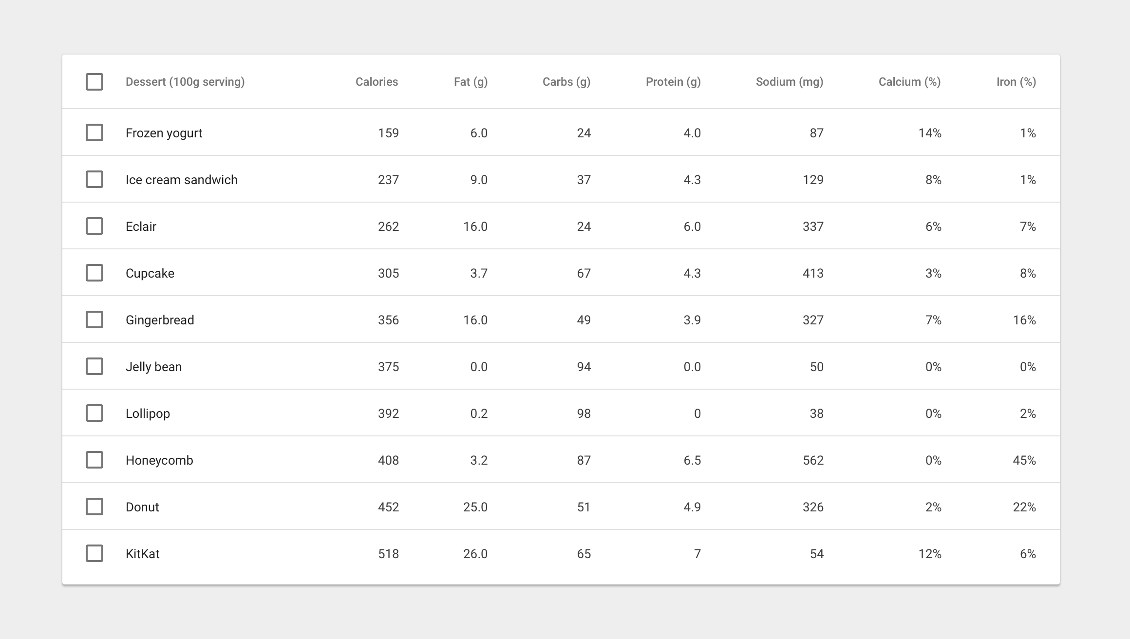
Table attributes
Global attributes for the table
| Available | Params | Type | Details |
| ---------------- | ---------------------------------------------- | ------------- | ------------- |
|:white_check_mark:| selectable-rows | Boolean | optional, checkboxes accompany each row if need to select or manipulate data |
|:white_check_mark:| virtual-repeat | Boolean | optional, when set, virtual scrolling will be applied to the table. You must set a fixed height to the .md-virtual-repeat-container class in order to make it work properly. Since virtual scrolling is working with fixed height. |
|:white_check_mark:| delete-row-callback | Function | optional, callback function when deleting rows. The callback will be called with the array of the deleted row ids. Don't forget to specify table-row-id for mdt-row. If you do, it will return the deleted rows data. |
|:white_check_mark:| selected-row-callback | Function | optional, callback function when selecting rows. The callback will be called with the array of the selected row ids. Don't forget to specify table-row-id for mdt-row. If you do, it will return the selected rows data. |

| Available | Params | Type | Details |
| ---------------- | ---------------------------------------------- | ------------- | ------------- |
|:white_check_mark:| animate-sort-icon | Boolean | optional, if enabled, sort icon will be animated on change |
|:white_check_mark:| ripple-effect | Boolean | optional, if enabled, ripple effect will be applied on the column names when clicked |

| Available | Params | ChildParams | Type | Details |
| ---------------- | ---------------------------------- | ------------------------------- | ------------- | ------------- |
|:x: | title-overflow-handler | | String | optional, Sometimes, column names don’t fit in a container in between columns. There are two options to handle this |
|:x: | | (default) truncateColumnNames | - | Shorten the column name and display it in full on hover |
|:x: | | useHorizontalScrollingOnTable | - | Display the full column name and enable horizontal scrolling in the table container |


| Available | Params | ChildParams | Type | Details |
| -----------------| ------------------------------------------ | ------------------------------- | ------------- | ------------- |
|:white_check_mark:| table-card | | Object | optional, tables can be embedded within a card, with table navigation and data manipulation tools available at the top and bottom. |
|:white_check_mark:| | title | String | The title of the table card |
|:x: | | actionIcons | Boolean | Card action icons (header and footer) |
|:white_check_mark:| | visible | Boolean | The visibility of the table card |
|:white_check_mark:| | columnSelector | Boolean | enables the column selection for the table (you can disable certain columns from the list selection, using exclude-from-column-selector, see the related docs) |

| Available | Params | ChildParams | Type | Details|
| -----------------| ------------------------------------------ | ------------------------------- | ------------- | ------ |
|:white_check_mark:| paginated-rows | | Object | optional, if set, then basic pagination will applied to the bottom of the table. |
|:white_check_mark:| | isEnabled | Boolean | Optional, if provided then basic pagination will applied to the bottom of the table |
|:white_check_mark:| | rowsPerPageValues | Array | Optional, if provided then it will apply the rows per page values from the given arguments. Example: [5,10,20] |
| Available | Params | ChildParams | Type | Details | | ---------------- |----------------------------------- | ------------------------------- | ------------- | ------------- | |:white_check_mark:| alternate-headers | | String | optional, some table cards may require headers with actions instead of titles. Two possible approach
