Dexplot
Simple plotting library that wraps Matplotlib and integrated with DataFrames
Install / Use
/learn @dexplo/DexplotREADME
Dexplot


Dexplot is a Python library for delivering beautiful data visualizations with a simple and intuitive user experience.
Goals
The primary goals for dexplot are:
- Maintain a very consistent API with as few functions as necessary to make the desired statistical plots
- Allow the user tremendous power without using matplotlib
Installation
pip install dexplot
Built for long and wide data
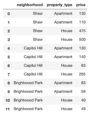
Dexplot is primarily built for long data, which is a form of data where each row represents a single observation and each column represents a distinct quantity. It is often referred to as "tidy" data. Here, we have some long data.
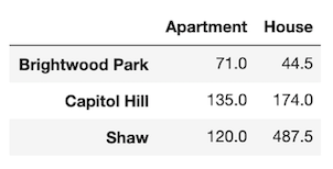
Dexplot also has the ability to handle wide data, where multiple columns may contain values that represent the same kind of quantity. The same data above has been aggregated to show the mean for each combination of neighborhood and property type. It is now wide data as each column contains the same quantity (price).
Usage
Dexplot provides a small number of powerful functions that all work similarly. Most plotting functions have the following signature:
dxp.plotting_func(x, y, data, aggfunc, split, row, col, orientation, ...)
x- Column name along the x-axisy- Column name the y-axisdata- Pandas DataFrameaggfunc- String of pandas aggregation function, 'min', 'max', 'mean', etc...split- Column name to split data into distinct groupsrow- Column name to split data into distinct subplots row-wisecol- Column name to split data into distinct subplots column-wiseorientation- Either vertical ('v') or horizontal ('h'). Default for most plots is vertical.
When aggfunc is provided, x will be the grouping variable and y will be aggregated when vertical and vice-versa when horizontal. The best way to learn how to use dexplot is with the examples below.
Families of plots
There are two primary families of plots, aggregation and distribution. Aggregation plots take a sequence of values and return a single value using the function provided to aggfunc to do so. Distribution plots take a sequence of values and depict the shape of the distribution in some manner.
- Aggregation
- bar
- line
- scatter
- count
- Distribution
- box
- violin
- hist
- kde
Comparison with Seaborn
If you have used the seaborn library, then you should notice a lot of similarities. Much of dexplot was inspired by Seaborn. Below is a list of the extra features in dexplot not found in seaborn
- Ability to graph relative frequency and normalize over any number of variables
- No need for multiple functions to do the same thing (far fewer public functions)
- Ability to make grids with a single function instead of having to use a higher level function like
catplot - Pandas
groupbymethods available as strings - Ability to sort by values
- Ability to sort x/y labels lexicographically
- Ability to select most/least frequent groups
- x/y labels are wrapped so that they don't overlap
- Figure size (plus several other options) and available to change without using matplotlib
- A matplotlib figure object is returned
Examples
Most of the examples below use long data.
Aggregating plots - bar, line and scatter
We'll begin by covering the plots that aggregate. An aggregation is defined as a function that summarizes a sequence of numbers with a single value. The examples come from the Airbnb dataset, which contains many property rental listings from the Washington D.C. area.
import dexplot as dxp
import pandas as pd
airbnb = dxp.load_dataset('airbnb')
airbnb.head()
There are more than 4,000 listings in our dataset. We will use bar charts to aggregate the data.
airbnb.shape
(4581, 12)
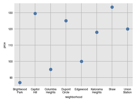
Vertical bar charts
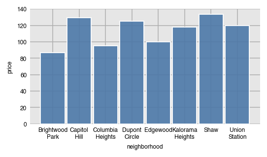
In order to performa an aggregation, you must supply a value for aggfunc. Here, we find the median price per neighborhood. Notice that the column names automatically wrap.
dxp.bar(x='neighborhood', y='price', data=airbnb, aggfunc='median')
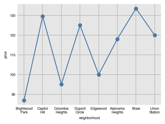
Line and scatter plots can be created with the same command, just substituting the name of the function. They both are not good choices for the visualization since the grouping variable (neighborhood) has no meaningful order.
dxp.line(x='neighborhood', y='price', data=airbnb, aggfunc='median')
dxp.scatter(x='neighborhood', y='price', data=airbnb, aggfunc='median')
Components of the groupby aggregation
Anytime the aggfunc parameter is set, you have performed a groupby aggregation, which always consists of three components:
- Grouping column - unique values of this column form independent groups (neighborhood)
- Aggregating column - the column that will get summarized with a single value (price)
- Aggregating function - a function that returns a single value (median)
The general format for doing this in pandas is:
df.groupby('grouping column').agg({'aggregating column': 'aggregating function'})
Specifically, the following code is executed within dexplot.
airbnb.groupby('neighborhood').agg({'price': 'median'})
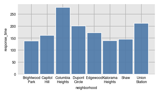
Number and percent of missing values with 'countna' and 'percna'
In addition to all the common aggregating functions, you can use the strings 'countna' and 'percna' to get the number and percentage of missing values per group.
dxp.bar(x='neighborhood', y='response_time', data=airbnb, aggfunc='countna')
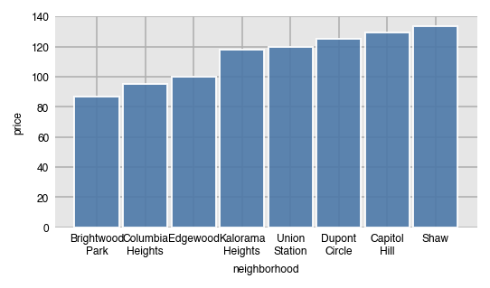
Sorting the bars by values
By default, the bars will be sorted by the grouping column (x-axis here) in alphabetical order. Use the sort_values parameter to sort the bars by value.
- None - sort x/y axis labels alphabetically (default)
asc- sort values from least to greatestdesc- sort values from greatest to least
dxp.bar(x='neighborhood', y='price', data=airbnb, aggfunc='median', sort_values='asc')
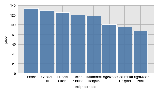
Here, we sort the values from greatest to least.
dxp.bar(x='neighborhood', y='price', data=airbnb, aggfunc='median', sort_values='desc')
Specify order with x_order
Specify a specific order of the labels on the x-axis by passing a list of values to x_order. This can also act as a filter to limit the number of bars.
dxp
Related Skills
node-connect
342.5kDiagnose OpenClaw node connection and pairing failures for Android, iOS, and macOS companion apps
claude-opus-4-5-migration
85.3kMigrate prompts and code from Claude Sonnet 4.0, Sonnet 4.5, or Opus 4.1 to Opus 4.5
frontend-design
85.3kCreate distinctive, production-grade frontend interfaces with high design quality. Use this skill when the user asks to build web components, pages, or applications. Generates creative, polished code that avoids generic AI aesthetics.
model-usage
342.5kUse CodexBar CLI local cost usage to summarize per-model usage for Codex or Claude, including the current (most recent) model or a full model breakdown. Trigger when asked for model-level usage/cost data from codexbar, or when you need a scriptable per-model summary from codexbar cost JSON.
