Ggbump
A geom for ggplot to create bump plots
Install / Use
/learn @davidsjoberg/GgbumpREADME
ggbump <img src="man/figures/logo.png" align="right" />
<!-- badges: start -->![]()
![]()
The R package ggbump creates elegant bump charts in ggplot. Bump
charts are good to use to plot ranking over time, or other examples when
the path between two nodes have no statistical significance. Also
includes functions to create custom smooth lines called sigmoid curves.
Installation
You can install ggbump from CRAN with:
install.packages("ggbump")
Or the latest development version from github with:
devtools::install_github("davidsjoberg/ggbump")
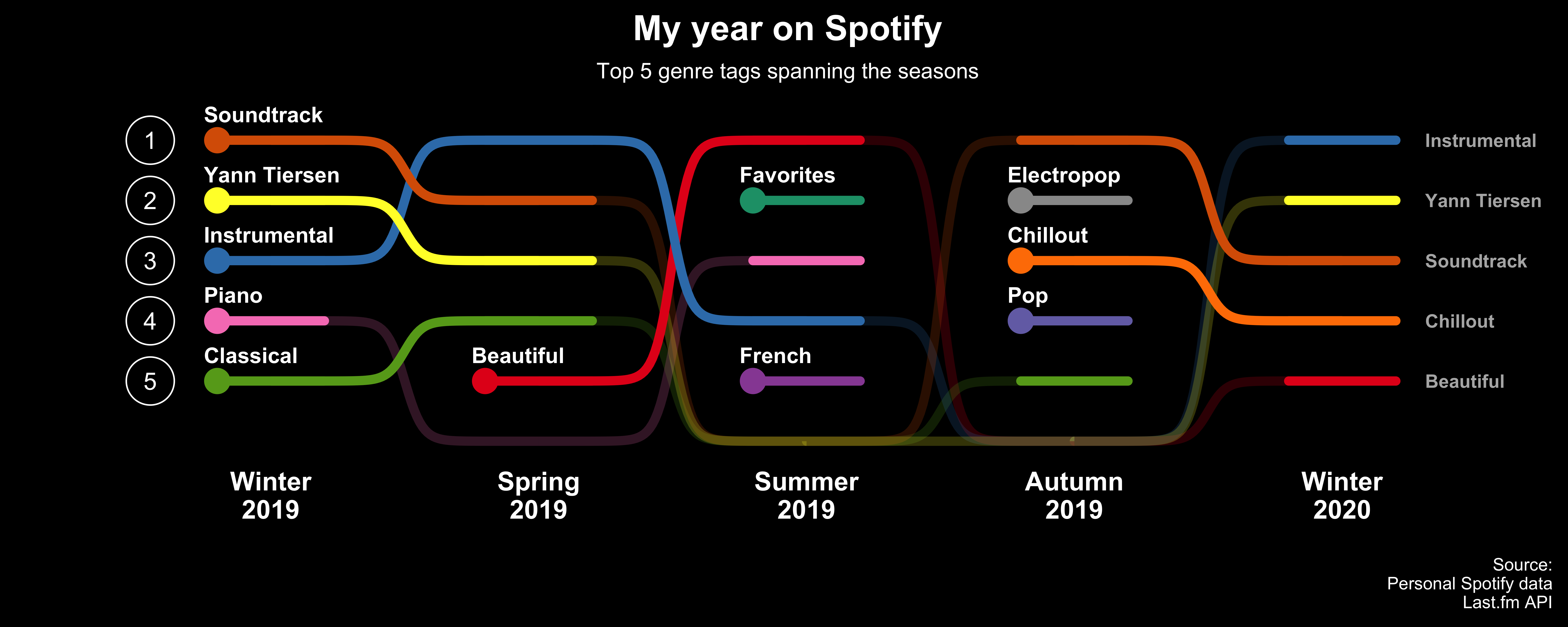
Bump chart examples
Basic example:
<img src="man/figures/README-main_plot-1.png" width="100%" />A more advanced example:
Click here for code to the plot above
Flags could be used instead of names:
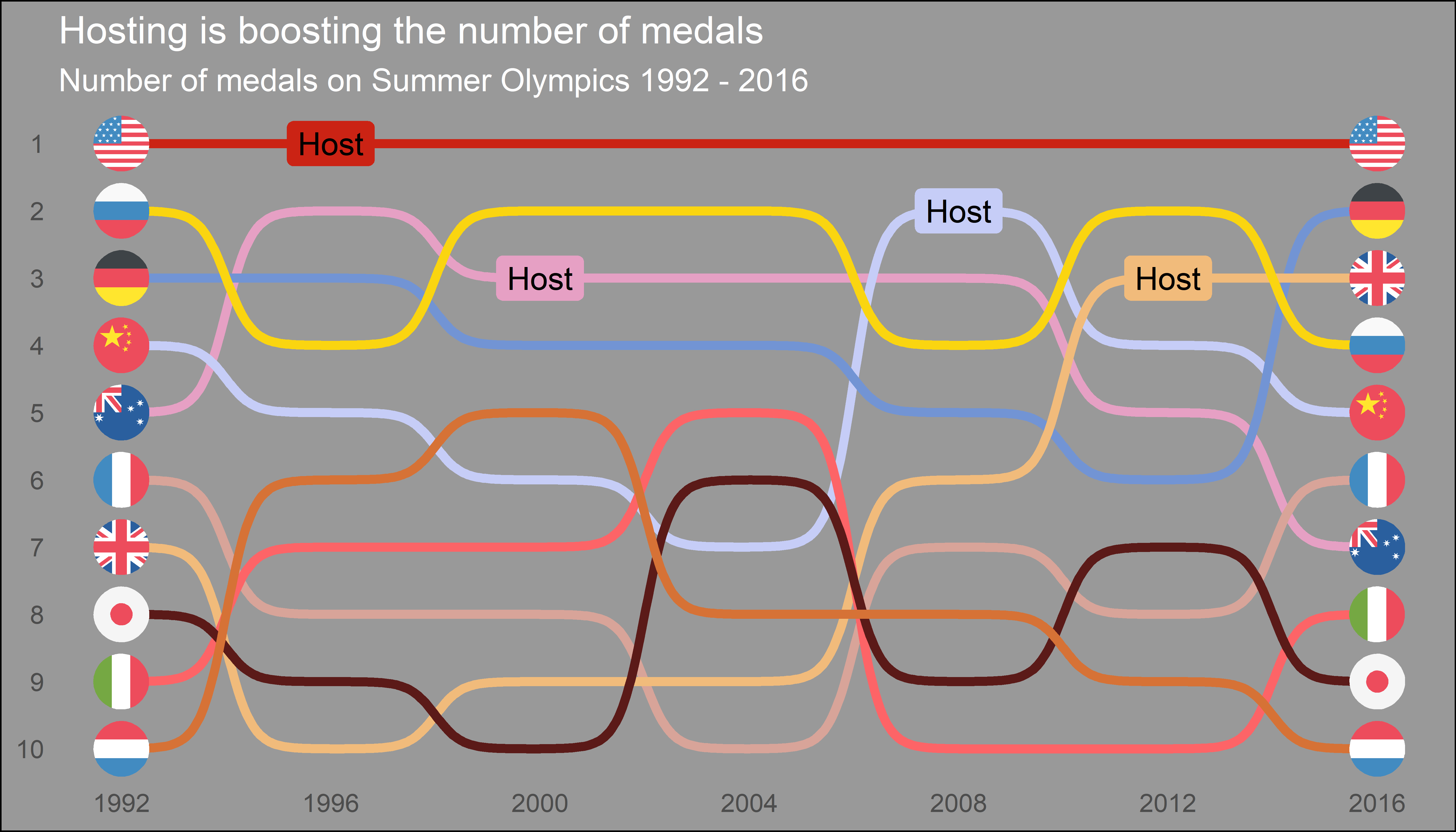
Click here for code to the plot above
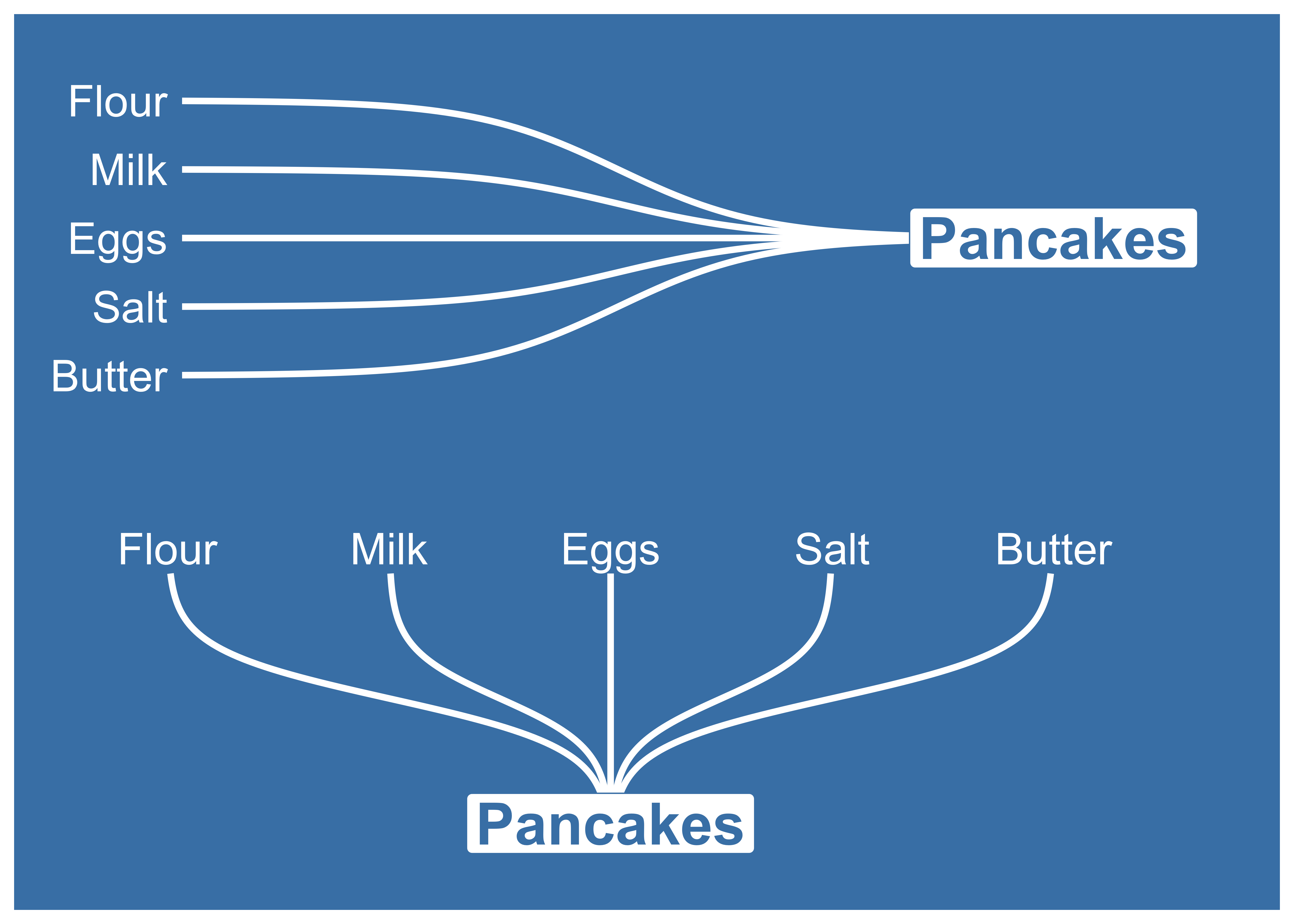
Sigmoid curves examples
With geom_sigmoid you can make custom sigmoid
curves:
Click here for code to the plot above
With geom_sigmoid you have the flexibility to make more complex plots:

Click here for code to the plot above
Tutorial
Prep
Load packages and get some data with rank:
if(!require(pacman)) install.packages("pacman")
library(ggbump)
pacman::p_load(tidyverse, cowplot, wesanderson)

df <- tibble(country = c("India", "India", "India", "Sweden", "Sweden", "Sweden", "Germany", "Germany", "Germany", "Finland", "Finland", "Finland"),
             year = c(2011, 2012, 2013, 2011, 2012, 2013, 2011, 2012, 2013, 2011, 2012, 2013),
             value = c(492, 246, 246, 369, 123, 492, 246, 369, 123, 123, 492, 369))

knitr::kable(head(df))
| country | year | value | | :------ | ---: | ----: | | India | 2011 | 492 | | India | 2012 | 246 | | India | 2013 | 246 | | Sweden | 2011 | 369 | | Sweden | 2012 | 123 | | Sweden | 2013 | 492 |
To create a ranking column we use rank from base R. We specify
ties.method = "random" to make sure that each country have different
rankings if they have the same value.
df <- df %>%
  group_by(year) %>%
  mutate(rank = rank(value, ties.method = "random")) %>%
  ungroup()

knitr::kable(head(df))
| country | year | value | rank | | :------ | ---: | ----: | ---: | | India | 2011 | 492 | 4 | | India | 2012 | 246 | 2 | | India | 2013 | 246 | 2 | | Sweden | 2011 | 369 | 3 | | Sweden | 2012 | 123 | 1 | | Sweden | 2013 | 492 | 4 |
Make a bump chart
Most simple use case:
ggplot(df, aes(year, rank, color = country)) +
    geom_bump()
Pimp the bump chart!
Improve the bump chart by adding:
- A point for each rank observation.
- Choose a minimal theme, I use
theme_minimal_grid()fromcowplot. - Choose nice colors so it does not look generic ggplot. I use a
palette from
wesanderson. - Remove legend and add labels at the start and end of the bumpy ride.
- Reverse the y-axis to get rank 1 at the top.
- Adjust the ‘smoothness’ of the lines by setting
smoothto 8. Higher means less smooth.
ggplot(df, aes(year, rank, color = country)) +
  geom_point(size = 7) +
  geom_text(data = df %>% filter(year == min(year)),
            aes(x = year - .1, label = country), size = 5, hjust = 1) +
  geom_text(data = df %>% filter(year == max(year)),
            aes(x = year + .1, label = country), size = 5, hjust = 0) +
  geom_bump(size = 2, smooth = 8) +
  scale_x_continuous(limits = c(2010.6, 2013.4),
                     breaks = seq(2011, 2013, 1)) +
  theme_minimal_grid(font_size = 14, line_size = 0) +
  theme(legend.position = "none",
        panel.grid.major = element_blank()) +
  labs(y = "RANK",
       x = NULL) +
  scale_y_reverse() +
  scale_color_manual(values = wes_palette(n = 4, name = "GrandBudapest1"))
geom_bump with factors (development version only)
You can use geom_bump with factors or character as x axis. Just
remember to keep an eye on factor order.
# Original df
df <- tibble(season = c("Spring", "Pre-season", "Summer", "Season finale", "Autumn", "Winter",
                        "Spring", "Pre-season", "Summer", "Season finale", "Autumn", "Winter",
                        "Spring", "Pre-season", "Summer", "Season finale", "Autumn", "Winter",
                        "Spring", "Pre-season", "Summer", "Season finale", "Autumn", "Winter"),
             rank = c(1, 3, 4, 2, 1, 4,
                      2, 4, 1, 3, 2, 3,
                      4, 1, 2, 4, 4, 1,
                      3, 2, 3, 1, 3, 2),
             player = c(rep("David", 6),
                        rep("Anna", 6),
                        rep("Franz", 6),
                        rep("Ika", 6)))

# Create factors and order factor
df <- df %>%
  mutate(season = factor(season, levels = unique(season)))

# Add manual axis labels to plot
ggplot(df, aes(season, rank, color = player)) +
  geom_bump(size = 2, smooth = 20, show.legend = F) +
  geom_point(size = 5, aes(shape = player)) +
  theme_minimal_grid(font_size = 10, line_size = 0) +
  theme(panel.grid.major = element_blank(),
        axis.ticks = element_blank()) +
  scale_color_manual(values = wes_palette(n = 4, name = "IsleofDogs1"))
Feedback
If you find any error or have suggestions for improvements you are more than welcome to contact me :)
Related Skills
node-connect
334.5kDiagnose OpenClaw node connection and pairing failures for Android, iOS, and macOS companion apps
frontend-design
82.2kCreate distinctive, production-grade frontend interfaces with high design quality. Use this skill when the user asks to build web components, pages, or applications. Generates creative, polished code that avoids generic AI aesthetics.
openai-whisper-api
334.5kTranscribe audio via OpenAI Audio Transcriptions API (Whisper).
commit-push-pr
82.2kCommit, push, and open a PR
