Neumorphic
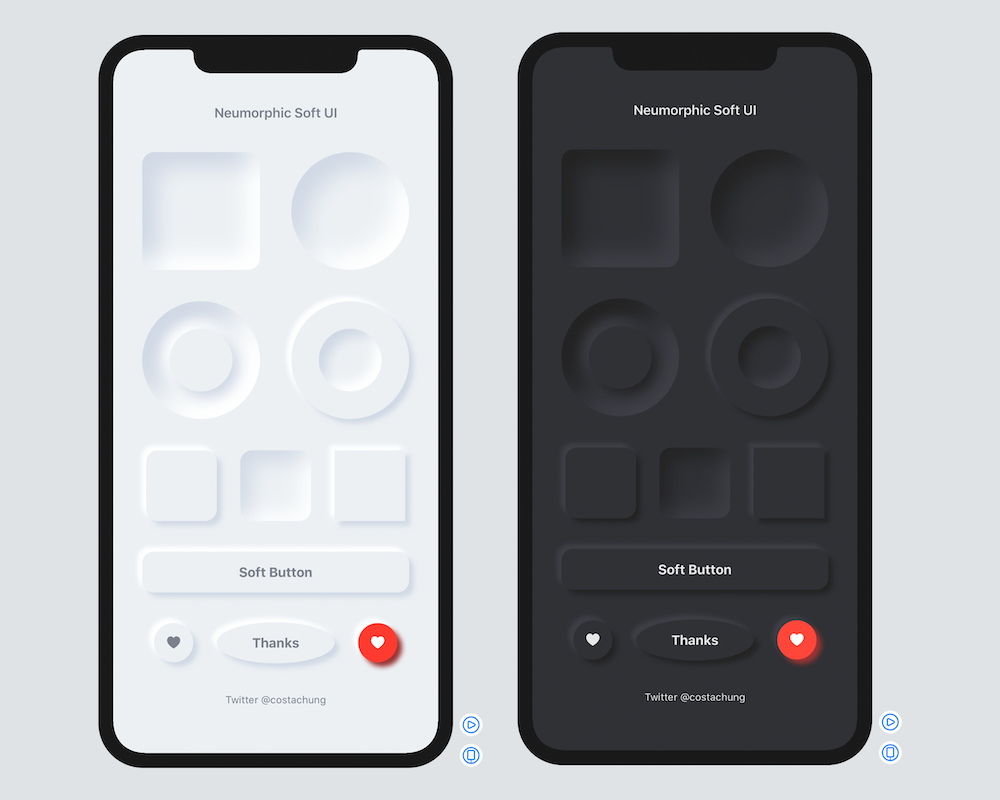
🚀Neumorphic is a SwiftUI utility to build Neumorphism Soft UI (supports both *outer shadow and *inner shadow)
Install / Use
/learn @costachung/NeumorphicREADME
Neumorphic SwiftUI : Neumorphism Soft UI
Neumorphic is a SwiftUI utility to build Neumorphism Soft UI easily using custom view modifier and custom button style. It supports all shapes.
Hi, I’m Costa. It is simple to create outer shadow in SwiftUI by writing two lines of code. However, we can’t easily create inner shadow in SwiftUI. That’s the reason why I build this tool to make it simple and reusable.
Installation
Requirements .iOS(.v13),.macOS(.v10_15)
Swift Package Manager
- In Xcode, open your project and navigate to File → Swift Packages → Add Package Dependency.
- Paste the repository URL (https://github.com/costachung/neumorphic/) and click Next.
- For Rules, select version.
- Click Finish.
Swift Package
.package(url: "https://github.com/costachung/neumorphic/", .upToNextMajor(from: "2.0.5"))
Usage
Import Neumorphic package to your view.
import Neumorphic
Simply use .softOuterShadow and .softInnerShadow methods to create outer shadow and inner shadow respectively.
Create Rounded Rectangle with Outer Shadow

RoundedRectangle(cornerRadius: 20).fill(Color.Neumorphic.main).softOuterShadow()
Create Rounded Rectangle with Inner Shadow

RoundedRectangle(cornerRadius: 20).fill(Color.Neumorphic.main).softInnerShadow(RoundedRectangle(cornerRadius: 20))
Create Circles

  HStack {
      Circle().fill(Color.Neumorphic.main).softOuterShadow()
      Circle().fill(Color.Neumorphic.main).softInnerShadow(Circle())
  }
Create Soft Button

Button(action: {}) {
    Text("Soft Button").fontWeight(.bold)
}
.softButtonStyle(RoundedRectangle(cornerRadius: 20))
Create Soft Button with custom style

HStack {
    Button(action: {}) {
        Image(systemName: "heart.fill")
    }.softButtonStyle(Circle())

    Button(action: {}) {
        Image(systemName: "heart.fill")
    }.softButtonStyle(Circle(), mainColor: Color.red, textColor: Color.white, darkShadowColor: Color(rgb: 0x993333, alpha: 1), lightShadowColor:Color("redButtonLightShadow"))
}
Customization
softInnerShadow
You can change the color, spread of the shadow, and the shadow radius of the inner shadow.
softInnerShadow<S : Shape>(_ content: S, darkShadow: Color, lightShadow: Color, spread: CGFloat, radius: CGFloat)
softOuterShadow
You can change the color, offset of the shadow, and the shadow radius of the outer shadow.
softOuterShadow(darkShadow: Color, lightShadow: Color, offset: CGFloat, radius:CGFloat)

Example of using background method to add it under TextField:
            VStack {
                HStack {
                    Image(systemName: "magnifyingglass").foregroundColor(secondaryColor).font(Font.body.weight(.bold))
                    TextField("Search ...", text: $name).foregroundColor(secondaryColor)
                }
                .padding()
                .background(
                    RoundedRectangle(cornerRadius: 30).fill(mainColor)
                    .softInnerShadow(RoundedRectangle(cornerRadius: 30), darkShadow: darkShadowColor, lightShadow: lightShadowColor, spread: 0.05, radius: 2)
                )
            }
            .padding()
Or, something like this:

ZStack(alignment: .bottom){
                RoundedRectangle(cornerRadius: 20).fill(mainColor)
                .softInnerShadow(RoundedRectangle(cornerRadius: 20), darkShadow: darkShadow, lightShadow: lightShadow, spread: 0.3, radius: 2)
                .frame(width: 30, height:150)

                RoundedRectangle(cornerRadius: 20).fill(barColor)
                    .frame(width: 30, height:100)
            }
Example Project
Check out the neumorphic-examples XCode project to see how to build neumorphic UI and buttons. If you use the default shadow colors of Neumorphic, you can also get dark mode support for free.
Soft Button Style Customization
softButtonStyle<S : Shape>(_ content: S, padding: CGFloat, mainColor: Color, textColor: Color, darkShadowColor: Color, lightShadowColor: Color, pressedEffect: SoftButtonPressedEffect)
Soft Button - Pressed Effects

                    HStack {
                        Spacer()
                        Button(action: {}) {
                            Text(".none").fontWeight(.bold)
                        }.softButtonStyle(Capsule(), pressedEffect: .none)
                        Spacer()
                        Button(action: {}) {
                            Text(".flat").fontWeight(.bold)
                        }.softButtonStyle(Capsule(), pressedEffect: .flat)
                        Spacer()
                        Button(action: {}) {
                            Text(".hard").fontWeight(.bold)
                        }.softButtonStyle(Capsule(), pressedEffect: .hard)
                        Spacer()
                    }
Soft Toggle
SoftSwitchToggleStyle

Toggle("Toggle", isOn: $toggleIsOn)
  .softSwitchToggleStyle(tint: .green, labelsHidden: true)
SoftToggleStyle

For example, Play and Stop Button
    Toggle(isOn: $toggleIsOn, label: {
        if toggleIsOn {
            Image(systemName: "stop.fill")
                .font(.title)
        }
        else{
            Image(systemName: "play.fill")
                .font(.title)
        }
    })
    .softToggleStyle(Circle(), padding: 20)
Auto, Light, and Dark Mode for iOS and MacOS
Default Neumorphic Colors
Access default neumorphic colors using Color.Neumorphic, for example,
Color.Neumorphic.main
Auto ColorScheme
- Color.Neumorphic supports light and dark mode on both iOS and MacOS automatically by default.
Set the color scheme manually
- When you use default neumorphic colors and you want to set the color scheme manually, you can do it by setting Color.Neumorphic.colorSchemeType to the type you want. For example, to force the color scheme in dark mode, use:
Color.Neumorphic.colorSchemeType = .dark
Contacts
https://twitter.com/costachung
License
Neumorphic Package is released under the MIT license. See the LICENSE file for more info.
Related Skills
openhue
345.4kControl Philips Hue lights and scenes via the OpenHue CLI.
sag
345.4kElevenLabs text-to-speech with mac-style say UX.
weather
345.4kGet current weather and forecasts via wttr.in or Open-Meteo
tweakcc
1.5kCustomize Claude Code's system prompts, create custom toolsets, input pattern highlighters, themes/thinking verbs/spinners, customize input box & user message styling, support AGENTS.md, unlock private/unreleased features, and much more. Supports both native/npm installs on all platforms.
