Timelines
A powerful & easy to use timeline package for Flutter! 🚀
Install / Use
/learn @chulwoo-park/TimelinesREADME

Caveat: This package is an early stage. Not enough testing has been done to guarantee stability. Some APIs may change.
Examples
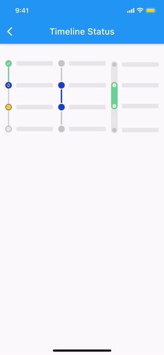
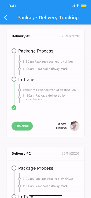
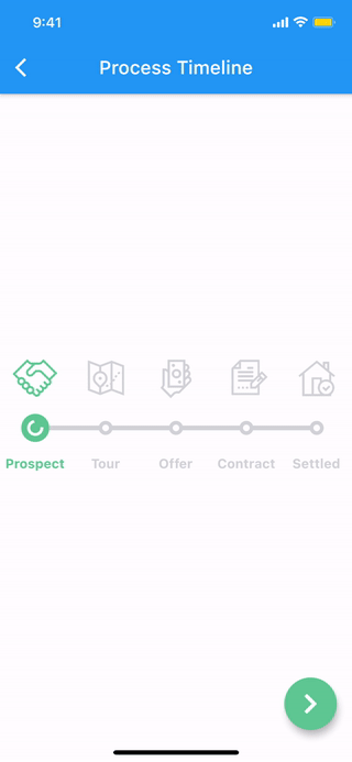
Check it out on the web or look at the source code.
| Timeline status | Package delivery tracking | Process timeline |
| - | - | - |
|  |
|  |
|  |
|
Features
The timeline and each components are all WIDGET.
- Common styles can be easily implemented with predefined components.
- Vertical, horizontal direction.
- Alternating contents.
- Combination with Flutter widgets(Row, Column, CustomScrollView, etc).
- Customize each range with themes.
Getting started
Installation
1. Depend on it
Add this to your package's pubspec.yaml file:
dependencies:
  timelines: ^[latest_version]
2. Install it
You can install packages from the command line:
with Flutter:
$ flutter pub get
Alternatively, your editor might support flutter pub get. Check the docs for your editor to learn more.
3. Import it
Now in your Dart code, you can use:
import 'package:timelines/timelines.dart';
Basic Usage
@override
Widget build(BuildContext context) {
  return Timeline.tileBuilder(
    builder: TimelineTileBuilder.fromStyle(
      contentsAlign: ContentsAlign.alternating,
      contentsBuilder: (context, index) => Padding(
        padding: const EdgeInsets.all(24.0),
        child: Text('Timeline Event $index'),
      ),
      itemCount: 10,
    ),
  );
}
Check the Example or the API reference for more details.
Components
Theme
Check out Theme Demo to see how the values inside TimelineTile work with the theme.
To customize the timeline component with a theme, do the following:
TimelineTheme(
  data: TimelineThemeData(...),
  child: DotIndicator(...),
);
If you only want to change part of the parent theme, use TimelineTheme.of(context):
TimelineTheme(
  data: TimelineThemeData.of(context).copyWith(...),
  child: DotIndicator(...),
);
If the component you want to customize is Timeline or FixedTimeline, this is also possible:
FixedTimeline(
  theme: TimelineThemeData(...),
  children: [...],
);
Indicator
<table> <th colspan="2">ContainerIndicator</th> <tr> <td align="center"> <img src="https://raw.github.com/chulwoo-park/timelines/main/screenshots/container_indicator.png" alt="ContainerIndicator"> </td> <td> <pre lang="dart"> ContainerIndicator( child: Container( width: 15.0, height: 15.0, color: Colors.blue, ), )</pre> </td> </tr> <th colspan="2">DotIndicator</th> <tr> <td align="center"> <img src="https://raw.github.com/chulwoo-park/timelines/main/screenshots/dot_indicator.png" alt="DotIndicator"> </td> <td><pre lang="dart">DotIndicator()</pre></td> </tr> <th colspan="2">OutlinedDotIndicator</th> <tr> <td align="center"> <img src="https://raw.github.com/chulwoo-park/timelines/main/screenshots/outlined_dot_indicator.png" alt="OutlinedDotIndicator"> </td> <td><pre lang="dart">OutlinedDotIndicator()</pre></td> </tr> </table>Connector
<table> <th colspan="2">SolidLineConnector</th> <tr> <td align="center"> <img src="https://raw.github.com/chulwoo-park/timelines/main/screenshots/solid_line_connector.png" alt="SolidLineConnector"> </td> <td> <pre lang="dart"> SizedBox( height: 20.0, child: SolidLineConnector(), )</pre> </td> </tr> <th colspan="2">DashedLineConnector</th> <tr> <td align="center"> <img src="https://raw.github.com/chulwoo-park/timelines/main/screenshots/dashed_line_connector.png" alt="DashedLineConnector"> </td> <td> <pre lang="dart"> SizedBox( height: 20.0, child: DashedLineConnector(), )</pre> </td> </tr> <th colspan="2">DecoratedLineConnector</th> <tr> <td align="center"> <img src="https://raw.github.com/chulwoo-park/timelines/main/screenshots/decorated_line_connector.png" alt="DecoratedLineConnector"> </td> <td> <pre lang="dart"> SizedBox( height: 20.0, child: DecoratedLineConnector( decoration: BoxDecoration( gradient: LinearGradient( begin: Alignment.topCenter, end: Alignment.bottomCenter, colors: [Colors.blue, Colors.lightBlueAccent[100]], ), ), ), )</pre> </td> </tr> </table>TimelineNode
Pure timeline UI component with no content.
The TimelineNode contains an indicator and two connectors on both sides of the indicator:
<table> <th colspan="2">Simple TimelineNode</th> <tr> <td align="center"> <img src="https://raw.github.com/chulwoo-park/timelines/main/screenshots/simple_timeline_node.png" alt="Simple TimelineNode"> </td> <td> <pre lang="dart"> SizedBox( height: 50.0, child: TimelineNode.simple(), )</pre> </td> </tr> <th colspan="2">Complex TimelineNode</th> <tr> <td align="center"> <img src="https://raw.github.com/chulwoo-park/timelines/main/screenshots/complex_timeline_node.png" alt="Complex TimelineNode"> </td> <td> <pre lang="dart"> SizedBox( height: 80.0, child: TimelineNode( indicator: Card( margin: EdgeInsets.zero, child: Padding( padding: EdgeInsets.all(8.0), child: Text('Complex'), ), ), startConnector: DashedLineConnector(), endConnector: SolidLineConnector(), ), )</pre> </td> </tr> </table>TimelineTile
Displays content on both sides of the node:
<table> <th colspan="2">TimelineTile</th> <tr> <td align="center"> <img src="https://raw.github.com/chulwoo-park/timelines/main/screenshots/timeline_tile.png" alt="TimelineTile"> </td> <td> <pre lang="dart"> TimelineTile( oppositeContents: Padding( padding: const EdgeInsets.all(8.0), child: Text('opposite\ncontents'), ), contents: Card( child: Container( padding: EdgeInsets.all(8.0), child: Text('contents'), ), ), node: TimelineNode( indicator: DotIndicator(), startConnector: SolidLineConnector(), endConnector: SolidLineConnector(), ), )</pre> </td> </tr> </table>TimelineTileBuilder
TimelineTileBuilder provides powerful build features.
Connection
Each tile draws only half of the line connecting the neighboring tiles.
Using the connected constructor, lines connecting adjacent tiles can build as one index.
ContentsAlign
This value determines how the contents of the timeline will be built:
<table> <th colspan="2">ContentsAlign.basic</th> <tr> <td align="center"> <img src="https://raw.github.com/chulwoo-park/timelines/main/screenshots/contents_align_basic.png" alt="Basic contents align"> </td> <td> <pre lang="dart"> F