FlexLayout
Docking Layout Manager for React
Install / Use
/learn @caplin/FlexLayoutREADME
FlexLayout


FlexLayout is a layout manager that arranges React components in multiple tabsets, tabs can be resized and moved.

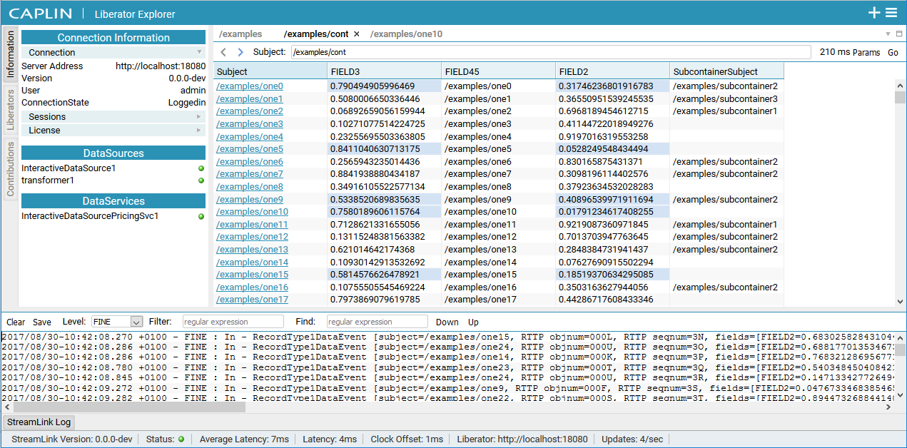
Try it now using CodeSandbox
Screenshot of Caplin Liberator Explorer using FlexLayout
FlexLayout's only dependency is React.
Features:
- splitters
- tabs (scrolling or wrapped)
- tab dragging and ordering
- tabset dragging (move all the tabs in a tabset in one operation)
- dock to tabset or edge of frame
- maximize tabset (double click tabset header or use icon)
- tab overflow (show menu when tabs overflow, scroll tabs using mouse wheel)
- border tabsets
- popout tabs into new browser windows
- submodels, allow layouts inside layouts
- tab renaming (double click tab text to rename)
- theming - light, dark, underline, gray, rounded and combined
- works on mobile devices (iPad, Android)
- add tabs using drag, add to active tabset, add to tabset by id
- tab and tabset attributes: enableTabStrip, enableDock, enableDrop...
- customizable tabs and tabset rendering
- component state is preserved when tabs are moved
- Playwright tests
- typescript type declarations
Installation
FlexLayout is in the npm repository. install using:
npm install flexlayout-react
Import FlexLayout in your modules:
import {Layout, Model} from 'flexlayout-react';
Include the light, dark, underline, gray, rounded or combined theme by either:
Adding an import in your js code:
import 'flexlayout-react/style/light.css';
or by copying the relevant css from the node_modules/flexlayout-react/style directory to your public assets folder (e.g. public/style) and linking the css in your html:
<link rel="stylesheet" href="/style/light.css" />
How to change the theme dynamically in code
Usage
The <Layout> component renders the tabsets and splitters, it takes the following props:
Required props:
| Prop | Description | | --------------- | ----------------- | | model | the layout model | | factory | a factory function for creating React components |
Additional optional props
The model is tree of Node objects that define the structure of the layout.
The factory is a function that takes a Node object and returns a React component that should be hosted by a tab in the layout.
The model can be created using the Model.fromJson(jsonObject) static method, and can be saved using the model.toJson() method.
Example Configuration:
const json = {
    global: {},
    borders: [],
    layout: {
        type: "row",
        weight: 100,
        children: [
            {
                type: "tabset",
                weight: 50,
                children: [
                    {
                        type: "tab",
                        name: "One",
                        component: "placeholder",
                    }
                ]
            },
            {
                type: "tabset",
                weight: 50,
                children: [
                    {
                        type: "tab",
                        name: "Two",
                        component: "placeholder",
                    }
                ]
            }
        ]
    }
};
Example Code
const model = Model.fromJson(json);

function App() {

  const factory = (node) => {
    const component = node.getComponent();

    if (component === "placeholder") {
      return <div>{node.getName()}</div>;
    }
  }

  return (
    <Layout
      model={model}
      factory={factory} />
  );
}
The above code would render two tabsets horizontally each containing a single tab that hosts a div component (returned from the factory). The tabs could be moved and resized by dragging and dropping. Additional tabs could be added to the layout by sending actions to the model.
<img src="screenshots/Screenshot_two_tabs.png?raw=true" alt="Simple layout" title="Generated Layout"/>Try it now using CodeSandbox
A simple Typescript example can be found here:
https://github.com/nealus/flexlayout-vite-example
The model json contains 4 top level elements:
- global - (optional) where global options are defined
- layout - where the main row/tabset/tabs layout hierarchy is defined
- borders - (optional) where up to 4 borders are defined ("top", "bottom", "left", "right").
- popouts - (optional) where the popout windows are defined
The layout element is built up using 3 types of 'node':
-
row - rows contains a list of tabsets and child rows, the top level 'row' will render horizontally (unless the global attribute rootOrientationVertical is set) , child 'rows' will render in the opposite orientation to their parent row.
-
tabset - tabsets contain a list of tabs and the index of the selected tab
-
tab - tabs specify the name of the component that they should host (that will be loaded via the factory) and the text of the actual tab.
The layout structure is defined with rows within rows that contain tabsets that themselves contain tabs.
Within the demo app you can show the layout structure by ticking the 'Show layout' checkbox, rows are shown in blue, tabsets in orange.

The optional borders element is made up of border nodes
- border - borders contain a list of tabs and the index of the selected tab, they can only be used in the borders top level element.
The tree structure for the JSON model is well defined as Typescript interfaces, see JSON Model
Each type of node has a defined set of requires/optional attributes.
Weights on rows and tabsets specify the relative weight of these nodes within the parent row, the actual values do not matter just their relative values (ie two tabsets of weights 30,70 would render the same if they had weights of 3,7).
NOTE: the easiest way to create your initial layout JSON is to use the demo app, modify one of the existing layouts by dragging/dropping and adding nodes then press the 'Show Layout JSON in console' button to print the JSON to the browser developer console.
By changing global or node attributes you can change the layout appearance and functionality, for example:
Setting tabSetEnableTabStrip:false in the global options would change the layout into a multi-splitter (without tabs or drag and drop).
global: {tabSetEnableTabStrip:false},
Dynamically Changing the Theme
The 'combined.css' theme contains all the other themes and can be used for theme switching.
When using combined.css, add a className (of the form "flexlayout__theme_[theme name]") to the div containing the <Layout> to select the applied theme.
For example:
    <div ref={containerRef} className="flexlayout__theme_light">
        <Layout model={model} factory={factory} />
    </div>
Change the theme in code by changing the className on the containing div.
For example:
containerRef.current!.className = "flexlayout__theme_dark"
Customizing Tabs
You can use the <Layout> prop onRenderTab to customize the tab rendering:
<img src="screenshots/Screenshot_customize_tab.png?raw=true" alt="FlexLayout Tab structure" title="Tab structure"/>
Update the renderValues parameter as needed:
renderValues.leading : the red block
renderValues.content : the green block
renderValues.buttons : the yellow block
For example:
onRenderTab = (node: TabNode, renderValues: ITabRenderValues) => {
    // renderValues.leading = <img style={{width:"1em", height:"1em"}}src="images/folder.svg"/>;
    // renderValues.content += " *";
    renderValues.buttons.push(<img key="menu" style={{width:"1em", height:"1em"}} src="images/menu.svg"/>);
}
Customizing Tabsets
You can use the <Layout> prop onRenderTabSet to customize the tabset rendering:
<img src="screenshots/Screenshot_customize_tabset.png?raw=true" alt="FlexLayout Tab structure" title="Tabset structure" />
Update the renderValues parameter as needed:
renderValues.leading : the blue block
renderValues.stickyButtons : the red block
renderValues.buttons : the green block
For example:
onRenderTabSet = (node: (TabSetNode | BorderNode), renderValues: ITabSetRenderValues) => {
    renderValues.stickyButtons.push(
        <button
            key="Add"
            title="Add"
            className="flexlayout__tab_toolbar_button"
            onClick={() => {
                model.doAction(Actions.addNode({
                    component: "placeholder",
                    name: "Added " + nextAddIndex.current++
                }, node.getId(), DockLocation.CENTER, -1, true));
            }}
        ><AddIcon/></button>);

    renderValues.buttons.push(<img key="menu" style={{width:"1em", height:"1em"}} src="images/menu.svg"/>);
}
Model Actions
Once the model json has been loaded all changes to the model are applied through actions.
You apply actions using the Model.doAction() method.
This method takes a single argument, created by one of the action
generators (accessed as FlexLayout.Actions.<actionName>):
[Actions doc](https:
