Vidify
Vidify is a modern, customizable video player for React applications, designed to provide seamless video playback and a personalized UI experience.
Install / Use
/learn @braiekhazem/VidifyREADME
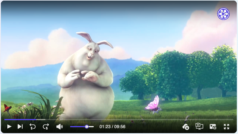
🔗 🚀 Live Demo: Demo
✨ Features
- 📹 Video player component that provides consistent UI/UX on different browsers.
- 🎨 Super customizable layout.
- 🎥 Enhanced Playback Speed Control with Custom Options
- 📝 Provide tools for users to add annotations.
- 🔄 Vidify supports passing an array of video sources.
- 📱 Flexbox css with SVG icons. Mobile friendly.
- 🎨 Provide options for users to customize the primary color.
- ♿️ Accessibility supported, keyboards events supported.
- ✔️ Vidify offers all the essential features expected from a modern video player.
- 🛠️ Customize the control bar, progress bar, and more to match your a- pplication's design and user experience requirements.
- 🎮 Define states and actions to control Vidify with your own user interface elements.
- 📋 Vidify supports customizable ccontrol bar for enhanced user interaction.
- 🎬 Interactive Play Triggers (Hover, Click...).
- 🚫 Tailored Error Components for Enhanced User Experience
- 🎨 Customizable UI icons.
- 🌐 Multilingual Support (en, ar, fr) for Global Reach.
- 🎞 Dynamic Video Filter Customization (Opacity, Saturation, Blur...).
- 🍔 Context Menu Customization for Precise User Interactions.
- ⏳ Custom Loader Options for Smooth User Engagement.
- 💻 Written in TypeScript.
📦 Install
You can install Vidify via npm:
npm i vidify
Or using yarn:
yarn add vidify
🔨 Usage
import { VideoPlayer } from "vidify";

const MyVideoPlayer = ({ src }) => (
  <VideoPlayer src={src} autoplay className="my-video-player" />
);

export default MyVideoPlayer;
⌨️ Keyboard shortcuts (When video player focused)
| Key binding | Action | | ----------- | ----------------- | | Space or K | Play/Pause | | shift + P | Next video | | shift + N | Previous video | | shift + D | Download | | shift + S | Screenshot | | ← | Rewind | | → | Forward | | ↑ | Volume up | | ↓ | Volume down | | M | Toggle mute | | F | Toggle fullscreen |
🛠️ Props
🏷️ HTML Video Tag Native Attributes
| Props | Type | Default | Note | | ----------- | ----------------------------- | ----------- | ---- | | src | string| string[] | '' | | | preload | 'auto'| 'metadata' | 'none' | 'auto' | | | autoPlay | boolean | false | | | loop | boolean | false | | | muted | boolean | false | | | volume | number | 1.0 | | | crossOrigin | string | 'anonymous' | |
More attributes details : Vidify props attributes
🛠️ Vidify Props
| Prop | Type | Description | | -------------------- | --------------------------------------------------- | --------------------------------------------------------------------------------- | | src | string | string[] | The source(s) of the video file(s). | | defaultSrcIndex | number | The index of the default source to play. | | startTime | number | The time (in seconds) to start playing the video from. | | children | React.ReactNode | Child elements to be rendered within the video player component. | | className | string | Additional CSS class(es) to apply to the video player component. | | id | string | The unique identifier of the video player component. | | primaryColor | string | The primary color used for styling the video player interface. | | annotation | ReactNode | Additional content (such as text or icons) to be displayed on the video player. | | annotationStyle | CSSProperties | CSS styles to apply to the annotation content. | | width | string | The width of the video player. | | height | string | The height of the video player. | | durationType | "remainingTime" | "default" | The type of duration display for the video player. | | placeholder | string | The URL of an image to display as a placeholder before the video loads. | | title | string | The title of the video player. | | style | CSSProperties | Custom CSS styles to apply to the video player. | | controller | contextmenu | boolean | contextmenuRender | Configurations for the control bar of the video player. | | volume | number | The volume level of the video player (0 to 1). | | paused | boolean | Whether the video is paused or not. | | poster | string | The URL of an image to display as the video poster. | | thumbnail | string | The URL of an image to display as the video thumbnail. | | autoPlay | boolean | Whether the video should automatically start playing when loaded. | | playbackRate | number | The playback rate of the video (e.g., 1 for normal speed, 2 for double speed). | | playsInline | boolean | Whether the video should play inline (e.g., in the same layout as other content). | | preload | string | Specifies how the video should be loaded when the page loads. | | crossOrigin | "anonymous" | "use-credentials" | "" | undefined | The CORS setting for the video resource. | | loop | boolean | Whether the video should loop playback. | | muted | boolean | Whether the video should be muted. | | containerRef | React.Ref<any> | Reference to the container element of the video player. | | block | boolean | Whether the video player should be displayed full width or not. | | rounded | boolean | | lang | "ar" | "en" | "fr" | Specifies the language for video captions and UI elements. | | playOn | "click" | "hover" | "focus" | "visible" | Determines when the video starts playing. | | customLoader | ReactNode | | | error | errorOtions | Options for handling and displaying video playback errors. | | customIcons | ICustomIcons | Custom icons to replace default icons in the video player UI. | | contextMenu | itemMenu[ ] | Array of items for the context menu. | | enableContextMenu
