C3PyO
Python wrapper for the c3 javascript plotting library
Install / Use
/learn @benalexkeen/C3PyOREADME
C3PyO - Easy Interactive Charts


C3PyO is a python wrapper for the data visualisation library C3.js It will provide a framework for including dynamic graphs in your python web projects.
There is an example of usage in a flask application in the examples directory.
| Description | Python wrapper for the C3.js graph library | |-------------|------------------------------------------------------------------| | Docs | Click Here for Docs | | C3.js | http://c3js.org/ | | Maintainers | benalexkeen |
Installation
pip install c3pyo
Then have a go at some of the commands below (Note that the images shown are static but the graphs are interactive)
Line Chart
x = [1, 2, 3, 4, 5]
y1 = [1,2,4,24,48]
y2 = [2, 4, 8, 48, 96]

import c3pyo as c3
chart = c3.LineChart()
chart.plot(x, y1, label="y1")
chart.plot(x, y2, label="y2")
chart.show()

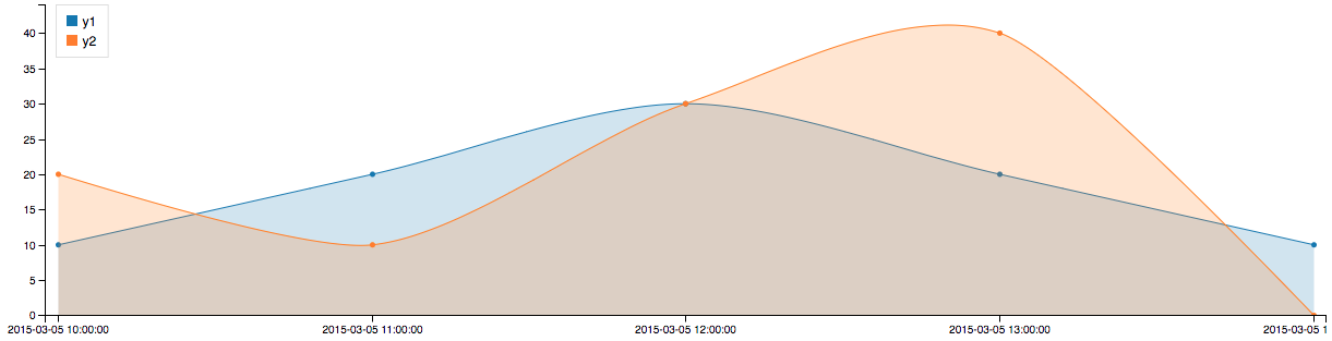
Spline Chart
import datetime
dts = [datetime.datetime(2015, 3, 5, x) for x in [10, 11, 12, 13, 14]]
y1 = [10, 20, 30, 20, 10]
y2 = [20, 10, 30, 40, 0]

import c3pyo as c3
chart = c3.SplineChart()
chart.legend_position('inset')
chart.area(True)
chart.plot(dts, y1, label="y1")
chart.plot(dts, y2, label="y2")
chart.show()
Bar Chart
men_height = [175, 176, 172, 172, 177]
women_height = [156, 162, 158, 160, 164]

import c3pyo as c3
chart = c3.BarChart()
chart.plot(men_height, label='Men_Heights')
chart.plot(women_height, label='Women_Heights')
chart.set_xticklabels(('UK', 'USA', 'Japan', 'China', 'Russia'))
chart.ylabel('Height (cm)')
chart.show()

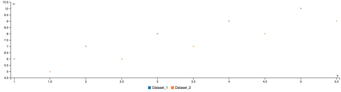
Scatter Chart
dataset_1 = {'x': [1, 2, 3, 4, 5], 'y': [6, 7, 8, 9, 10]}
dataset_2 = {'x': [1.5, 2.5, 3.5, 4.5, 5.5], 'y': [5, 6, 7, 8, 9]}

import c3pyo as c3
chart = c3.ScatterChart()
chart.plot(dataset_1['x'], dataset_1['y'], label='Dataset1')
chart.plot(dataset_2['x'], dataset_2['y'], label='Dataset2')
chart.show()