Windowed
Non-confusing, 'windowed slider' checkboxes and dropdowns with jQuery
Install / Use
/learn @alexpeattie/WindowedREADME
windowed.js
windowed.js is a jQuery plugin that implements Chris Norström's awesome "Windowed Slider" concept. It takes your regular checkboxes or <select> lists and transforms them into slick 'windowed sliders'.
Requirements
- jQuery: 1.7+
File size
- Uncompressed: 12.75 Kb
- Minified: 5.9 Kb
- Minified + gzipped: 2.2 Kb
Quickstart
Add the windowed.min.css and jquery.windowed.min.js files to your HTML page:
<head>
  <link rel="stylesheet" href="path/to/windowed.min.css" />
</head>
<body>
  <!-- blah blah -->
  <script src="jquery.js"></script>
  <script src="/path/to/jquery.windowed.min.js"></script>
</body>
Transform your checkbox or <select> by calling .windowed():
$('select, input:checkbox').windowed()
Usage
Checkbox
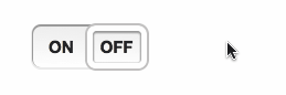
To get started, just call .windowed() on a checkbox or dropdown.
HTML:
<input type="checkbox" />
JS:
$('input:checkbox').windowed()
Result:

Select menu
HTML:
<select>
  <option>WE</option>
  <option>HAVE</option>
  <option>CHOICES!</option>
</select>
JS:
$('select').windowed()
Result:

Vertical
You can make a vertical select using by setting the vertical option to true.
HTML:
<select>
  <option>If you need more room for choices</option>
  <option selected="selected"
    >Feel free to go with the vertical orientation</option
  >
  <option>It's not as elegant as using a radio button</option>
  <option>But it's an option</option></select
>
JS:
$('select').windowed({
  vertical: true
})
Result:

Custom text, width and height
Customize the label text on a checkbox with the on and off options.
JS:
$('input:checkbox').windowed({
  on: 'ENABLED',
  off: 'DISABLED'
})
You can use CSS to set the component’s width and height. Alternatively, you can pass a width or height option to the JS function.
CSS:
.window-toggle {
  width: 200px;
  height: 50px;
}

Callback
Set a callback (fires on change) using the change option.
The callback function will be passed:
- the jQuery event object for the callback
- either:
- For a checkbox, a boolean value indicating if the component’s checked (
true) or unchecked (false). - For a
<select>dropdown, the currently selected<option>element.
- For a checkbox, a boolean value indicating if the component’s checked (
Note: if the DOM element has an onchange event, that will still be fired - although using a windowed.js change callback is preferable.
Themes
The theme option can change the style of the component, by adding classes to the component’s container <div>. Included by default are 4 themes: info, success, warning and danger.
theme can be a string, or if set to true, windowed.js will use the CSS classes already present on the checkbox/dropdown.
For info on creating a custom theme, see below.
HTML:
<input id="themeDemo" type="checkbox" />

<input class="success" type="checkbox" checked="checked" />
<input class="warning" type="checkbox" />
<input class="danger" type="checkbox" checked="checked" />
JS:
$('#themeDemo').windowed({
  theme: 'info'
})

$('input:checkbox:not(#themeDemo)').windowed({
  theme: true
})
Result:

Disabled
Set disabled to true to make a disabled component. The component will also inherit the disabled state (if present) on the existing <input> or <select>.
You can also change the enabled/disabled state by calling windowed('setEnabled', boolean) or windowed('toggleEnabled').
HTML:
<input id="demoDisable" type="checkbox" />

<select id="demoDisableAlt" disabled="disabled">
  <option>Hello</option>
  <option>World</option>
</select>
JS:
$('#demoDisable').windowed({
  disabled: true
})

$('#demoDisableAlt').windowed()
$('#demoDisableAlt').windowed('setEnabled', false)
Result:

Change state
You can change a checkbox’s state using .windowed('setState', s) where s can be true (checked) or false (unchecked); or using .windowed('toggleState').
For dropdowns, use windowed('selectOption', n) where n is the (0-based) index of the option you want selected.
HTML:
<input type="checkbox" />

<button class="btn on">On</button>
<button class="btn off">Off</button>
<button class="btn toggle">Toggle</button>

<select>
  <option>ONE</option>
  <option>TWO</option>
  <option>THREE</option>
</select>

<button class="btn num">1</button>
<button class="btn num">2</button>
<button class="btn num">3</button>
JS:
$('input:checkbox, select').windowed()

$('.btn.on').click(function () {
  $('input:checkbox').windowed('setState', true)
})

$('.btn.off').click(function () {
  $('input:checkbox').windowed('setState', false)
})

$('.btn.toggle').click(function () {
  $('input:checkbox').windowed('toggleState')
})

$('.btn.num').click(function () {
  // We have to -1 because the index is 0 based
  // i.e. the first option's index is 0, 2nd is 1 etc.
  $('select').windowed('selectOption', $(this).text() - 1)
})
Animation
Set animate to false to disable animation.
You can change the speed of animation (in milliseconds), using the animateDuration option.
HTML:
<input type="checkbox" />

<select>
  <option>TAKE</option>
  <option>IT</option>
  <option>SLOW</option>
</select>
JS:
$('input:checkbox').windowed({
  animate: false
})

$('select').windowed({
  animateDuration: 1000
})
Tinted window
You can tint the window in CSS, using an RGBa background property.
CSS:
.windowed .slider {
  background: rgba(0, 0, 0, 0.1);
}
Result:

Custom themes
You can use CSS to style the windowed.js component. Some useful classes:
.windowed- The component’s container<div>, this is where your custom theme class will be applied.slider- The sliding window.checkstate- The on/off label text for a checkbox.option- A dropdown option.selected- The currently selected.optionor.checkstate.checkbox- Applied to components created from an<input type='checkbox'>.select-one- Applied to components created from a<select>
HTML:
<input type="checkbox" />

<select>
  <option>BLACK</option>
  <option>IS</option>
  <option>BEAUTIFUL</option>
</select>
JS:
$('input:checkbox, select').windowed({ theme: 'custom' })
CSS:
.windowed.custom {
  background-image: -moz-linear-gradient(center bottom, #000, #333);
}

.windowed.custom .slider {
  border-color: #6c3;
  box-shadow: 0 1px 1px 1px #363 inset, 0 0 0 2px #363;
}

.windowed.custom .checkstate,
.windowed.custom .option {
  color: #ddd;
  text-shadow: 1px 1px #000;
}

.windowed.custom .selected {
  color: #bfa;
}
Result:

Configuration options
animate
- Type:
Boolean - Default:
true
Enables jQuery animation on the slider window.
animateDuration
- Type:
NumberorString - Default:
400
Sets the duration of the animation (if enabled). As with jQuery's .animate() method, this can be a number, indicating the animation duration in milliseconds, or a predefined string (e.g. 'fast', 'slow').
disabled
- Type:
Boolean - Default:
false
Controls the disabled state of the component. Note: if the component is disabled, the original DOM element will be disabled too.
height
- Type:
Number - Default:
undefined
Sets the height of the component. Note: it's recommended that you instead use CSS to set this, if possible.
off
- Type:
String - Default:
'OFF'
Sets the label for the unchecked state of a checkbox-based component.
on
- Type:
String - Default:
'ON'
Sets the label for the checked state of a checkbox-based component.
theme
- Type:
BooleanorString - Default:
undefined
Allows theming of the component. If a string, the string will be appended to the component's container <div>'s class attribute. If set to to true, the container <div> will inherit the classes from the original DOM element.
vertical
- Type:
Boolean - Default:
false
Enables vertical mode. Can only be applied if the component was created from a <select>.
width
- Type:
Number - Default:
undefined
Sets the width of the component. Note: it's recommended that you instead use CSS to set this, if possible.
Overriding defaults
You can change the global defaults by modifying the $.fn.windowed.defaults object.
Methods
windowed.js includes a few utility methods. The methods follow the jQuery UI pattern:
$('select').windowed('methodName', [optionalParameters])
setEnabled
$('select').windowed('setEnabled', enabled)
Enables/disables the component. enabled is a boolean, where true enables the component, and false disables it. The meth
Related Skills
node-connect
342.0kDiagnose OpenClaw node connection and pairing failures for Android, iOS, and macOS companion apps
frontend-design
84.7kCreate distinctive, production-grade frontend interfaces with high design quality. Use this skill when the user asks to build web components, pages, or applications. Generates creative, polished code that avoids generic AI aesthetics.
openai-whisper-api
342.0kTranscribe audio via OpenAI Audio Transcriptions API (Whisper).
commit-push-pr
84.7kCommit, push, and open a PR
