SegmentedButton
Segmented Control/Button with animation for Android API 16+
Install / Use
/learn @addisonElliott/SegmentedButtonREADME

SegmentedButton
Android view that mimics iOS's SegmentedControl
Features
- Customizable text color, size and font
- Custom button drawables
- Customizable button dividers
- Solid and dashed border support
- Ripple effect on button tap
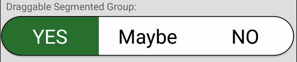
- Draggable buttons
- Animations
- Support for API 16+
Old Library
This project is originally forked from ceryle/SegmentedButton but has been revamped and given some TLC. The parent repository has been stagnant since October 17th, 2017.
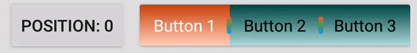
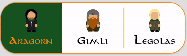
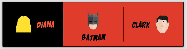
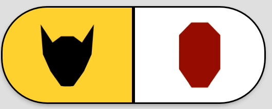
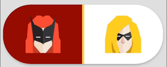
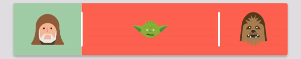
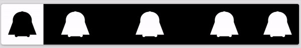
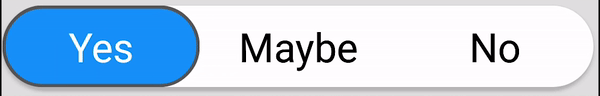
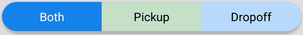
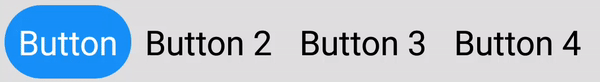
Preview

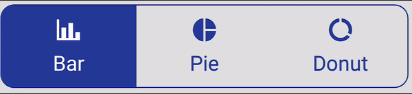
Code for all images can be found in the sample project
Installation
Gradle
Add it to your build.gradle with:
allprojects {
    repositories {
        maven { url "https://jitpack.io" }
    }
}
and:
dependencies {
    implementation 'com.github.addisonelliott:SegmentedButton:$LATEST_VERSION'
}
Note: The $LATEST_VERSION string should be replaced with the latest version. The available versions can be found
here: https://jitpack.io/#addisonElliott/SegmentedButton
Note: This library uses the AndroidX packages rather than the older Android support libraries. Periodic releases
with the Android support library will be released based on user demand with the version appended with -support (e.g.
3.1.2-support for $LATEST_VERSION). It is strongly recommended to upgrade your project to AndroidX to obtain the
latest features & bug fixes.
Note: Java 8 is required to use this library. This can be done by adding the following code to build.gradle while
using the Android plugin with a version of 3.0.0 or higher.
android {
    compileOptions {
        sourceCompatibility '1.8'
        targetCompatibility '1.8'
    }
}
Usage
Layout XML
<com.addisonelliott.segmentedbutton.SegmentedButtonGroup
    android:id="@+id/buttonGroup_lordOfTheRings"
    android:layout_width="match_parent"
    android:layout_height="wrap_content"
    android:layout_gravity="center_horizontal"
    android:layout_margin="4dp"
    android:elevation="2dp"
    android:background="@color/white"
    app:borderColor="@color/orange_700"
    app:borderWidth="1dp"
    app:divider="@color/orange_700"
    app:dividerPadding="10dp"
    app:dividerWidth="1dp"
    app:position="0"
    app:radius="30dp"
    app:ripple="true"
    app:rippleColor="@color/green_800"
    app:selectedBackground="@color/green_900">

    <com.addisonelliott.segmentedbutton.SegmentedButton
        android:layout_width="0dp"
        android:layout_height="match_parent"
        android:layout_weight="1"
        android:fontFamily="@font/aniron"
        android:padding="10dp"
        app:drawable="@drawable/ic_aragorn"
        app:drawableGravity="top"
        app:selectedTextColor="@color/orange_700"
        app:text="Aragorn"
        app:textColor="@color/black" />

    <com.addisonelliott.segmentedbutton.SegmentedButton
        android:layout_width="0dp"
        android:layout_height="match_parent"
        android:layout_weight="1"
        android:fontFamily="@font/aniron"
        android:padding="10dp"
        app:drawable="@drawable/ic_gimli"
        app:drawableGravity="top"
        app:selectedTextColor="@color/grey_600"
        app:text="Gimli"
        app:textColor="@color/black" />

    <com.addisonelliott.segmentedbutton.SegmentedButton
        android:layout_width="0dp"
        android:layout_height="match_parent"
        android:layout_weight="1"
        android:fontFamily="@font/aniron"
        android:padding="10dp"
        app:drawable="@drawable/ic_legolas"
        app:drawableGravity="top"
        app:selectedTextColor="@color/yellow_200"
        app:text="Legolas"
        app:textColor="@color/black" />
</com.addisonelliott.segmentedbutton.SegmentedButtonGroup>
Java
segmentedButtonGroup.setOnPositionChangedListener(new OnPositionChangedListener() {
    @Override
    public void onPositionChanged(final int position) {
        // Handle stuff here
    }
});

// Get current position
segmentedButtonGroup.getPosition();
Check out the sample project for additional examples
Attributes
SegmentedButtonGroup
| Attribute | Format | Description |
| ---------------------------------- | ----------------- | -------------------------------------------------------------------------- |
| android:background | drawable\|color | Set background for every button when unselected (default: transparent) |
| app:selectedBackground | drawable\|color | Set background for every button when selected (default: transparent) |
| app:borderWidth | dimension | Width of border around button group |
| app:borderColor | color | Color of border |
| app:borderDashWidth | dimension | Width of dashes, 0 indicates solid line |
| app:borderDashGap | dimension | Width of gaps in dashes |
| app:selectedBorderWidth | dimension | Width of border around selected button in group |
| app:selectedBorderColor | color | Color of border for selected button in group |
| app:selectedBorderDashWidth | dimension | Width of dashes for selected button in group, 0 indicates solid line |
| app:selectedBorderDashGap | dimension | Width of gaps in dashes for selected button in group |
| app:radius | dimension | Radius of corners for button group |
| app:selectedButtonRadius | dimension | Radius of corners for selected button in group |
| app:position | integer | Default button that is selected |
| app:draggable | boolean | Whether or not buttons can be dragged to change selected state |
| app:ripple | boolean | Whether or not ripple effect is enabled for all buttons |
| app:rippleColor | color | Ripple effect tint color for each button |
| app:divider | drawable\|color | Drawable or color to display for divider between buttons |
| app:dividerWidth | dimension | Width of the divider between buttons, 0 indicates no dividers |
| app:dividerRadius | `d
Related Skills
node-connect
342.5kDiagnose OpenClaw node connection and pairing failures for Android, iOS, and macOS companion apps
frontend-design
85.3kCreate distinctive, production-grade frontend interfaces with high design quality. Use this skill when the user asks to build web components, pages, or applications. Generates creative, polished code that avoids generic AI aesthetics.
openai-whisper-api
342.5kTranscribe audio via OpenAI Audio Transcriptions API (Whisper).
qqbot-media
342.5kQQBot 富媒体收发能力。使用 <qqmedia> 标签,系统根据文件扩展名自动识别类型(图片/语音/视频/文件)。
