BDialog
Extend the Bootstrap Modal features, making dialog more functions and easier to use, dialog type including modal, alert, mask and toast types
Install / Use
/learn @TerryZ/BDialogREADME
<br><br>
<p align="center"><img src="logo/vertical.png" alt="bDialog" height="200" ></p> <h3 align="center">bDialog</h3> <p align="center"> A multi-layer nested, highly customizable powerful dialog plugin, <br> dialog type including modal dialog, alert dialog, mask layer, toast dialog </p> <p align="center"> <a href="https://travis-ci.org/TerryZ/bDialog"><img src="https://travis-ci.org/TerryZ/bDialog.svg?branch=master"></a> <a href="https://www.npmjs.com/package/bdialog"><img src="https://img.shields.io/npm/v/bdialog.svg"></a> <a href="https://www.npmjs.com/package/bdialog"><img src="https://img.shields.io/npm/dy/bdialog.svg"></a> <a href="https://mit-license.org/"><img src="https://img.shields.io/badge/license-MIT-brightgreen.svg"></a> </p><br><br>
Guide, Demos and Documents
Explorer on
The Vuejs version: v-dialogs
If you think this project is helpful, please star it.
<br><br>
Features
- jQuery plugin, on Bootstrap Modal plugin basis to extend
- multi-layer Nested modal dialog
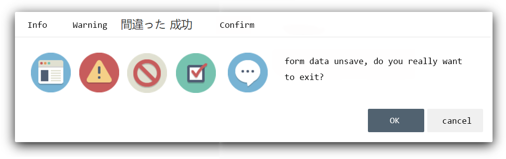
- alert mode dialog provide
info、warning、error、success、confirmtypes - mask layer block all element when data loading
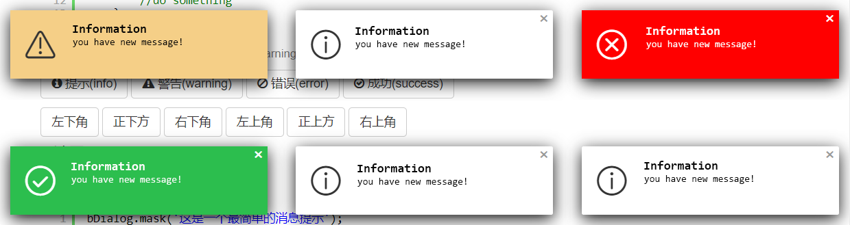
- toast dialog, provide
info、warning、error、successtypes and 6 corner position - flexible style setting
- when browser size changes, the dialog will automatically repositioned to the center of the browser
- dialog area outside the click, the window automatically positioning and other scenes have a corresponding reminder animation
<br><br>
The Alert Dialog Icon
the icons in alert dialog used are made by Elegant Themes and control icon, toast icon used are come from IconFont
<br><br>
Plugin Preview
Modal Mode
Alert Mode
Mask Mode
Toast Mode
<br><br>
<br><br><br><br>
Install
download bDialog plugin zip file by last release, or Click me to download bDialog
or use NPM
npm i bdialog
Usage
As you can see in the Demo page, you will need to include:
- jQuery library (1.6.0+), untest on jquery2.x & 3.x
- The JavaScript file b.dialog.js (or its minified version b.dialog.min.js)
- The css file b.dialog.bootstrap3.css for bootstrap3.x , b.dialog.css for bootstrap2.x
Including files
<!-- include for Bootstrap2.x -->
<link rel="stylesheet" href="b.dialog.css" type="text/css">
<!-- include for Bootstrap3.x -->
<link rel="stylesheet" href="b.dialog.bootstrap3.css" type="text/css">
<!-- Above the css file under your css framework choose one of them to include -->


<!-- jquery-ui draggable liabrary if you need dialog drag function -->
<script type="text/javascript" src="jquery-ui.min.js" >< /script>

<script type="text/javascript" src="b.dialog.js" >< /script>
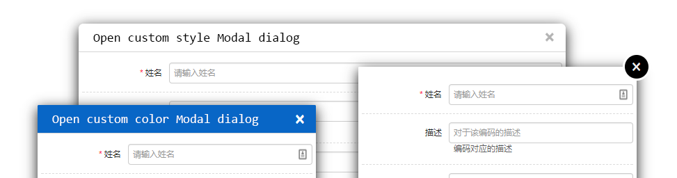
Open a Modal dialog
bDialog.open({
    title : 'User Info Modify',
    width : 500,
    height : 450,
    url : 'http://aa.com/load',
    params : {
        'userName' : 'Bryant'
    },
    callback:function(data){
        if(data && data.results && data.results.length > 0 ){
            bDialog.alert('已完成弹出窗口操作!<br>接收到弹出窗口传回的 userName 参数,值为:<b>' +
            data.results[0].userName + '</b>');
        }else{
            bDialog.alert('弹出窗口未回传参数',$.noop,{
              messageType : 'error'
            });
        }
    }
});
Quick Demo
//Modal :
bDialog.open({
url : 'http://some url'
});
bDialog.open({
dom : $('#some element').html()
});
//Alert :
bDialog.alert('your message');
bDialog.alert('your message',function(){
//your callback
});
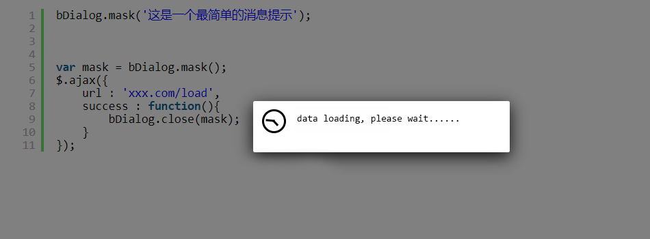
//Mask :
bDialog.mask();
//Toast :
bDialog.toast('your message');
bDialog.toast('your message',{
//toast dialog type
messageType : 'warning',
//show dialog in topleft position
position : 'topLeft',
//don't show close button
dialogCloseButton : false,
//auto close dialog time(second),default 3s
closeTime : 0
});
<br><br>
Options
-
backdrop
string | boolean
default : 'static'
the dialog backdrop layer set- 'static' : click the backdrop can not close the dialog
- false : do not show backdrop
- true : show backdrop, but click the backdrop will close dialog
-
title
string | boolean
default : '对话框'
set text to show in title bar,setfalseto close the title bar -
language
string
default : 'cn'
dialog using language
| Code | Language | | ------ | ------ | | cn | chinese | | en | english | | jp | japanse |
-
width
number
default : 700
dialog width, only work on modal dialog mode -
height
number
default : 400
dialog height, only work on modal dialog mode -
animation
boolean
default : true
whether show animation when dialog open -
dialogCloseButton
boolean
default : true
whether show the 'X' close button -
dialogMaxButton
boolean
default : true
whether show maximize button -
closeButton
boolean
default : false
whether to close dialog bottom bar, only work in Modal dialog mode -
scroll
boolean
default : true
whether to display the scroll bar -
drag
boolean
default : true
whether to allow the window to be draggedthe drag function is depend on jquery-ui draggable liabrary,if not include it, drag function will auto close
-
url
string
default : false
the remote page url open in modal dialog -
params
object
default : undefined
pass the parameters to the new open modal dialog, in the new modal dialog you can get parameters like thisvar params = bDialog.getDialogParams();example
params : { name : 'Michael', num : 23 } -
dom
object
default : undefined
the html element or javascript object or jquery object to show in modal dialog -
fullWidth
boolean
default : false
whether to show full width modal dialog -
customClass
string
default : undefined
specify custom style class name -
show
boolean
default : false whether show dialog when dialog init finish -
onShow
function
default : undefined
before dialog show callback -
onShowed
function
default : undefined
when the dialog has been made visible to call this callback -
onHide
function
default : undefined
before dialog close callback -
onHidden
function
default : undefined
when dialog completely close callback -
callback
function
default : undefined
when dialog close callback, this callback different from others callback its can be return data to caller.
param
dataobjectreturn to caller data
example{ callback : function(data){ if(data && data.results && data.results.length > 0 ){ $('#input').val(data.results[0]); } } } //the param data is come from bDialog.close('i am return data'); -
messageType
string
default : 'info'
setup alert dialog, toast dialog type, the full type is- info(default)
- warning
- error
- success
- confirm(only work on alert dialog)
the different type will show different icon
-
position
string
default : 'bottomRight'
toast dialog display position, the full position is- topLeft
- topCenter
- topRight
- bottomLeft
- bottomCenter
- bottomRight(default)
-
closeTime
number
default : 3(second)
auto close toast dialog time, set 0 to disabled auto close dialog -
cancel
function
default : undefined
when alert dialog mode, and alert type is confirm, this callback is used to the cancel button callback
examplecancel : function(dialog){ bDialog.alert('The deal was canceled'); }
API
- open
open a modal dialog
param- params example
bDialog.open({ url : 'http://someurl' }); //so simple to open a remote page in modal dialog - close
close opened dialog (modal, alert, mask)
param- data
objectreturn to caller data - [dialog]
objectoptional to set, if you have a opened dialog object,you can directly to it. if no setup this param, plugin will close the last open dialog example
bDialog.close({name:'Michael',num:23});//close and return data(last open dialog) var dlg = bDialog.open({...}); $('#theBtn').click(function(){ bDialog.close({name:'Michael',num:23},dlg); }); - data
- getDialog
get last opened dialog (modal, alert, mask)var dlg = bDialog.getDialog(); - getDialogParams
get params data from open dialog params
in the opened modal dialog, you can get params like thisbDialog.open({ params : { name : 'Michael', num : 23 } });var params = bDialog.getDialogParams(); $('#name').val(params.name); - alert
open a message alert dialog, the alert dialog can be info, warning, error, success, confirm types param- message
stringthe message show in alert dialog - callback
functionclose alert dialog callback - params
objectsetup alert dialog params
bDialog.alert('a am info message');//just show message bDialog.alert('a am info message',function(){ $('#name').val(''); });//show message and do something when alert dialog close bDialog.alert('a am info - message
