CookieConsent
This cookie consent react component aims to provide a fully customizable banner or modal to be displayed once your site is visited
Install / Use
/learn @Schlomoh/CookieConsentREADME
React-cookieConsent
This react cookie consent library provides you with a fully customizable banner or modal

Installation 🧑🏽💻
Install the component library using:
npm install @schlomoh/react-cookieconsent
or
yarn add @schlomoh/react-cookieconsent
You'll also need to install styled-components
npm install styled-components
yarn add styled-components
Features ✨
- Two seperate components (modal and banner)
- Fully customizable via css
- Define custom text to inform the user
- Pass in callbacks for denial and acception
- Enable or disable cookie preferences
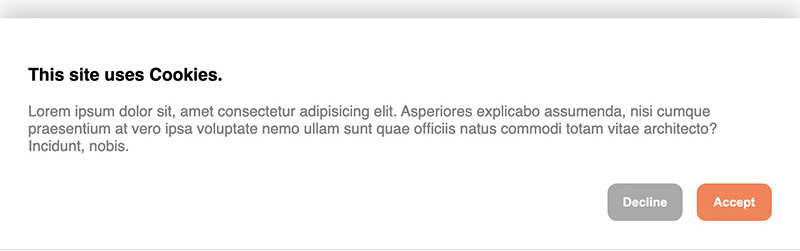
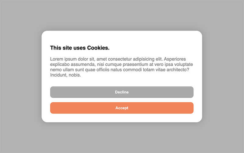
Preview 👀
Default cookie banner
Default cookie Modal
Usage / Examples ✏️
You can either use the components right out of the box without setting any properties or completely customize either one of the consent components in your own taste.
Cookie modal 💚
Basic
import { CookieBanner } from '@schlomoh/react-cookieConsent'

const MyApp = () => (
    <>
        <CookieBanner > // above the rest of the page
        <MyPage />
    </>
)
Cookie banner 💙
Basic
import { CookieModal } from '@schlomoh/react-cookieConsent'

const MyApp = () => (
    <>
        <CookieModal > // above the rest of the page
        <MyPage />
    </>
)
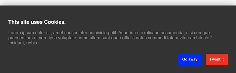
Customized 📐
(All properties work for both modal and banner)
...

const Content = () => (
    <>
        <h3>I'm using cookies on my site.</h3>
        <p>Bla Bla Bla this is my own informational text.</p>
    </>
)

const containerStyle = {backgroundColor: '#333'};
const buttonStyle = {borderRadius: 0}
const primaryButtonStyle={...buttonStyle, backgroundColoe:'red'}
const secondaryButtonStyle={...buttonStyle, backgroundColoe:'blue'}

const MyApp = () => (
    <>
        <CookieBanner
            acceptButtonText='I want it'
            declineButtonText='Go away'
            headingColor='white'
            paragraphColor='grey'
            containerStyle={containerStyle}
            primaryButtonStyle={primaryButtonStyle}
            secondaryButtonStyle={secondaryButtonStyle}
            infoContent={<Content />}
        />
        <MyPage />
    </>
)
... it then looks like this (dont mind the text👀 earlier screenshot):
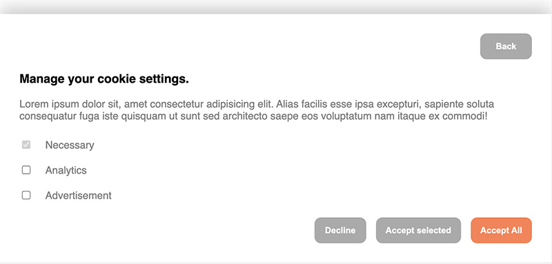
Enabling cookie preferences 🔧
To let a visitor select their cookie preferences the property enableManagement has to be set to true.
You can then set an array of cookie categories which the user can select from. There is always the category "Necessary" predefined and set to true and disabled by default.
When enableManagement is set you can also override the default text of the button by setting managementButtonText='whatever'. This button is a secondary button.
For example
<>
    <CookieBanner
        enableManagement
        managementButtonText='manage cookie preferences'
        cookieCategories={['analytics', 'advertisement']}
    />
</>
Callbacks 👉🏼
You can define callbacks which are called on either accept or decline. Simply pass a function into the onAccept or onDecline property which is executed accordingly.
The onAccept event can pass an object with the selected cookies as ICookieObject into your accept callback.
const onAccept = (cookies : ICookieObject) => {
    console.log(cookies);
};

const onDecline = () => {
    console.log('declined');
}


// inside your app
const MyApp = () => (
    <>
        <CookieBanner
        onAccept={onAccept}
        onDecline={onDecline}
        />
    <>
)
Reference 🔎
The ICookieObject:
interface ICookieObject {
  [key: string]: boolean;
}
Example:
{ "advertisement": false, "analytics": true }
Sample usage in a NextJs project
- Make a component named Cookie.tsx in your components folder with the following content.
'use client';

import { CookieBanner } from '@schlomoh/react-cookieconsent';
import React from 'react';

const MyCookieBanner = () => {
    const Content = () => (
        <>
            <h3>Lorem Ipsum Dolor Sit Amet</h3>
            <p>Lorem ipsum dolor sit amet, consectetur adipiscing elit, sed do eiusmod tempor incididunt ut labore et dolore magna aliqua. Ut enim ad minim veniam, quis nostrud exercitation ullamco laboris nisi ut aliquip ex ea commodo consequat. <a href="/cookie" className='text-blue underline'>Cookie Policy</a></p>

        </>
    )

    const MContent = () => (
        <>
            <h3> Lorem Ipsum Dolor Sit Amet </h3>
            <p> Lorem ipsum dolor sit amet, consectetur adipiscing elit, sed do eiusmod tempor incididunt ut labore et dolore magna aliqua. Ut enim ad minim veniam, quis nostrud exercitation ullamco laboris nisi ut aliquip ex ea commodo consequat. </p>
        </>
    )

    const containerStyle = {backgroundColor: 'white'};
    const buttonStyle = {borderRadius: 0}
    const primaryButtonStyle={...buttonStyle, backgroundColor:'green'}
    const secondaryButtonStyle={...buttonStyle, backgroundColor:'red'}

  return (
    <CookieBanner
        acceptButtonText='I accept'
        declineButtonText='Reject'
        headingColor='black'
        paragraphColor='grey'
        containerStyle={containerStyle}
        primaryButtonStyle={primaryButtonStyle}
        secondaryButtonStyle={secondaryButtonStyle}
        infoContent={<Content />}
        enableManagement
        managementContent={<MContent />}
        managementButtonText='Consent Preferences'
        cookieCategories={['analytics', 'advertisement']}
        // accentColor = 'coral'
    />
  );
};

export default MyCookieBanner;
- add the component it your App.js or _app,js or app/layout.js file
import CookieBanner from '@/components/Cookie'
...

...

        <ThemeProviders>
          <Analytics analyticsConfig={siteMetadata.analytics as AnalyticsConfig} />
          <SectionContainer>
            <div className="flex h-screen flex-col justify-between font-sans">
              <SearchProvider>
                <Header />
                <main className="mb-auto">{children}</main>
              </SearchProvider>
              <Footer />
              <CookieBanner />
            </div>
          </SectionContainer>
        </ThemeProviders>
...
Here's how looks like:- . Calls go through the generic message tool with channel="bluebubbles".
node-connect
345.4kDiagnose OpenClaw node connection and pairing failures for Android, iOS, and macOS companion apps
slack
345.4kUse when you need to control Slack from OpenClaw via the slack tool, including reacting to messages or pinning/unpinning items in Slack channels or DMs.
frontend-design
104.6kCreate distinctive, production-grade frontend interfaces with high design quality. Use this skill when the user asks to build web components, pages, or applications. Generates creative, polished code that avoids generic AI aesthetics.
