ListKit
DSL for UICollectionViewCompositionalLayout
Install / Use
/learn @ReactComponentKit/ListKitREADME
ListKit

DSL for UICollectionViewCompositionalLayout!
About
ListKit is DSL for building UICollectionViewCompositionalLayout. You can make UICollectionViewCompositionalLayout easy with ListKit. ListKit is Declarative and Component-Based. Also, ListKit supports diffable data source for UICollectionView!
Examples
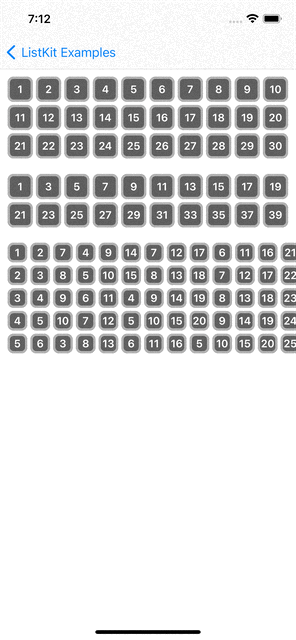
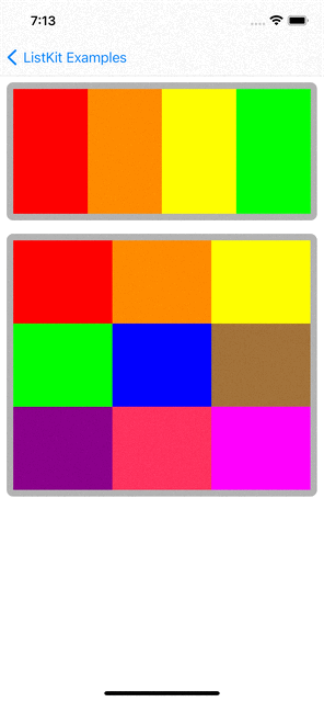
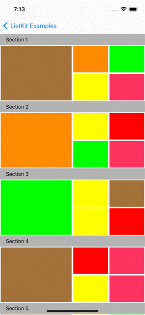
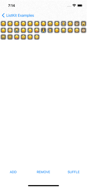
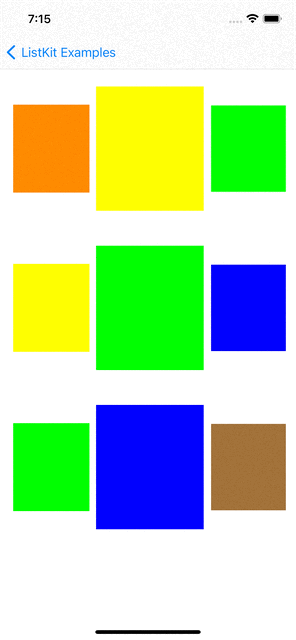
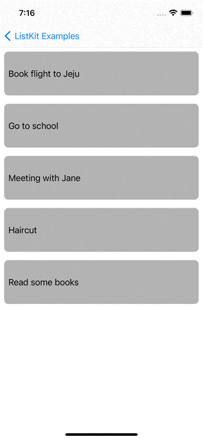
You can checkout examples for ListKit at here:
| |
| |
| |
| |
| |
| |:----------------------------:|:------------------------:|:------------------------:|:----------------------:|:----------------------:|:----------------------:|
renderer.render(of: Array(0..<10)) { index in
    Section(id: index) {
        HGroup(width: .fractionalWidth(1.0), height: .absolute(150)) {
            for _ in 0..<3 {
                ColorBox2Component(color: randomColor, width: .fractionalWidth(0.5), height: .fractionalHeight(1.0))
                VGroup(of: [0, 1], width: .fractionalWidth(0.25), height: .fractionalHeight(1.0)) { _ in
                    ColorBox2Component(color: randomColor, width: .fractionalWidth(1.0), height: .fractionalHeight(0.5))
                }
                VGroup(of: [0, 1], width: .fractionalWidth(0.25), height: .fractionalHeight(1.0)) { _ in
                    ColorBox2Component(color: randomColor, width: .fractionalWidth(1.0), height: .fractionalHeight(0.5))
                }
            }
        }
    }
    .orthogonalScrollingBehavior(.groupPaging)
    .boundarySupplementaryItem(SectionHeaderComponent(title: "Section \(index + 1)"))
}
Layout Elements
Section
Section(id: UUID()) {
    HGroup(width: .fractionalWidth(1.0), height: .absolute(150)) {
        for i in 0..<4 {
            ColorBoxComponent(color: colors[i], width: .fractionalWidth(1.0/4), height: .fractionalHeight(1.0))
        }
    }
}
.contentInsets(top: 16, leading: 16, bottom: 16, trailing: 16)
.decorationItem(SectionBackgroundComponent())
.boundarySupplementaryItem(SectionHeaderComponent(title: "Section \(index + 1)"))
Section is a group of data items. You can define multiple sections in a layout. In UICollectionViewCompositionalLayout, Section has only one root Group.
Group(HGroup and VGroup)
In UICollectionViewCompositionalLayout, individual items are grouped into Group. Group has two types which are HGroup and VGroup. HGroup layouts items in horizontaly direction. VGroup layouts items in vertically. Group can have multiple items(components in ListKit) and groups.
Section(id: UUID()) {
    VGroup(of: [0, 1, 2], width: .fractionalWidth(1.0), height: .estimated(30)) { number in
        HGroup(of: [0, 1, 2], width: .fractionalWidth(1.0), height: .absolute(100)) { index in
            ColorBoxComponent(color: colors[(number * 3) + index], width: .fractionalWidth(1.0/3.0), height: .fractionalHeight(1.0))
        }
    }
}
Component
Component presents UI for the data item. It is the basic unit in ListKit. You can map a data into a component. You can define a component like below:
import UIKit
import ListKit

struct ColorBoxComponent: Component {
    var id: AnyHashable { UUID() }
    let color: UIColor
    let width: NSCollectionLayoutDimension
    let height: NSCollectionLayoutDimension

    public init(color: UIColor, width: NSCollectionLayoutDimension, height: NSCollectionLayoutDimension) {
        self.color = color
        self.width = width
        self.height = height
    }

    func contentView() -> UIView {
        return UIView(frame: .zero)
    }

    func layoutSize() -> NSCollectionLayoutSize {
        return NSCollectionLayoutSize(widthDimension: width, heightDimension: height)
    }

    func edgeSpacing() -> NSCollectionLayoutEdgeSpacing? {
        return nil
    }

    func contentInsets() -> NSDirectionalEdgeInsets {
        return .zero
    }

    func render(in content: UIView) {
        content.backgroundColor = color
    }
}
Component has a content view which is inherited from UIVIew. You can define more complex component with it's content view.
import UIKit
import SnapKit
import ListKit

struct EmojiBoxComponent: Component {
    let id: AnyHashable
    let emoji: String

    init(emoji: String) {
        self.id = emoji
        self.emoji = emoji
    }

    func contentView() -> EmojiBoxComponentContentView {
        EmojiBoxComponentContentView()
    }

    func layoutSize() -> NSCollectionLayoutSize {
        return NSCollectionLayoutSize(widthDimension: .absolute(30), heightDimension: .absolute(30))
    }

    func edgeSpacing() -> NSCollectionLayoutEdgeSpacing? {
        return nil
    }

    func contentInsets() -> NSDirectionalEdgeInsets {
        return .init(top: 2, leading: 2, bottom: 2, trailing: 2)
    }

    func render(in content: EmojiBoxComponentContentView) {
        content.label.text = emoji
    }
}

final class EmojiBoxComponentContentView: UIView {
    lazy var label: UILabel = {
        let label = UILabel(frame: .zero)
        label.font = UIFont.boldSystemFont(ofSize: 14)
        label.textColor = .white
        label.textAlignment = .center
        return label
    }()

    init() {
        super.init(frame: .zero)
        setupView()
    }

    required init?(coder: NSCoder) {
        fatalError()
    }

    func setupView() {
        addSubview(label)
        label.snp.makeConstraints { make in
            make.edges.equalToSuperview()
        }
        self.backgroundColor = .darkGray
        self.layer.borderWidth = 3
        self.layer.borderColor = UIColor.lightGray.cgColor
        self.layer.cornerRadius = 8.0
    }
}
Define Layout and Render it
Renderer
You can define layout in declarative way and render the layout with Renderer. Rederer is defined with DataSource.
var renderer: ComposeRenderer = ComposeRenderer(dataSource: PlainDataSource())
Also, you can set UICollectionViewDelegate and custom collection view cell.
/// Renderer's initializer.
public init(dataSource: DataSource, delegate: UICollectionViewDelegate? = nil, cellClass: AnyClass? = nil) {
    ...
}
Todo example use cellClass for handling swipe actions.
You can define layout and update it like below:
var emojiList: [String] = ["😊"] {
    didSet {
        render()
    }
}

override func render() {
    renderer.render(animated: true) {
        Section(id: Sections.main) {
            HGroup(of: emojiList, width: .fractionalWidth(1.0), height: .estimated(30)) { item in
                EmojiBoxComponent(emoji: item)
            }
        }
    }
}
DataSource
ListKit provides PlainDataSource and DiffableDataSource. PlainDataSource is used for UICollectionView that uses UICollectionViewFlowLayout. DiffableDataSource is used for UICollectionView that uses UICollectionViewDiffableDataSource and NSDiffableDataSourceSnapshot. The emoji example and Todo example use DiffableDataSource
Customizing DataSource
You can customize data source like below:
import UIKit
import ListKit
import SwipeCellKit

class TodoDataSource: DiffableDataSource, SwipeCollectionViewCellDelegate {
    override func configure(cell: UICollectionViewCell) {
        guard let swipableCell = cell as? SwipeCollectionViewCell else { return }
        swipableCell.delegate = self
    }

    func collectionView(_ collectionView: UICollectionView, editActionsForItemAt indexPath: IndexPath, for orientation: SwipeActionsOrientation) -> [SwipeAction]? {
        guard orientation == .right else { return nil }

        guard let deletable = component(at: indexPath, to: Deletable.self) else { return nil }

        let deleteAction = SwipeAction(style: .destructive, title: "Delete") { action, indexPath in
            deletable.delete()
            action.fulfill(with: .delete)
        }

        deleteAction.image = UIImage(systemName: "trash")
        return [deleteAction]
    }
}
TodoDataSource is inherited from DiffableDataSource and customize it to use SwipeCellKit for swipe actions.
Iterable Data
ListKit provides render(of: [T]), HGroup(of: [T]) and VGroup(of: [T]) to handle iterable data and define dynamic layout with that data.
class ComplexLayoutViewController: BaseViewController {

    let colors: [UIColor] = [
        UIColor.red,
        UIColor.orange,
        UIColor.yellow,
        UIColor.green,
