Panuon.WPF.UI
Professional wpf ui library.
Install / Use
/learn @Panuon/Panuon.WPF.UIREADME
<a href="https://www.nuget.org/packages/Panuon.WPF.UI" target='_blank'><img src="https://img.shields.io/badge/Nuget-Panuon.WPF.UI-green"></a>


#切换到简体中文
<br/>
QQ频道:https://pd.qq.com/s/fpap7qj2y
Panuon.WPF.UI
A professional UI engine for customization.
Panuon.WPF.UI allows you to achieve the desired UI effect with minimal code.
Do not directly upgrade from Panuon.UI.Silver 1.x version to Panuon.UI.Silver 2.2 or Panuon.WPF.UI 1.x version. There are significant differences in how these versions are used.
Upgrade
Since Panuon.UI.Silver 2.2.20, this library has been renamed Panuon.WPF.UI. For the specific upgrade method, please refer to this wiki document (currently only supports Chinese).
Documents
Only Chinese documentation is now available.
Chinese Wiki Document
Contributors
<img width="40" height="40" src="https://avatars.githubusercontent.com/u/23360265?v=4"></img> <img width="40" height="40" src="https://avatars.githubusercontent.com/u/1386803?v=4"></img> <img width="40" height="40" src="https://avatars.githubusercontent.com/u/30036652?v=4"></img> <img width="40" height="40" src="https://avatars.githubusercontent.com/u/103859536?v=4"></img>
How to use
1. Add resource dictionary to your App.xaml
xmlns:pu="https://opensource.panuon.com/wpf-ui"
···

<pu:StyleDictionary Includes="All" />
2. Use attached properties like Material Design does, although there is no relationship between the two libraries
xmlns:pu="https://opensource.panuon.com/wpf-ui"
...

<Button Width="150"
        Height="35"
        Background="#6CBCEA"
        pu:ButtonHelper.CornerRadius="5"
        pu:ButtonHelper.HoverBackground="#6CA3EA"
        pu:ButtonHelper.ClickBackground="#83A6D4" />
3. Or, use styles without affecting other controls
xmlns:pu="https://opensource.panuon.com/wpf-ui"
...

<!--Don't add <pu:StyleDictionary Includes="All" />-->
<pu:KeyOnlyStyleDictionary Includes="Button,TextBox" />
xmlns:pu="https://opensource.panuon.com/wpf-ui"
...

<Button Width="150"
        Height="35"
        Style="{StaticResource {x:Static pu:StyleKeys.ButtonStyle}}"
        Background="#6CBCEA"
        pu:ButtonHelper.CornerRadius="5"
        pu:ButtonHelper.HoverBackground="#6CA3EA"
        pu:ButtonHelper.ClickBackground="#83A6D4" />
Samples
These pages were included in the Samples project. Download this repository to get the source code.
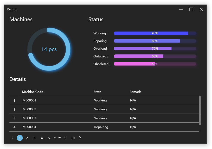
Report
Samples/Views/Examples/ReportView.xaml
261 code lines to implement this page in Panuon.WPF.UI.
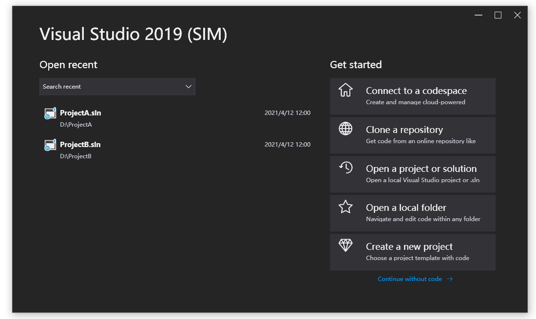
Visual Studio 2019 (SIM)
Samples/Views/Examples/VisualStudio2019View.xaml
293 code lines to implement this page in Panuon.WPF.UI.
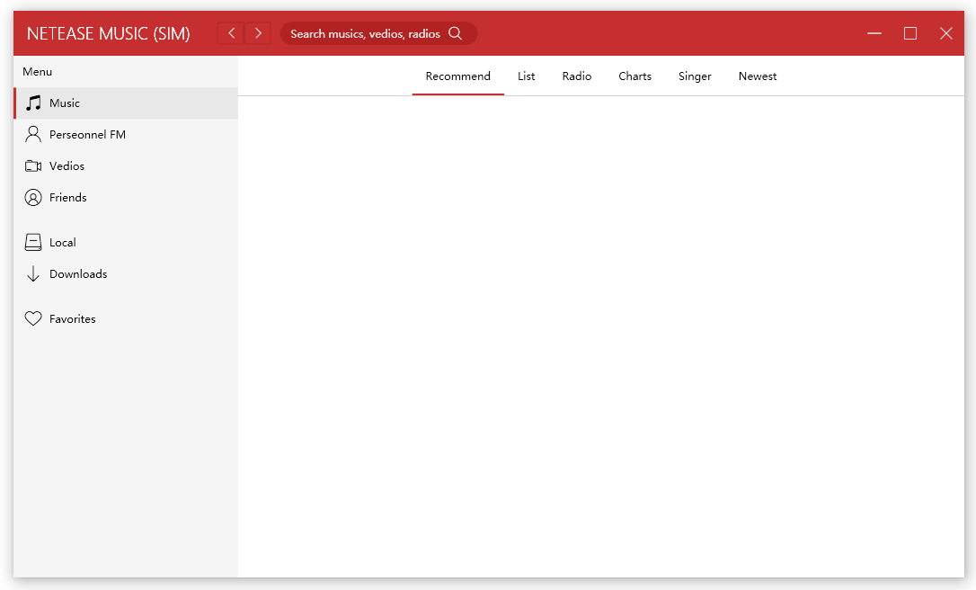
Netease Music (SIM)
Samples/Views/Examples/NeteaseMusicView.xaml
272 code lines to implement this page in Panuon.WPF.UI.
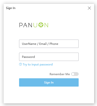
Sign In Example
Samples/Views/Examples/SignInView.xaml
187 code lines to implement this page in Panuon.WPF.UI.