Scattertext
Beautiful visualizations of how language differs among document types.
Install / Use
/learn @JasonKessler/ScattertextREADME


![]()

Scattertext 0.2.3
A tool for finding distinguishing terms in corpora and displaying them in an interactive HTML scatter plot. Points corresponding to terms are selectively labeled so that they don't overlap with other labels or points.
Cite as: Jason S. Kessler. Scattertext: a Browser-Based Tool for Visualizing how Corpora Differ. ACL System Demonstrations. 2017.
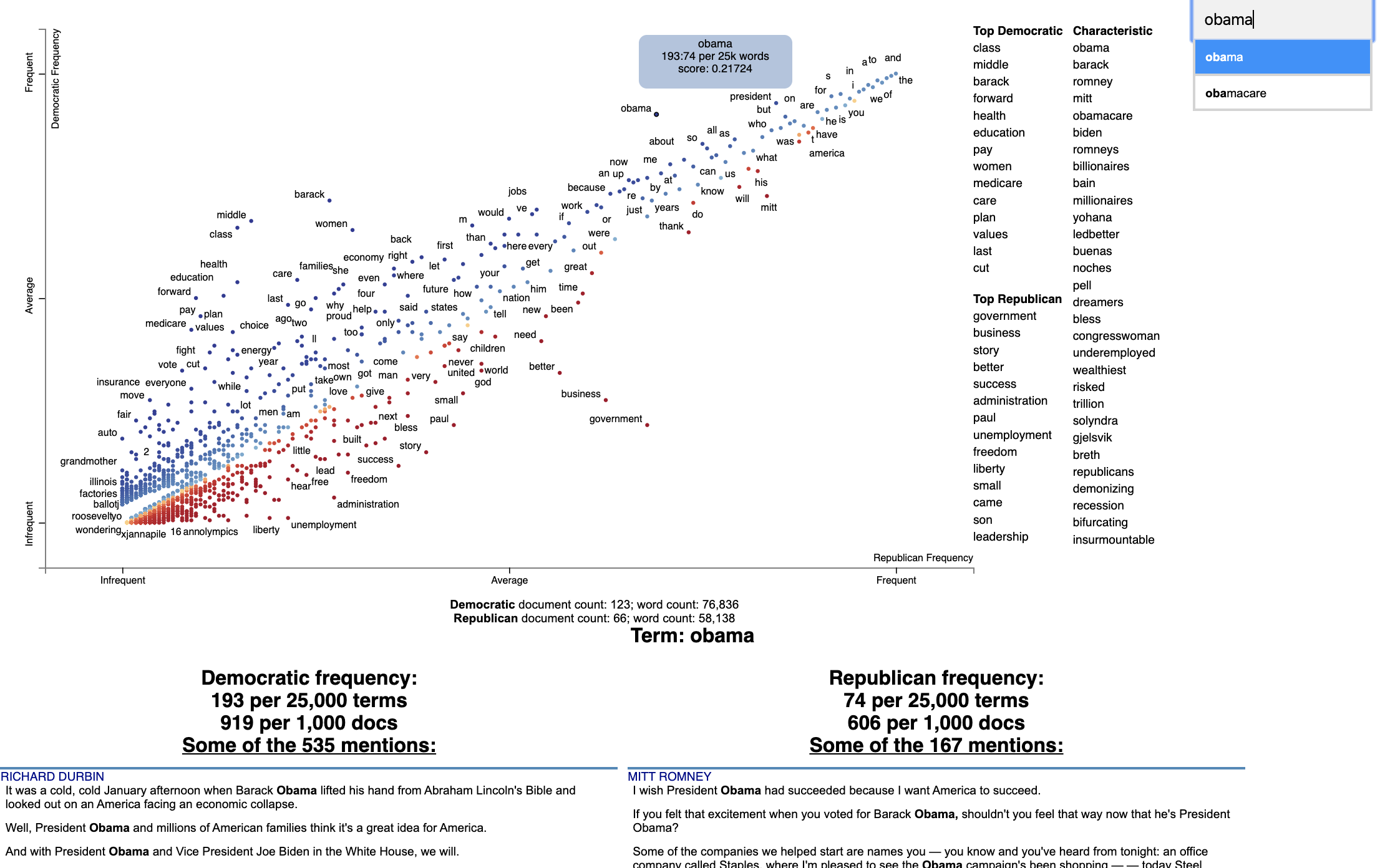
Below is an example of using Scattertext to create visualize terms used in 2012 American political conventions. The 2,000 most party-associated uni grams are displayed as points in the scatter plot. Their x- and y- axes are the dense ranks of their usage by Republican and Democratic speakers respectively.
import scattertext as st

df = st.SampleCorpora.ConventionData2012.get_data().assign(
    parse=lambda df: df.text.apply(st.whitespace_nlp_with_sentences)
)

corpus = st.CorpusFromParsedDocuments(
    df, category_col='party', parsed_col='parse'
).build().get_unigram_corpus().compact(st.AssociationCompactor(2000))

html = st.produce_scattertext_explorer(
    corpus,
    category='democrat',
    category_name='Democratic',
    not_category_name='Republican',
    minimum_term_frequency=0,
    pmi_threshold_coefficient=0,
    width_in_pixels=1000,
    metadata=corpus.get_df()['speaker'],
    transform=st.Scalers.dense_rank,
    include_gradient=True,
    left_gradient_term='More Republican',
    middle_gradient_term='Metric: Dense Rank Difference',
    right_gradient_term='More Democratic',
)
open('./demo_compact.html', 'w').write(html)
The HTML file written would look like the image below. Click on it for the actual interactive visualization.
Citation
Jason S. Kessler. Scattertext: a Browser-Based Tool for Visualizing how Corpora Differ. ACL System Demonstrations. 2017. Link to paper: arxiv.org/abs/1703.00565
@article{kessler2017scattertext,
  author    = {Kessler, Jason S.},
  title     = {Scattertext: a Browser-Based Tool for Visualizing how Corpora Differ},
  booktitle = {Proceedings of ACL-2017 System Demonstrations},
  year      = {2017},
  address   = {Vancouver, Canada},
  publisher = {Association for Computational Linguistics},
}
Table of Contents
-
- Help! I don't know Python but I still want to use Scattertext
- Using Scattertext as a text analysis library: finding characteristic terms and their associations
- Visualizing term associations
- Visualizing phrase associations
- Adding color gradients to explain scores
- Visualizing Empath topics and categories
- Visualizing the Moral Foundations 2.0 Dictionary
- Ordering Terms by Corpus Characteristicness
- Document-Based Scatterplots
- Using Cohen's d or Hedge's g to visualize effect size
- Using Cliff's Delta to visualize effect size
- Using Bi-Normal Separation (BNS) to score terms
- Using correlations to explain classifiers
- Using Custom Background Word Frequencies
- Plotting word productivity
-
- Visualizing differences based on only term frequencies
- Visualizing query-based categorical differences
- Visualizing any kind of term score
- Custom term positions
- Emoji analysis
- Visualizing SentencePiece tokens
- Visualizing scikit-learn text classification weights
- Creating lexicalized semiotic squares
- Visualizing topic models
- Creating T-SNE-style word embedding projection plots
- Using SVD to visualize any kind of word embeddings
- Exporting plot to matplotlib
- Using the same scale for both axes
Installation
Install Python 3.11 or higher and run:
$ pip install scattertext
If you cannot (or don't want to) install spaCy, substitute nlp = spacy.load('en') lines with
nlp = scattertext.WhitespaceNLP.whitespace_nlp. Note, this is not compatible
with word_similarity_explorer, and the tokenization and sentence boundary detection
capabilities will be low-performance regular expressions. See demo_without_spacy.py
for an example.
It is recommended you install jieba, spacy, empath, astropy, flashtext, gensim and umap-learn in order to
take full advantage of Scattertext.
Scattertext should mostly work with Python 2.7, but it may not.
The HTML outputs look best in Chrome and Safari.
Style Guide
The name of this project is Scattertext. "Scattertext" is written as a single word
and should be capitalized. When used in Python, the package scattertext should be defined
to the name st, i.e., import scattertext as st.
Overview
This is a tool that's intended for visualizing what words and phrases are more characteristic of a category than others.
Consider the example at the top of the page.
Looking at this seem overwhelming. In fact, it's a relatively simple visualization of word use during the 2012 political convention. Each dot corresponds to a word or phrase mentioned by Republicans or Democrats during their conventions. The closer a dot is to the top of the plot, the more frequently it was used by Democrats. The further right a dot, the more that word or phrase was used by Republicans. Words frequently used by both parties, like "of" and "the" and even "Mitt" tend to occur in the upper-right-hand corner. Although very low frequency words have been hidden to preserve computing resources, a word that neither party used, like "giraffe" would be in the bottom-left-hand corner.
The interesting things happen close to the upper-left and lower-right corners. In the upper-left corner, words like "auto" (as in auto bailout) and "millionaires" are frequently used by Democrats but infrequently or never used by Republicans. Likewise, terms frequently used by Republicans and infrequently by Democrats occupy the bottom-right corner. These include "big government" and "olympics", referring to the Salt Lake City Olympics in which Gov. Romney was involved.
Terms are colored by their association. Those that are more associated with Democrats are blue, and those more associated with Republicans red.
Terms that are most characteristic of the both sets of documents are displayed on the far-right of the visualization.
The inspiration for this visualization came from Dataclysm (Rudder, 2014).
Scattertext is designed to help you build these graphs and efficiently label points on them.
The documentation (including this readme) is a work in progress. Please see the tutorial below as well as the PyData 2017 Tutorial.
Poking around the code and tests should give you a good idea of how things work.
The library covers some novel and effective term-importance formulas, including Scaled F-Score.
Customizing the Visualization and Plotting Dispersion
New in Scattertext 0.1.0, one can use a dataframe for term/metadata positions and other term-specific data. We can also use it to determine term-specific information which is shown after a term is clicked.
Note that it is possible to disable the use of document categories in Scattertext, as we shall see in this example.
This example covers plotting term dispersion against word frequency and identifying the terms which are most and least dispersed given their frequencies. Using the Rosengren's S dispersion measure (Gries 2021), terms tend to increase in their dispersion scores as they get more frequent. We'll see how we can both plot this effect and factor out the effect of frequency.
This, along with a number of other dispersion metrics presented in Gries (2021), are available
Related Skills
best-practices-researcher
The most comprehensive Claude Code skills registry | Web Search: https://skills-registry-web.vercel.app
mentoring-juniors
Community-contributed instructions, agents, skills, and configurations to help you make the most of GitHub Copilot.
groundhog
399Groundhog's primary purpose is to teach people how Cursor and all these other coding agents work under the hood. If you understand how these coding assistants work from first principles, then you can drive these tools harder (or perhaps make your own!).
isf-agent
a repo for an agent that helps researchers apply for isf funding
