MeiWidgetView
🔥一款汇总了郭霖,鸿洋,以及自己平时收集的自定义控件集合库(小红书)
Install / Use
/learn @HpWens/MeiWidgetViewREADME
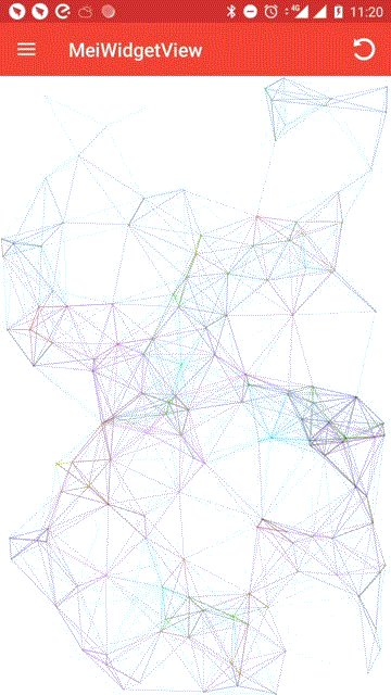
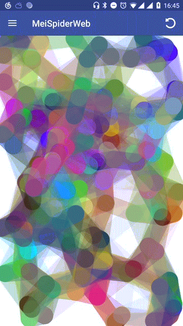
最新动态-网页动态背景“五彩蛛网”
想了解更多大厂炫酷控件,请关注微信公众号:控件人生
<div align=center><img src="https://upload-images.jianshu.io/upload_images/2258857-196f00b808ab8668.jpg?imageMogr2/auto-orient/strip%7CimageView2/2/w/1240" width="200px"/></div> <div align=center>扫一扫 关注我的公众号</div> <div align=center>不定期的发放现金红包 快到碗里来~</div>自定义LayoutManager
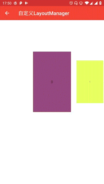
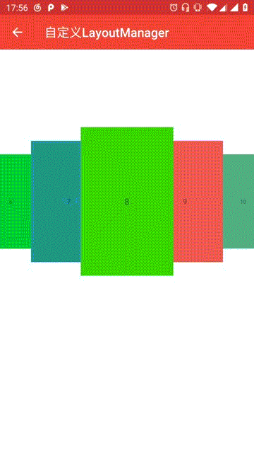
博客地址:Android自定义控件进阶篇,自定义LayoutManager
GIF圆角控件
<div align="center"> <img src="https://img-blog.csdnimg.cn/20190407133537583.gif"> </div>小红书任意拖拽标签控件
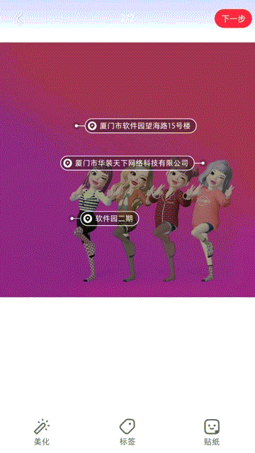
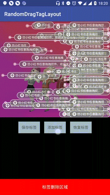
博客地址:Android控件人生第一站,小红书任意拖拽标签控件
小红书自定义CoordinatorLayout联动效果
博客地址:第一站小红书图片裁剪控件之二,自定义CoordinatorLayout联动效果
小红书图片裁剪控件
Flutter“蛛网”控件
<div align="center"> <img src="https://img-blog.csdnimg.cn/20190418165735299.gif"> </div>MeiWidgetView
一款汇总了郭霖,鸿洋,以及自己平时收集的自定义控件的集合库。主旨帮助大家学习自定义控件中的一些技巧,分析问题解决问题的一种思路。
引入
Step 1. Add the JitPack repository to your build file
root build.gradle
    allprojects {
        repositories {
            ...
            maven { url "https://jitpack.io" }
        }
    }
Step 2. Add the dependency
app build.gradle
	dependencies {
	       implementation 'com.github.HpWens:MeiWidgetView:v0.1.6'
	}
Download APK
使用
1、文字路径
a、效果预览
<img src="https://github.com/HpWens/MCropImageView/blob/master/gif/mei_main.gif" width="280px"/>
b、xml布局
    <com.meis.widget.MeiTextPathView
        ...
        android:layout_width="match_parent"
        android:layout_height="wrap_content"/>
c、xml属性
    <declare-styleable name="MeiTextPathView">
        <!-- 路径文字 -->
        <attr name="text" format="string"/>
	<!-- 路径文字大小 -->
        <attr name="textSize" format="dimension"/>
	<!-- 路径文字颜色 -->
        <attr name="textColor" format="color"/>
	<!-- 路径绘制时长 -->
        <attr name="duration" format="integer"/>
	<!-- 文字的描边宽度 -->
        <attr name="strokeWidth" format="dimension"/>
	<!-- 是否循环绘制 -->
        <attr name="cycle" format="boolean"/>
	<!-- 是否自动开始播放 -->
        <attr name="autoStart" format="boolean"/>
    </declare-styleable>
d、参考文章
2、弹跳小球
a、效果预览
<img src="https://github.com/HpWens/MCropImageView/blob/master/gif/bounce_ball.gif" width="280px"/>
b、xml布局
    <com.meis.widget.ball.BounceBallView
        ...
        android:layout_width="match_parent"
        android:layout_height="wrap_content">
c、属性
- bounce_count :小球弹跳次数
- ball_color:小球颜色
- ball_count:小球数量
- ball_radius:小球半径
- ball_delay:小球出现时间间隔(当小球数大于1时)
- anim_duration:小球一次动画时长
- physic_mode : 开启物理效果(下落加速上升减速)
- random_color: 开启小球颜色随机
- random_radius: 开启小球大小随机(在基础大小上下浮动)
- random_path: 开启小球路径随机(在基础路径坐标上下浮动)
d、参考文章
3、扩散圆(主题切换)
a、效果预览
<img src="https://github.com/HpWens/MCropImageView/blob/master/gif/mei_ripple.gif" width="280px"/>
b、xml布局
    <com.meis.widget.MeiRippleView
        ...
        android:layout_width="match_parent"
        android:layout_height="wrap_content" />
c、相关方法
    /**
     * @param startX      被点击view相对屏幕的 view中心点x坐标
     * @param startY      被点击view相对屏幕的 view中心点y坐标
     * @param startRadius 开始扩散的半径
     */
    public void startRipple(int startX, int startY, int startRadius)
d、参考文章
Android自定义View实现炫酷的主题切换动画(仿酷安客户端)
4、酷炫的路径
a、效果预览
<img src="https://github.com/HpWens/MCropImageView/blob/master/gif/mei_line_path.gif" width="280px"/>
b、xml布局
    <com.meis.widget.MeiLinePathView
        ...
        android:layout_width="match_parent"
        android:layout_height="wrap_content" />
c、相关方法
    //设置路径
    public void setPath(Path path) {
        mKeyframes = new Keyframes(path);
        mAlpha = 0;
    }
d、参考文章
5、MEI-图片滚动视差控件
a、效果预览
<img src="https://github.com/HpWens/MCropImageView/blob/master/gif/mei_parallax.gif" width="280px"/>
b、xml布局
    <com.meis.widget.MeiScrollParallaxView
        ...
        android:layout_width="match_parent"
        android:layout_height="wrap_content"/>
c、属性
    <declare-styleable name="MeiScrollParallaxView">
        <!-- 滚动速率 (0~1) 值越大滚动视差越明显 -->
        <attr name="parallaxRate" format="float"/>
        <!-- 滑动是否显示视差 默认 true -->
        <attr name="enableParallax" format="boolean"/>
        <!-- 圆角宽度 默认 0  若通过修改父类来实现 则不需要设置此值-->
        <attr name="roundWidth" format="dimension"/>
        <!-- 是否显示圆形 默认 0  若通过修改父类来实现 则不需要设置此值-->
        <attr name="enableCircle" format="boolean"></attr>
        <!--圆角外的颜色 默认白色  若通过修改父类来实现 则不需要设置此值-->
        <attr name="outRoundColor" format="color"/>
    </declare-styleable>
d、参考文章
打造丝滑的滑动视差控件(ScrollParallaxView)
6、MEI-直播间送爱心
a、效果预览
<img src="https://github.com/HpWens/MCropImageView/blob/master/gif/mei_heart.gif" width="280px"/>
b、xml布局
    <com.meis.widget.heart.MeiHeartView
        ...
        android:layout_width="match_parent"
        android:layout_height="wrap_content"/>
c、属性
    <declare-styleable name="MeiHeartView">
        <!--爱心动画时长-->
        <attr name="heartDuration" format="integer"/>
        <!--是否显示透明度动画-->
        <attr name="heartEnableAlpha" format="boolean"/>
        <!--是否显示缩放动画-->
        <attr name="heartEnableScale" format="boolean"/>
    </declare-styleable>
d、参考文章
7、Mei-selector控件集
a、效果预览
<img src="https://github.com/HpWens/MCropImageView/blob/master/gif/mei_shape.gif" width="280px"/>
通过 xml 布局的方式替换掉 selector 文件 , 这么做的优势在于 , 减少 apk 体积 , 避免后期维护大量的 selector 文件 , 扩展性更强 , 易修改 , 直观 , 功能更加强大
b、特性
- 支持圆角(单独设定四个角角度,圆角半径是高度的一半)
- 支持背景Pressed,Disabled,Selected,Checked四种状态切换
- 支持描边(虚线,四种状态切换)
- 支持文本(四种状态切换)
- 支持涟漪(水波纹)
- 支持leftDrawable,topDrawable,rightDrawable,bottomDrawable四种状态切换
c、支持原生控件
- RadiusTextView
- RadiusCheckBox
- RadiusEditText
- RadiusFrameLayout
- RadiusLinearLayout
- RadiusRelativeLayout
d、扩展
委托的扩展方式(Delegate), 参考的是(AppCompatActivity实现方式), 具体请参考(RadiusTextView)
8、MEI-仿百度浏览器图片拖拽控件
a、效果预览
<img src="https://github.com/HpWens/MCropImageView/blob/master/gif/mei_drag.gif" width="280px"/>
b、xml布局
//PhotoDragRelativeLayout 继承 RelativeLayout 委托的方式 易扩展
<com.meis.widget.photodrag.PhotoDragRelativeLayout xmlns:android="http://schemas.android.com/apk/res/android"
    xmlns:app="http://schemas.android.com/apk/res-auto"
    android:id="@+id/pdr_content"
    android:layout_width="match_parent"
    android:layout_height="match_parent"
    android:background="#000">

    <android.support.v7.widget.Toolbar
        android:id="@+id/toolbar"
        android:layout_width="match_parent"
        android:layout_height="wrap_content"
        android:background="@color/colorPrimary"
        app:navigationIcon="@mipmap/ic_arrow_back_white_24dp"
        app:title="仿百度浏览器图片拖拽控件"
        app:titleTextColor="#FFF" />

    <me.relex.photodraweeview.PhotoDraweeView
        android:id="@+id/pdv_photo"
        android:layout_width="match_parent"
        android:layout_height="match_parent"
        android:layout_below="@+id/toolbar"
        android:src="@mipmap/ic_mei_ripple" />

</com.meis.widget.photodrag.PhotoDragRelativeLayout>
c、相关代码
   mPdrLayout.setDragListener(new PhotoDragHelper().setOnDragListener(new PhotoDragHelper.OnDragListener() {
       @Override
       public void onAlpha(float alpha) {
           //透明度的改变
           mPdrLayout.set
Related Skills
docs-writer
98.9k`docs-writer` skill instructions As an expert technical writer and editor for the Gemini CLI project, you produce accurate, clear, and consistent documentation. When asked to write, edit, or revie
model-usage
333.3kUse CodexBar CLI local cost usage to summarize per-model usage for Codex or Claude, including the current (most recent) model or a full model breakdown. Trigger when asked for model-level usage/cost data from codexbar, or when you need a scriptable per-model summary from codexbar cost JSON.
Design
Campus Second-Hand Trading Platform \- General Design Document (v5.0 \- React Architecture \- Complete Final Version)1\. System Overall Design 1.1. Project Overview This project aims t
arscontexta
2.8kClaude Code plugin that generates individualized knowledge systems from conversation. You describe how you think and work, have a conversation and get a complete second brain as markdown files you own.
