TextFieldBoxes
Material Design text field that comes in a box, based on (OLD) Google Material Design guidelines.
Install / Use
/learn @HITGIF/TextFieldBoxesREADME
TextFieldBoxes


A new Material Design text field that comes in a box, based on Google Material Design guidelines.
<a href='https://ko-fi.com/A3343PAW' target='_blank'><img height='36' style='border:0px;height:36px;' src='https://az743702.vo.msecnd.net/cdn/kofi4.png?v=0' border='0' alt='Buy Me a Coffee at ko-fi.com' /></a>
UPDATE NOTICE
1.4.5 Release
- Fix
attr/counterTextColorname conflict (#97 #99 #105). ThecounterTextColorproperty is now renamed tomCounterTextColor.
1.4.4 Release
- Layout updated to support bigger clear icon and end icons (#72).
1.4.3 Release
- Add
setSimpleTextChangeWatcher()as a better way to listen the input (#69). - Add
app:manualValidateErrorattribute to manually control error state validation (#70). - Bug fix (#71).
Requirements
- Android 4.0.3 IceCreamSandwich (API lv 15) or greater
- Your favorite IDE
Installation
In order to use it, you need to include it in your project.
Gradle:
allprojects {
    repositories {
      ...
      maven { url 'https://jitpack.io' }
    }
}
dependencies {
    compile 'com.github.HITGIF:TextFieldBoxes:1.4.5'
}
Maven:
<repositories>
    <repository>
         <id>jitpack.io</id>
         <url>https://jitpack.io</url>
    </repository>
</repositories>
<dependency>
    <groupId>com.github.HITGIF</groupId>
    <artifactId>TextFieldBoxes</artifactId>
    <version>1.4.5</version>
</dependency>
SBT:
resolvers += "jitpack" at "https://jitpack.io"
libraryDependencies += "com.github.HITGIF" % "TextFieldBoxes" % "1.4.5"
Leiningen:
:repositories [["jitpack" "https://jitpack.io"]]
:dependencies [[com.github.hitgif/textfieldboxes "1.4.5"]]
Usage
Table of Contents
- Basic
- Enable / Disable
- Helper Text & Error Text
- Prefix & Suffix
- Max & Min Characters
- Icon Signifier
- End Icon
- Clear Button
- Custom Colors
- Dense Spacing
- Always Show Hint
- Text Change Watcher
- Dark Theme
- Manual Validate Error
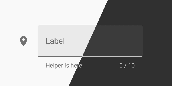
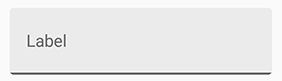
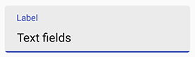
<a id="basic"/> 1. Basic
Add studio.carbonylgroup.textfieldboxes.TextFieldBoxes that contains a studio.carbonylgroup.textfieldboxes.ExtendedEditText to your layout:
...
<studio.carbonylgroup.textfieldboxes.TextFieldBoxes
    android:id="@+id/text_field_boxes"
    android:layout_width="match_parent"
    android:layout_height="wrap_content"
    app:labelText="Label"
    >

    <studio.carbonylgroup.textfieldboxes.ExtendedEditText
        android:id="@+id/extended_edit_text"
        android:layout_width="wrap_content"
        android:layout_height="wrap_content"
        />

</studio.carbonylgroup.textfieldboxes.TextFieldBoxes>
...
NOTE that app:labelText is optional from release 1.3.6.
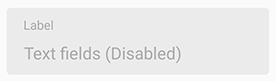
<a id="enable"/> 2. Enable / Disable
app:enabled in xml or setEnabled(boolean enabled) in Java.
<studio.carbonylgroup.textfieldboxes.TextFieldBoxes
    ...
    app:enabled="false"
    >
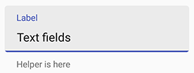
<a id="helper"/> 3. Helper Text & Error Text
NOTE: setting helper or error text to anything not empty will make the bottom view (which contains the helper label) visible and increase the height of the TextFieldBoxes. So if you want to always keep the bottom view visible (height increased), set the helper text to " " when there should be nothing.
helper text: app:helperText in xml or setHelperText(String helperText) in Java.
<studio.carbonylgroup.textfieldboxes.TextFieldBoxes
    ...
    app:helperText="Helper is here"
    >
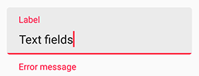
error text: setError(String errorText, boolean giveFocus) in Java.
Param giveFocus determines whether the field will gain focus when set error on. If true, the field gains focus immediately.
NOTE: Error will be removed when the text changes (input or delete).
setError("Error message");
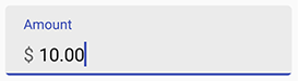
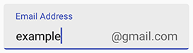
<a id="prefix"/> 4. Prefix & Suffix
! NOTE: Prifix and Suffix attributes should be set to ExtendedEditText.
Use app:prefix in xml or setPrefix(String prefix) in Java to set the unselectable prefix text at the start of the field.
Use app:suffix in xml or setSuffix(String suffix) in Java to set the unselectable suffix text at the end of the field.
<studio.carbonylgroup.textfieldboxes.ExtendedEditText
    ...
    app:prefix="$ "
    >
<studio.carbonylgroup.textfieldboxes.ExtendedEditText
    ...
    app:suffix="\@gmail.com"
    >
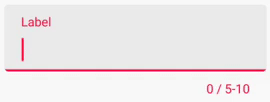
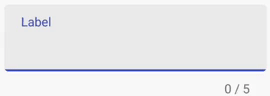
<a id="max"/> 5. Max & Min Characters
NOTE: setting max or min character will make the bottom view (which contains the counter label) visible and increase the height of the TextFieldBoxes.
Use app:maxCharacters in xml or setMaxCharacters(int maxCharacters) in java code to set the max characters count. Use removeMaxCharacters() in java code to remove the limit.
Use app:minCharacters in xml or setMinCharacters(int minCharacters) in java code to set the min characters count. Use removeMinCharacters() in java code to remove the limit.
The color of the bottom line will turn to errorColor (red by default) when exceeding max or min characters limit. 0, as default, means no max or min characters limit.
NOTE: Space and line feed will NOT count.
<studio.carbonylgroup.textfieldboxes.TextFieldBoxes
    ...
    app:maxCharacters="10"
    app:minCharacters="5"
    >
<studio.carbonylgroup.textfieldboxes.TextFieldBoxes
    ...
    app:maxCharacters="5"
    >
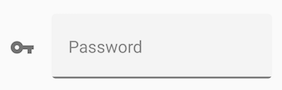
<a id="icon"/> 6. Icon Signifier
Use app:iconSignifier in xml or setIconSignifier(Int resourceID) to set the icon that is shown in front of the TextFieldBoxes if you want there to be one.
You can use setIsResponsiveIconColor(boolean isrResponsiveIconColor) in Java code to set whether the icon will change its color when gaining or losing focus as the label text and the bottomLine do.
NOTE that if true, the icon's color will always be HighlightColor (the same as the bottomLine) that will turn gray when losing focus. If false, the icon will always be in primaryColor.
<studio.carbonylgroup.textfieldboxes.TextFieldBoxes
    ...
    app:iconSignifier="@drawable/ic_vpn_key_black_24dp"
    >

<a id="end"/> 7. End Icon
Use app:endIcon in xml or setEndIcon(Int resourceID) to set the icon of the ImageButton that is shown at the end of the field if you want there to be one.
<studio.carbonylgroup.textfieldboxes.TextFieldBoxes
    ...
    app:endIcon="@drawable/ic_mic_black_24dp"
    >
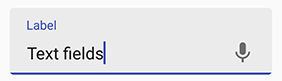
To make it useful (trigger voice input, dropdown event), you would like to use getEndIconImageButton() in Java code to set, for example, what will happen when it's clicked (with .setOnClickListener()), or anything else you want.
final TextFieldBoxes textFieldBoxes = findViewById(R.id.text_field_boxes);
textFieldBoxes.getEndIconImageButton().setOnClickListener(new View.OnClickListener() {
    @Override
    public void onClick(View view) {
        // What you want to do when it's clicked
    }
});
<a id="clear"/> 8. Clear Button
Use app:hasClearButton in xml or setHasClearButton(boolean hasClearButton) to set whether to show the clear button.
If true, a clear button will be shown at the end when there are characters (ANY character) entered in the field.
<studio.carbonylgroup.textfieldboxes.TextFieldBoxes
    ...
    app:hasClearButton="true"
    >
