Fbutton
From then on, developers only need to master one Button component, which is enough.
Install / Use
/learn @Fliggy-Mobile/FbuttonREADME
English | 简体中文
Like it? Please cast your Star 🥰 !
✨ Features
-
Rich corner effect
-
Exquisite border decoration
-
Gradient effect
-
Flexible icon support
-
Intimate Loading mode
-
Cool interaction Special effects
-
More sense of space Shadow
-
High-quality Neumorphism style
🛠 Guide
⚙️ Parameters
🔩 Basic parameters
|Param|Type|Necessary|Default|desc|
|---|---|:---:|---|---|
|onPressed|VoidCallback|true|null|Click callback. If null, FButton will enter an unavailable state|
|onPressedDown|VoidCallback|false|null|Callback when pressed|
|onPressedUp|VoidCallback|false|null|Callback when lifted|
|onPressedCancel|VoidCallback|false|null|Callback when cancel is pressed|
|height|double|false|null|height|
|width|double|false|null|width|
|style|TextStyle|false|null|text style|
|disableStyle|TextStyle|false|null|Unavailable text style|
|alignment|Alignment|false|null|alignment|
|text|String|false|null|button text|
|color|Color|false|null|Button color|
|disabledColor|Color|false|null|Color when FButton is unavailable|
|padding|EdgeInsetsGeometry|false|null|FButton internal spacing|
|corner|FCorner|false|null|Configure corners of Widget|
|cornerStyle|FCornerStyle|false|FCornerStyle.round|Configure the corner style of Widget. round-rounded corners, bevel-beveled|
|strokeColor|Color|false|Colors.black|Border color|
|strokeWidth|double|false|0|Border width. The border will appear when strokeWidth > 0|
|gradient|Gradient|false|null|Configure gradient colors. Will override the color|
|activeMaskColor|Color|否|Colors.transparent|The color of the mask when pressed|
|surfaceStyle|FSurface|false|FSurface.Flat|Surface style. Default [FSurface.Flat]. See [FSurface] for details|
💫 Effect parameters
|Param|Type|Necessary|Default|desc|
|---|---|:---:|---|---|
|clickEffect|bool|false|false|Whether to enable click effects|
|hoverColor|Color|false|null|FButton color when hovering|
|onHover|ValueChanged<bool>|false|null|Callback when the mouse enters/exits the component range|
|highlightColor|Color|false|null|The color of the FButton when touched. effect:true required|
🔳 Shadow parameters
|Param|Type|Necessary|Default|desc| |---|---|:---:|---|---| |shadowColor|Color|false|Colors.grey|Shadow color| |shadowOffset|Offset|false|Offset.zero|Shadow offset| |shadowBlur|double|false|1.0|Shadow blur degree, the larger the value, the larger the shadow range|
🖼 Icon & Loading parameters
|Param|Type|Necessary|Default|desc| |---|---|:---:|---|---| |image|Widget|false|null|An icon can be configured for FButton| |imageMargin|double|false|6.0|Spacing between icon and text| |imageAlignment|ImageAlignment|false|ImageAlignment.left|Relative position of icon and text| |loading|bool|false|false|Whether to enter the Loading state| |loadingWidget|Widget|false|null|Loading widget in loading state. Will override the default Loading effect| |clickLoading|bool|false|false|Whether to enter Loading state after clicking FButton| |loadingColor|Color|false|null|Loading colors| |loadingStrokeWidth|double|false|4.0|Loading width| |hideTextOnLoading|bool|false|false|Whether to hide text in the loading state| |loadingText|String|false|null|Loading text| |loadingSize|double|false|12|Loading size|
🍭 Neumorphism Style
|Param|Type|Necessary|Default|desc| |---|---|:---:|---|---| |isSupportNeumorphism|bool|false|false|Whether to support the Neumorphism style. Open this item [highlightColor] will be invalid| |lightOrientation|FLightOrientation|false|FLightOrientation.LeftTop|Valid when [isSupportNeumorphism] is true. The direction of the light source is divided into four directions: upper left, lower left, upper right, and lower right. Used to control the illumination direction of the light source, which will affect the highlight direction and shadow direction| |highlightShadowColor|Color|false|null|After the Neumorphism style is turned on, the bright shadow color|
📺 Demo
🔩 Basic Demo
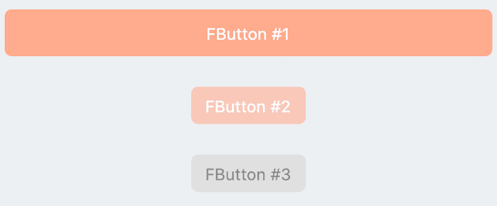
// FButton #1
FButton(
  height: 40,
  alignment: Alignment.center,
  text: "FButton #1",
  style: TextStyle(color: Colors.white),
  color: Color(0xffffab91),
  onPressed: () {},
)

// FButton #2
FButton(
  padding: const EdgeInsets.fromLTRB(12, 8, 12, 8),
  text: "FButton #2",
  style: TextStyle(color: Colors.white),
  color: Color(0xffffab91),
  corner: FCorner.all(6.0),
)

// FButton #3
FButton(
  padding: const EdgeInsets.fromLTRB(12, 8, 12, 8),
  text: "FButton #3",
  style: TextStyle(color: Colors.white),
  disableStyle: TextStyle(color: Colors.black38),
  color: Color(0xffF8AD36),

  /// set disable Color
  disabledColor: Colors.grey[300],
  corner: FCorner.all(6.0),
)
By simply configuring text and onPressed, you can construct an available FButton.
If onPressed is not set, FButton will be automatically recognized as not unavailable. At this time, ** FButton ** will have a default unavailable status style.
You can also freely configure the style of FButton when it is not available via the disabledXXX attribute.
🎈 Corner & Stroke
// #1
FButton(
  width: 130,
  text: "FButton #1",
  style: TextStyle(color: Colors.white),
  color: Color(0xffFF7043),
  onPressed: () {},
  clickEffect: true,

  /// 配置边角大小
  ///
  /// set corner size
  corner: FCorner.all(25),
),

// #2
FButton(
  width: 130,
  text: "FButton #2",
  style: TextStyle(color: Colors.white),
  color: Color(0xffFFA726),
  onPressed: () {},
  clickEffect: true,
  corner: FCorner(
    leftBottomCorner: 40,
    leftTopCorner: 6,
    rightTopCorner: 40,
    rightBottomCorner: 6,
  ),
),

// #3
FButton(
  width: 130,
  text: "FButton #3",
  style: TextStyle(color: Colors.white),
  color: Color(0xffFFc900),
  onPressed: () {},
  clickEffect: true,
  corner: FCorner(leftTopCorner: 10),

  /// 设置边角风格
  ///
  /// set corner style
  cornerStyle: FCornerStyle.bevel,
  strokeWidth: 0.5,
  strokeColor: Color(0xffF9A825),
),

// #4
FButton(
  width: 130,
  padding: EdgeInsets.fromLTRB(6, 16, 30, 16),
  text: "FButton #4",
  style: TextStyle(color: Colors.white),
  color: Color(0xff00B0FF),
  onPressed: () {},
  clickEffect: true,
  corner: FCorner(
      rightTopCorner: 25,
      rightBottomCorner: 25),
  cornerStyle: FCornerStyle.bevel,
  strokeWidth: 0.5,
  strokeColor: Color(0xff000000),
),
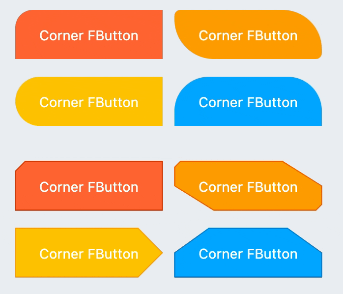
You can add rounded corners to FButton via the corner property. You can even control each fillet individually。
By default, the corners of FButton are rounded. By setting cornerStyle: FCornerStyle.bevel, you can get a bevel effect.
FButton supports control borders, provided that strokeWidth> 0 can get the effect 🥳.
🌈 Gradient
FButton(
  width: 100,
  height: 60,
  text: "#1",
  style: TextStyle(color: Colors.white),
  color: Color(0xffFFc900),

  /// 配置渐变色
  ///
  /// set gradient
  gradient: LinearGradient(colors: [
    Color(0xff00B0FF),
    Color(0xffFFc900),
  ]),
  onPressed: () {},
  clickEffect: true,
  corner: FCorner.all(8),
)
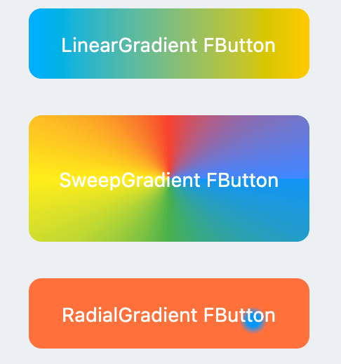
Through the gradient attribute, you can build FButton with gradient colors. You can freely build many types of gradient colors.
🍭 Icon
FButton(
  width: 88,
  height: 38,
  padding: EdgeInsets.all(0),
  text: "Back",
  style: TextStyle(color: Colors.white),
  color: Color(0xffffc900),
  onPressed: () {
    toast(context, "Back!");
  },
  clickEffect: true,
  corner: FCorner(
    leftTopCorner: 25,
    leftBottomCorner: 25,),

  /// 配置图标
  ///
  /// set icon
  image: Icon(
    Icons.arrow_back_ios,
    color: Colors.white,
    size: 12,
  ),

  /// 配置图标与文字的间距
  ///
  /// Configure the spacing between icon and text
  imageMargin: 8,
),

FButton(
  onPressed: () {},
  image: Icon(
    Icons.print,
    color: Colors.grey,
  ),
  imageMargin: 8,

  /// 配置图标与文字相对位置
  ///
  /// Configure the relative position of icons and text
  imageAlignment: ImageAlignment.top,
  text: "Print",
  style: TextStyle(color: textColor),
  color: Colors.transparent,
),
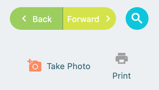
The image property can set an image for
